Orange Juice

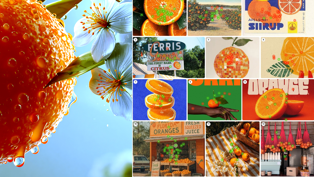
What does high quality orange juice look like? 50 people sorted 24 images of photography, labels and packaging, placing 535 green and red dots. Dew on cut fruit took 97%. A trendy can took zero. Packaging only wins when real fruit surrounds it. One variable explains every score: distance from the tree.

Read More
Orange Juice

What does high quality orange juice look like? 50 people sorted 24 images of photography, labels and packaging, placing 535 green and red dots. Dew on cut fruit took 97%. A trendy can took zero. Packaging only wins when real fruit surrounds it. One variable explains every score: distance from the tree.

The Anatomy of Craving, or What All That Brand Money Isn’t Buying

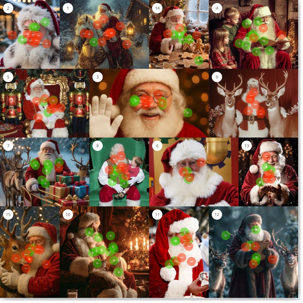
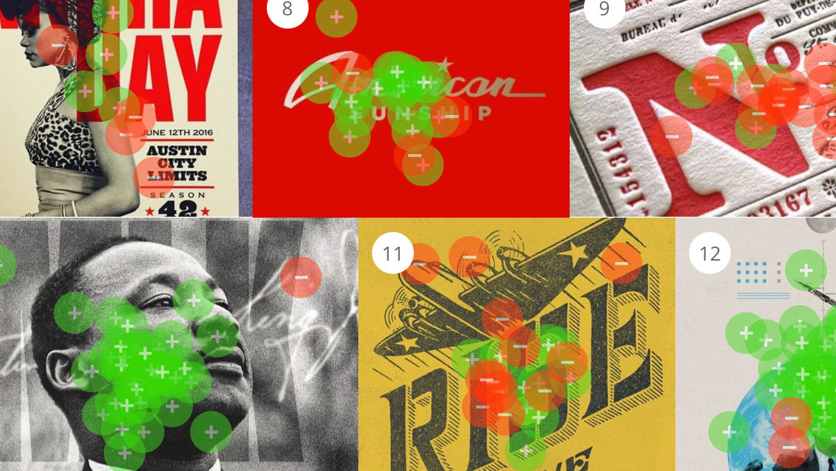
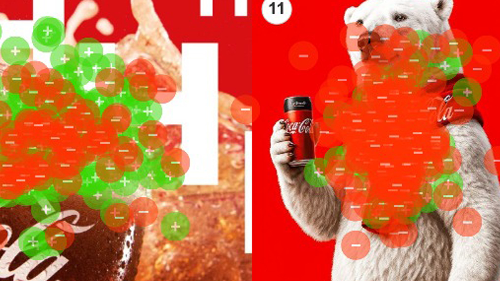
Every year, brands spend fortunes on nostalgia — the polar bears, the holiday trucks, the Santa on retainer — betting that feeling is what sells the drink. So we tested it. We asked 467 people what actually makes them crave a Coke, and the results were unkind to the marketing budget: not the beloved icons, but cold, wet, in-motion liquid — condensation on glass, a bottle at the lips. People don’t crave the brand. They crave the drink.

Coca-cola point maps

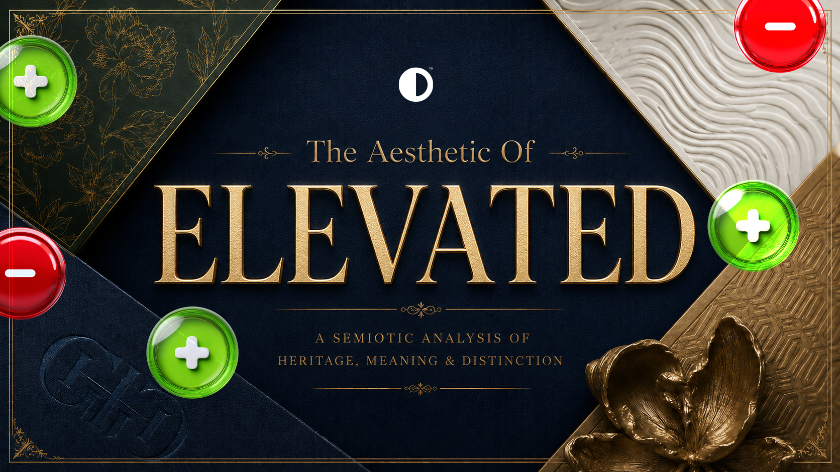
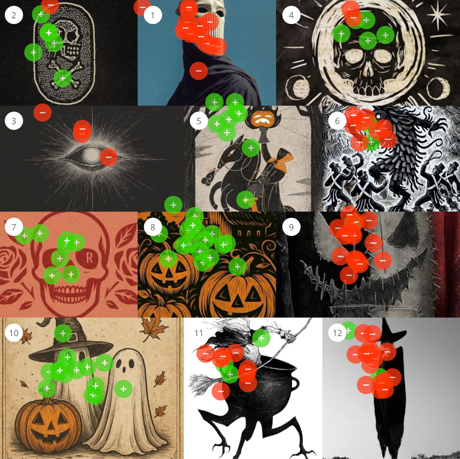
The Aesthetic of “Edgy”

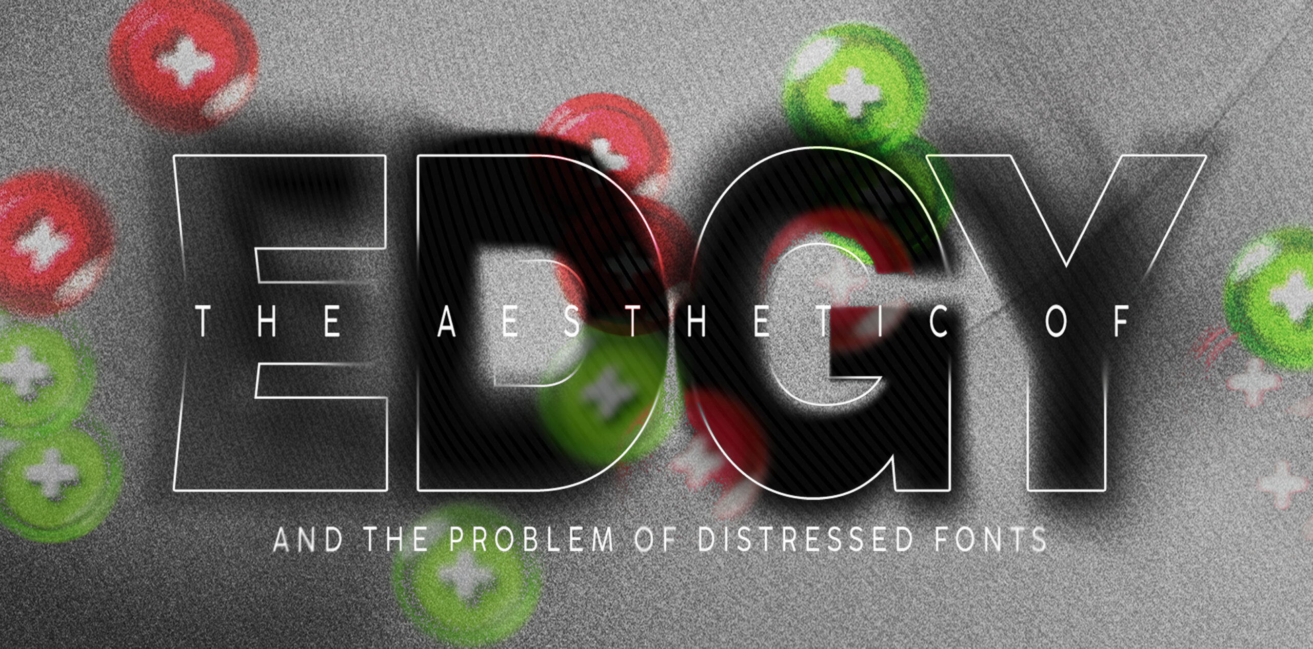
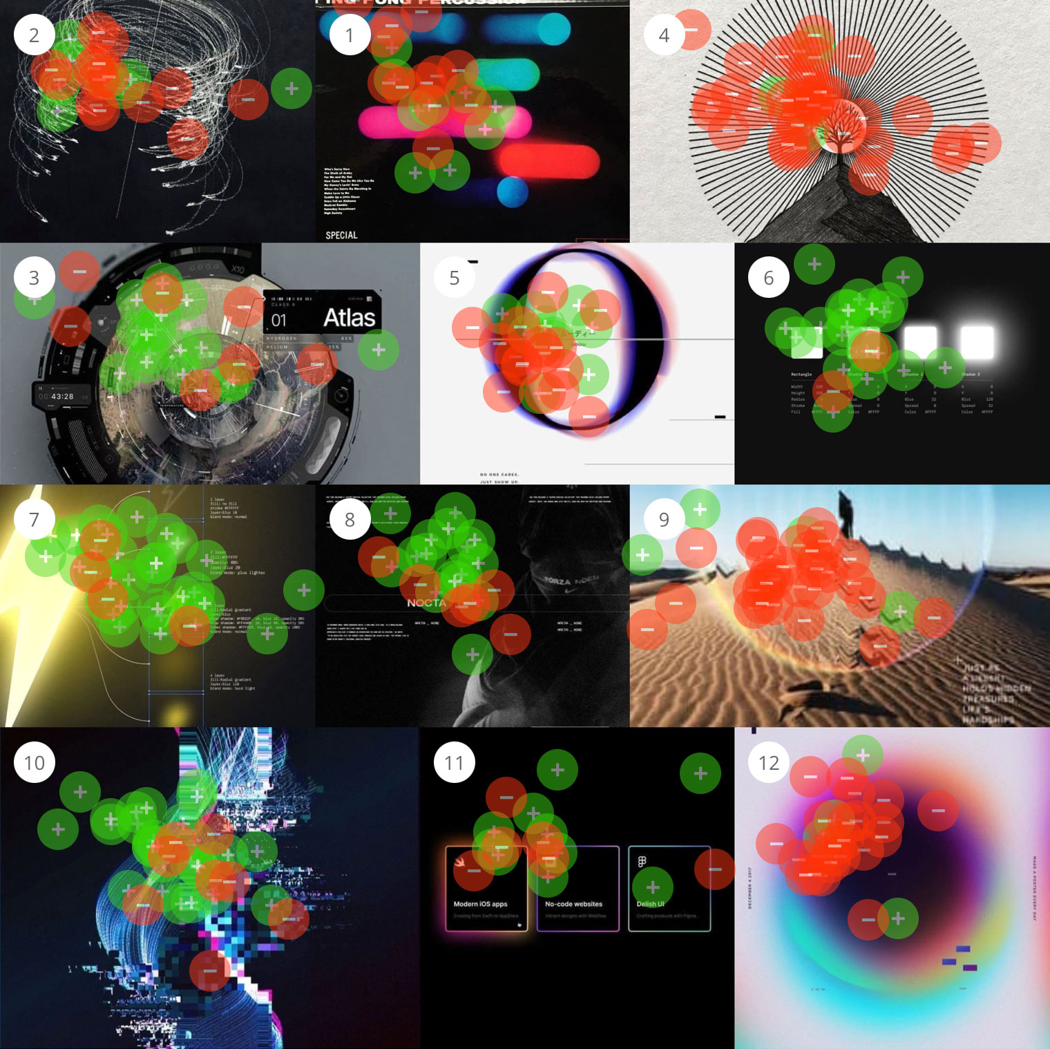
The Aesthetic of "Edgy" and the Problem of Distressed Fonts What do people mean when something feels “edgy”? It’s a word that shows up in creative direction all the time, but like most aesthetic language, it points to a vibe more than a clear set of decisions. So we...

Edgy Test results

The Legend Zelda Movie and What Fans Want to See

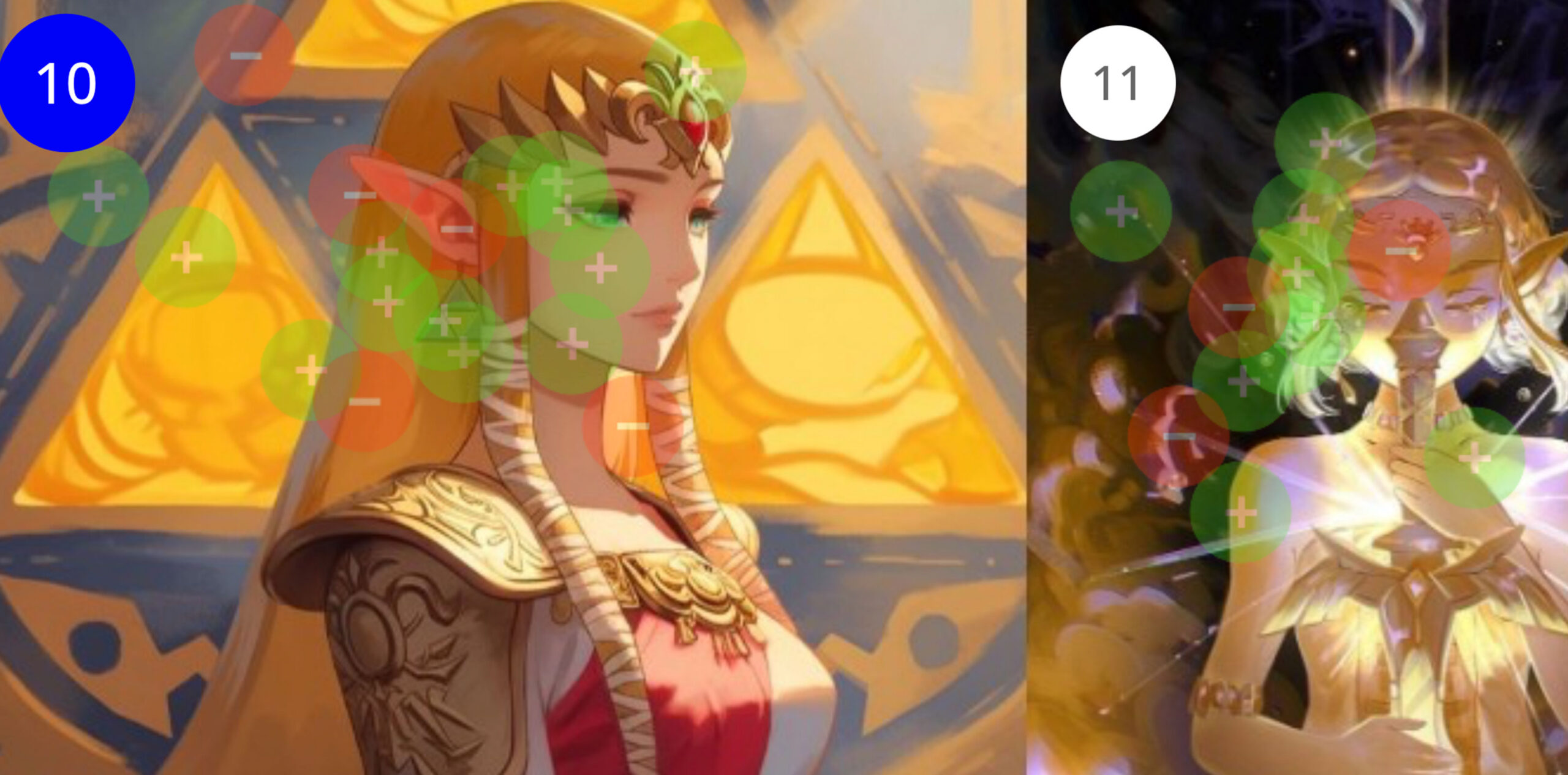
We tested six dimensions of the film’s visual direction using Constellations, from character design to villain treatment to overall style, spanning every era of the franchise. Despite Breath of the Wild being the bestselling Zelda game by a wide margin, its characters, enemies, and aesthetics consistently split the audience. What participants converged on was Ocarina of Time…

Zelda Test

When Client’s Say “Make It Pop”

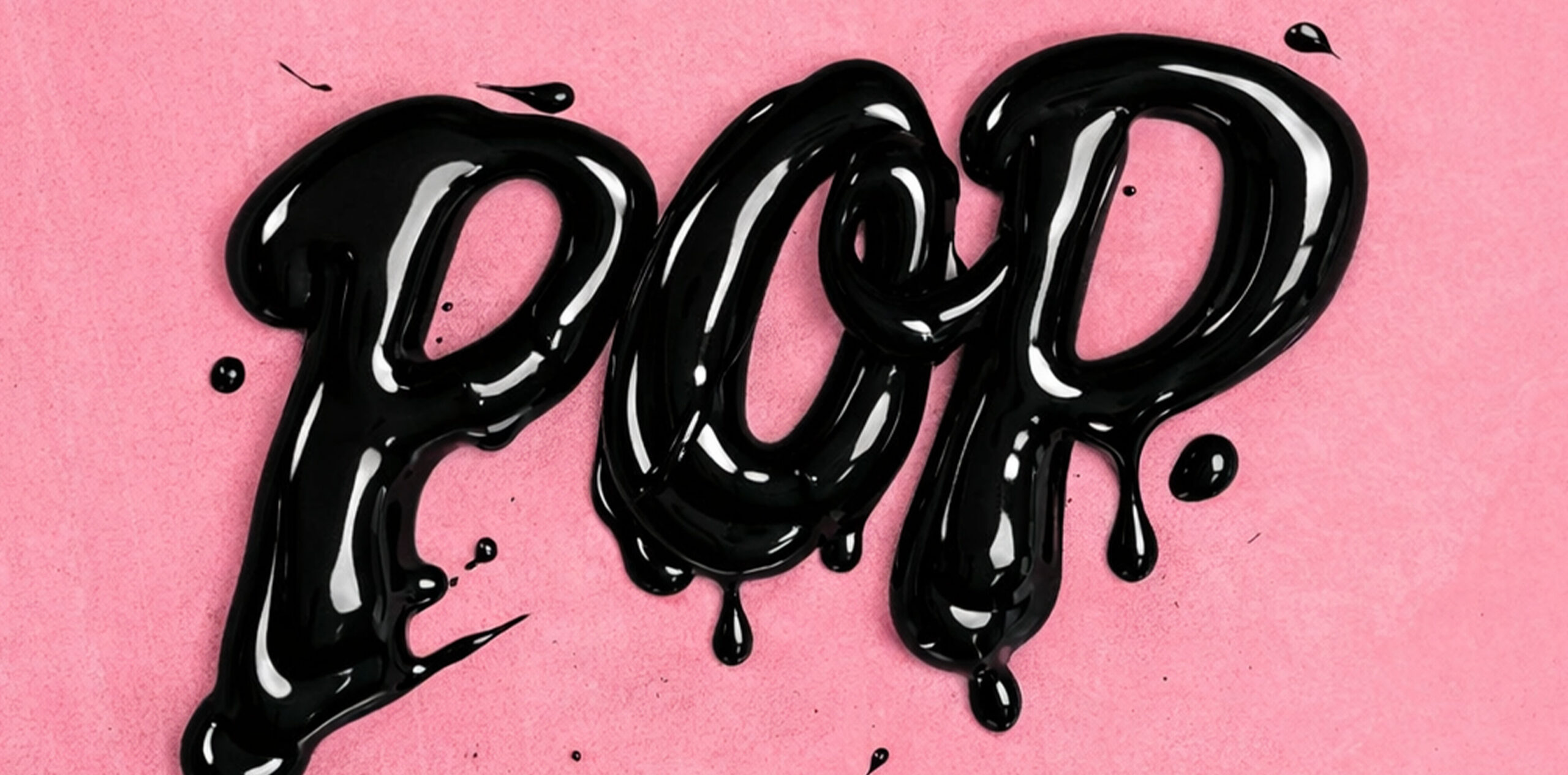
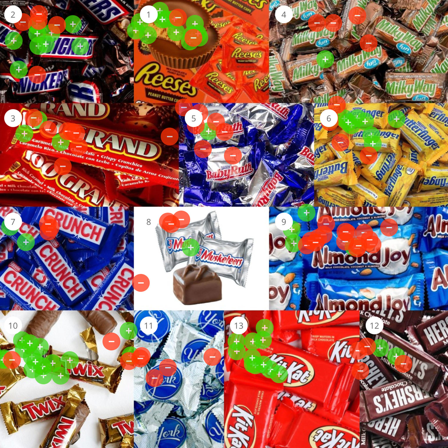
Every designer has heard it: “Can you make it pop?” It’s one of the most common pieces of creative feedback, and one of the hardest to act on, because it points to a feeling more than a specific fix. So we decided to find out what “pop” actually means. Using Constellations, we asked creative professionals to sort images by which ones pop and which ones don’t—and the results were surprisingly consistent.

POP

Recent Articles:

Your Client Speaks a Different Language

lients live in a world where A leads to B. Creative work has no such line, which is why “that doesn’t feel like us” is often the most precise note a client can give you. The gap isn’t obstruction, it’s vocabulary. Judgment and description are different skills. Ask for a reaction instead of a word.

A Field Guide to Vague Creative Feedback

Vague creative feedback isn’t a sign the stakeholder is being difficult. It’s a sign they’re reacting to something real they don’t have the vocabulary to name. “Feels off,” “more premium,” “needs more energy”—each one is a precise feeling wearing an imprecise word. Here’s what those phrases actually mean, and how to translate them into something measurable.

Why Mid-Project Pivots Happen (and What Triggers Them)

Creative projects rarely lurch off course at the end—they start wobbling much earlier, the moment a new stakeholder, leadership change, or unresolved internal thread enters the room. Most pivots trace back to alignment assumed but never established. Here’s what actually triggers them—and how to spot the warning signs weeks before the deadline slips.

How to Test a Logo Before You Launch It

You can’t test a logo by posting it to a Facebook group, running it past a focus group, or asking your spouse. Those methods measure who’s loudest, not what your audience associates with the mark. Here’s how to test the parts that matter—and the one thing to measure above all: association.

The Real Cost of a Rebrand Revision Cycle

A single round of major rebrand revisions costs $10K–$50K—and the invoice is the smallest part of it. The real cost is burnout, missed deadlines, and the people who quit after months of chasing “I just don’t love it.” Here’s where that cost actually lives, and how audience data shrinks it.

What Happens When You Show AI 100 Brand Directions

A year ago, AI couldn’t complete a Constellations perception test at all — every result was an even split. Today it handles simple prompts fine, but on the nuanced, abstract prompts branding depends on, it’s wildly off from human data. The danger isn’t that AI gets it wrong. It’s that it now sounds convincing while doing it.