
Audience Perception Mapping
Agencies that Win
Know What Lands
Constellations maps how your client and their audience feel about a creative direction, before a single deliverable exists. Your vision gets its backup before the pitch, not after the pushback.
Your taste is right. Now you can prove it.
Invite the stakeholders in. Invite the audience in. Connect the dots. Walk back with the picture that gets the yes.
See what your stakeholders and audiences love, what they don’t, and where they disagree.
Find the patterns that tell the story.


The Most Expensive Moment In Professional Creative
The Client
Just Doesn’t Love It
Three weeks of late nights. One offhand opinion in a meeting. The idea is dead. And you’re the one who walks back to the studio to tell the team. You weren’t wrong about the work. You just couldn’t prove it. That’s the whole problem.
See how far that number could drop.
The Approval Cliff Calculator
What does one killed concept really cost you?
This is the Moment the Pushback Stops.
You set the map on the table and the room goes quiet. Then they lean in. The questions change.
“Why should we trust you?” becomes “How did you get this?”
“Can we see other options?” becomes “I get it.”
And the real win comes later. Your client shows the map to their boss you struggled to get a meeting with, and the map wins that room too.
“We didn’t keep revisiting the direction like you often do. Constellations gave us a clear starting point, and the whole team moved forward together. The excitement was so high, we weren’t prepared for all the internal requests to update everything.”
Melissa Esbenshade · CMO & Board Member, InEight · 22 stakeholders aligned
More than a survey. A full perception study, run for you.
Every map is a real study with real people. Here is the work behind it.
Build the Audience
Find the people that matter… clients, social audiences, mailinglists, etc.
Load the Concepts
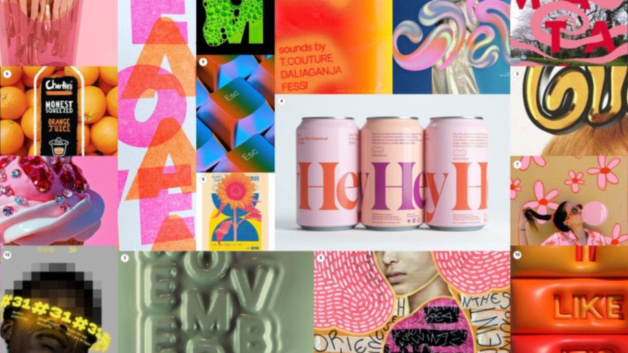
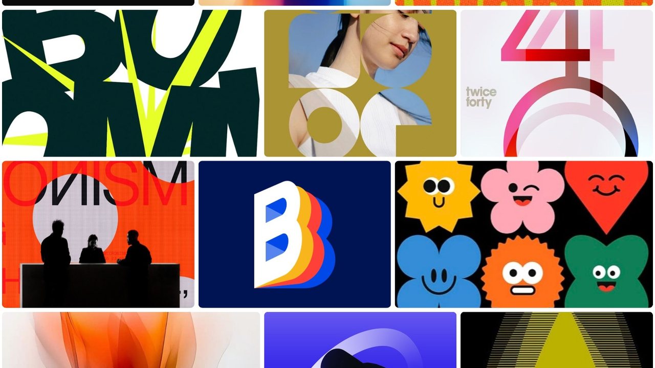
Line, form, texture, color, type… create a mood or several. What’s the vibe?
The Audience Reacts
Real people place gut reactions on the visuals you choose.
We Score and Sort
From a few to thousands of opinions measured and mapped for your case.
Make them See It
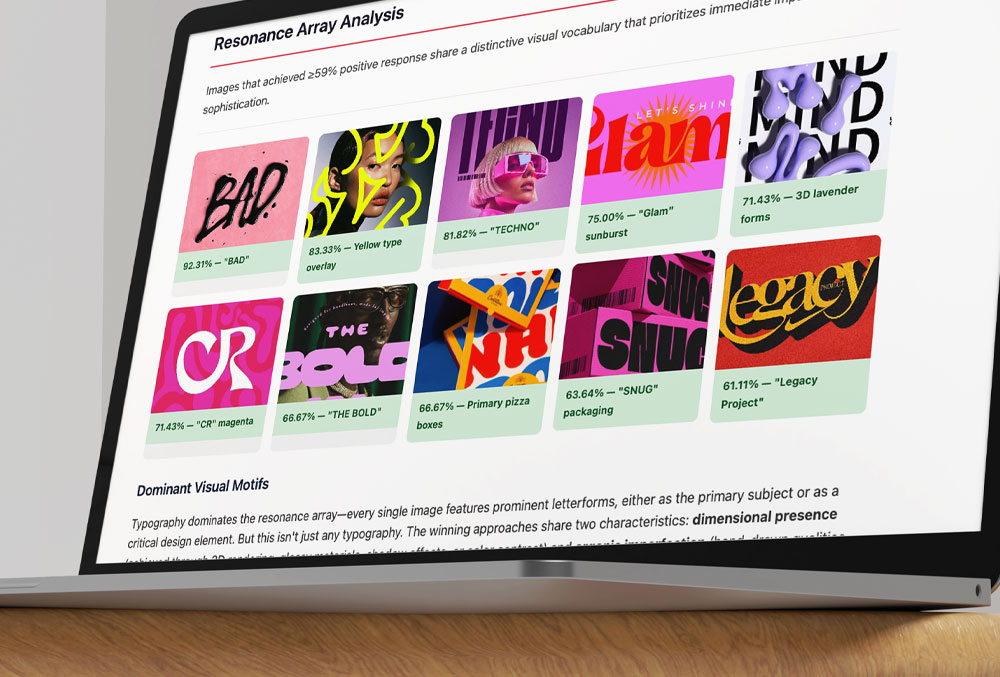
Preference maps and comparison arrays show that your vision works.
Walk in With the Thing that Can’t be Argued With
“I spent years on the agency side, watching good work die without a defense. I built Constellations so it doesn’t have to.”
Joseph Fioramonti · Founder, Constellations · built inside a branding agency
Hundreds of stakeholders aligned
Thousands of gut reactions measured
Millions in client work behind it
“It gave our direction real credibility. Once the client saw how the audience responded, they stopped pushing for the ‘safe’ version and signed off right away.”
CMO • B2B Marketing Campaign
“We spoke with several branding firms, but when we saw the team using Constellations, and the audience insight they could back with real data, we knew we’d found the right partner.”
VP • Global Enterprise Rebrand
“I’m a skeptic when it comes to creative firms, but this approach connected creativity with real business value. The final brand was strategically grounded.”
CEO Emeritus • Fortune 50 Company
We Map What Other Just Argue About
Orange Juice
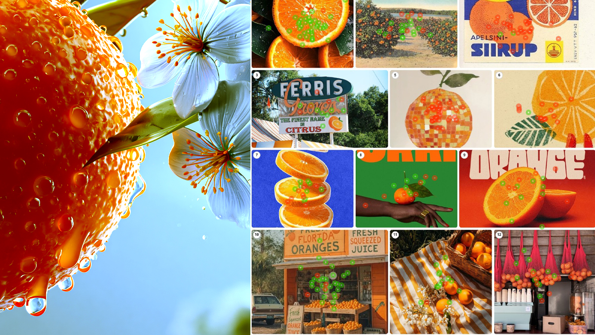
What does high quality orange juice look like? 50 people sorted 24 images of photography, labels and packaging, placing 535 green and red dots. Dew on cut fruit took 97%. A trendy can took zero. Packaging only wins when real fruit surrounds it. One variable explains every score: distance from the tree.
The Anatomy of Craving, or What All That Brand Money Isn’t Buying
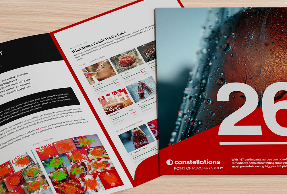
Every year, brands spend fortunes on nostalgia — the polar bears, the holiday trucks, the Santa on retainer — betting that feeling is what sells the drink. So we tested it. We asked 467 people what actually makes them crave a Coke, and the results were unkind to the marketing budget: not the beloved icons, but cold, wet, in-motion liquid — condensation on glass, a bottle at the lips. People don’t crave the brand. They crave the drink.
What Does Elevated Design Look Like?
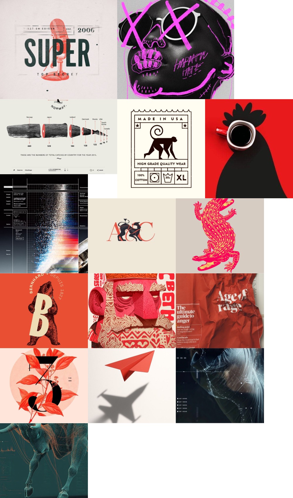
What makes design feel elevated? A Constellations visual study reveals the heritage codes, colors, textures, and forms behind elevated aesthetics.
Your Client Speaks a Different Language
lients live in a world where A leads to B. Creative work has no such line, which is why “that doesn’t feel like us” is often the most precise note a client can give you. The gap isn’t obstruction, it’s vocabulary. Judgment and description are different skills. Ask for a reaction instead of a word.
What Actually Belongs on a Concept Board
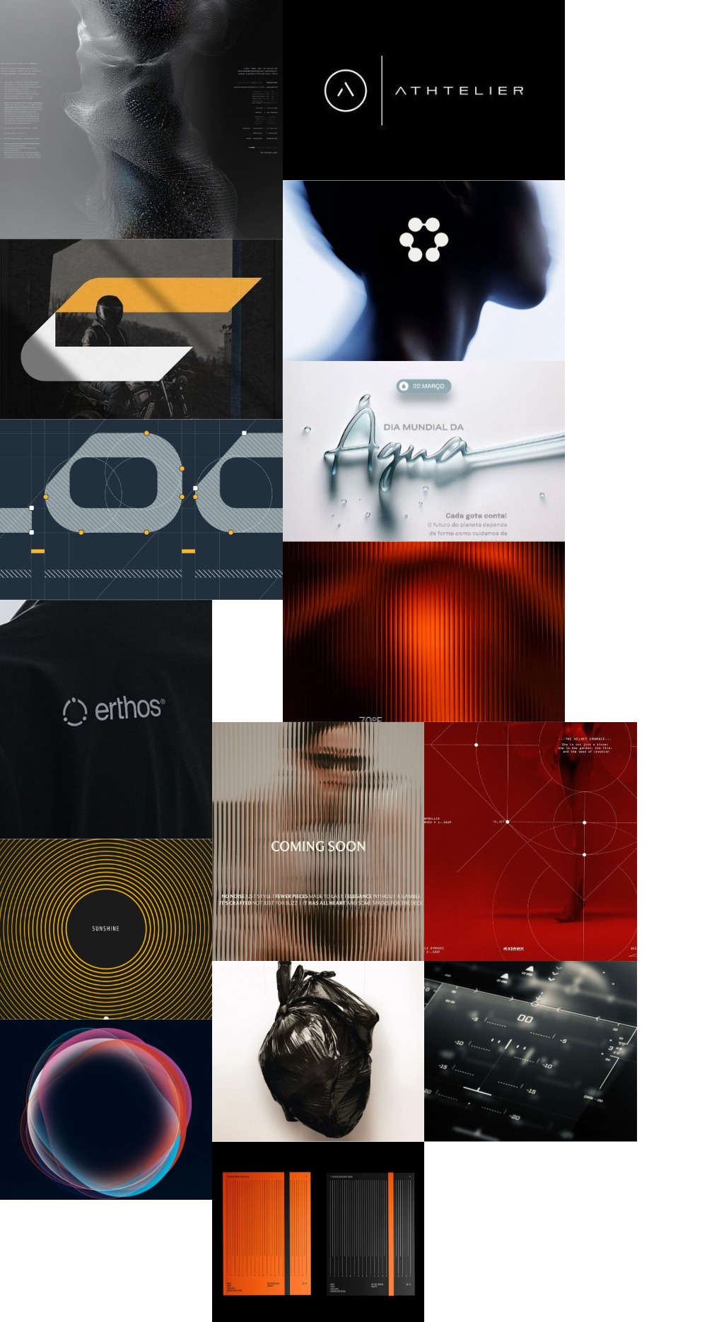
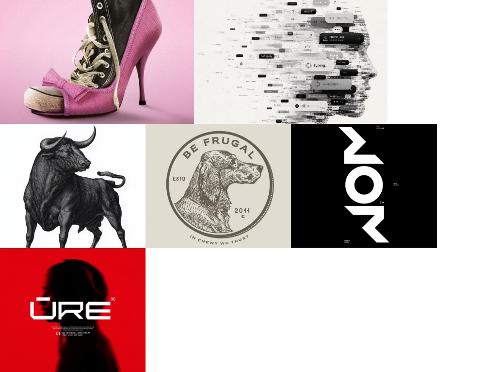
A concept board built to be tested holds raw design elements, not finished ideas. Line, form, texture, color and type, in enough volume to produce a pattern.
A Field Guide to Vague Creative Feedback
Vague creative feedback isn’t a sign the stakeholder is being difficult. It’s a sign they’re reacting to something real they don’t have the vocabulary to name. “Feels off,” “more premium,” “needs more energy”—each one is a precise feeling wearing an imprecise word. Here’s what those phrases actually mean, and how to translate them into something measurable.
We Map What Other Just Argue About
Orange Juice
What does high quality orange juice look like? 50 people sorted 24 images of photography, labels and packaging, placing 535 green and red dots. Dew on cut fruit took 97%. A trendy can took zero. Packaging only wins when real fruit surrounds it. One variable explains every score: distance from the tree.
The Anatomy of Craving, or What All That Brand Money Isn’t Buying
Every year, brands spend fortunes on nostalgia — the polar bears, the holiday trucks, the Santa on retainer — betting that feeling is what sells the drink. So we tested it. We asked 467 people what actually makes them crave a Coke, and the results were unkind to the marketing budget: not the beloved icons, but cold, wet, in-motion liquid — condensation on glass, a bottle at the lips. People don’t crave the brand. They crave the drink.
What Does Elevated Design Look Like?
What makes design feel elevated? A Constellations visual study reveals the heritage codes, colors, textures, and forms behind elevated aesthetics.
Your Client Speaks a Different Language
lients live in a world where A leads to B. Creative work has no such line, which is why “that doesn’t feel like us” is often the most precise note a client can give you. The gap isn’t obstruction, it’s vocabulary. Judgment and description are different skills. Ask for a reaction instead of a word.
What Actually Belongs on a Concept Board
A concept board built to be tested holds raw design elements, not finished ideas. Line, form, texture, color and type, in enough volume to produce a pattern.
A Field Guide to Vague Creative Feedback
Vague creative feedback isn’t a sign the stakeholder is being difficult. It’s a sign they’re reacting to something real they don’t have the vocabulary to name. “Feels off,” “more premium,” “needs more energy”—each one is a precise feeling wearing an imprecise word. Here’s what those phrases actually mean, and how to translate them into something measurable.
Every Project is Different.
Pitch it. Prove it. Settle it.
Anywhere an opinion can stall your work, a map can settle it. Run a study at the start of a pitch, in the middle of a concept round, or the week before a big reveal. The results drop straight into your deck and keep working long after the meeting ends. Here are a few of the ways agencies use them.
Pitch Decks
Walk in with evidence
Packaging
CPG shelf responses
Concept Testing
Direction before the client sees v1
RFP Responses
Poll before you pitch
Rebranding
De-risk the reveal and get buy-in
Campaign Creative
Get the client to see what wins
Make Them See It
Your taste is right. Now you can prove it.
Not Sure Where to Start?
No Pitch. Just Info.