
Audience Perception Mapping
Thousands of Authentic Perspectives
One Clear Picture
Constellations shows you how people truly see an issue, before positions harden. They respond to images instead of loaded words. So you see what people actually think, not what they think they’re supposed to say.
People struggle to articulate their view. Now they can show you.
Invite the stakeholders in. Invite the audience in. Connect the dots. See patterns in real, people-centered data.
See what audiences and communities see, where they align and where they disagree.
Find the pattern and gain clarity and deeper understanding.


Social Desirability Bias
The Old Tools Get Careful Answers. Not True Ones.
Most people skip surveys. The rest answer in personal PR mode: the safe answer, the smart one, not the true one. Your feedback gets polished before it reaches you. That’s the whole problem.
Constellations doesn’t feel like a test. So there are no wrong answers, just honest ones.
Schedule a call to discuss how Constellations can get through to the real perspective of your audience
Constellations Asks In a Way Words Can’t
What Constellations is, how it works, and why it gets answers surveys are unable to shed light on.
This Is the Moment People Stop Talking Around It.
What shows up on your screen is the thing you could never collect before: what people actually feel, at scale.
“Getting responses is like pulling teeth” becomes “Responses came in overnight.”
“What did they really mean by that?” becomes “The pattern is unmistakeable.”
And the real win comes later. The map goes up the chain, to the funder, the board, the committee you that is so har to pursued. And they see it clearly too.

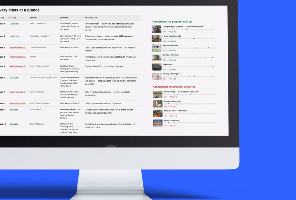

“In other surveys, a lot of times you’ll give a work answer. Here, when I responded, it was really a personal response — which was beautiful, and I think gives a deeper insight into the people that make up our organization.”
Stefon Harris · Co-Director, Express Newark, Founder & Director, Harmony Lab
More than a survey. A full perception study, run for you.
Every map is a real study with real people. Here is the work behind it.
Build the Audience
Constituents, stakeholders, staff, members — or a recruited audience that matches them.
Load the Concepts
We translate your issue into a visual question. No loaded wording, because there’s no wording.
The Audience Reacts
Reactions land right on the images. Minutes to do, no wrong answers.
We Score and Sort
From a dozen voices to thousands — scored, segmented, and mapped by any cut you need.
Make them See It
What resonates, what doesn’t, and where your community splits. Evidence anyone can read.
The whole picture, from every voice, and every perspective

“Words make people careful. Images are faster than careful. The reaction comes out honest and emotional before anyone can polish it. I watched that for fifteen years in design classrooms. Constellations turns it into research.”
Joseph Fioramonti · Design professor turned founder of Constellations
“”People who had been hesitant to commit started making decisions easily. The process made it safe to decide.””
Organizational Development Consultant
“You can’t reach our community with a fifty-question survey. This taps into how people actually express themselves.”
Co-Director, University Research Institution
“I’m a skeptic when it comes to creative firms, but this approach connected creativity with real business value. The final brand was strategically grounded.”
CEO Emeritus • Fortune 50 Company and non-profit Bord member
We Map What People Sense but Can’t Say.

How a U.S. Public Distinguishes “Health” from “Wellness”
How a U.S. Public Distinguishes "Health" from "Wellness" EHealth vs. Wellness: What People Actually Picture "Health" and "wellness" have become the twin engines of a trillion-dollar conversation — and we use the words almost interchangeably. Hospitals have wellness...
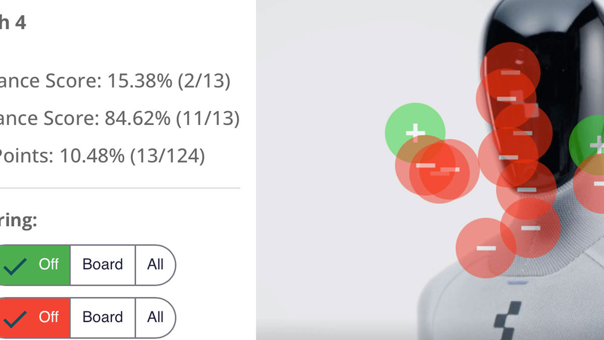
When We Look at Robots, What Are We Really Seeing?
When We Look at Robots, What Are We Really Seeing? Understanding the Tools-Versus-Beings Divide in Robot Perception What makes a robot seem helpful versus creepy? Using our platform Constellations, designed to capture perception through visual interaction, we asked...
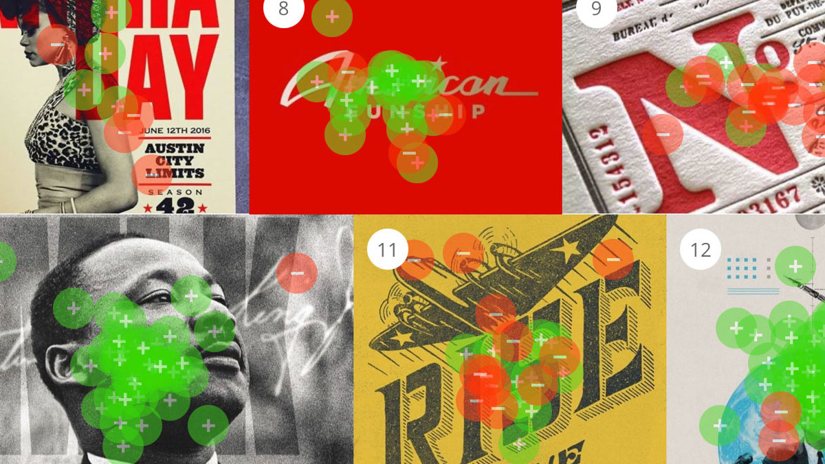
What does “American” Look Like?
What makes something look "American"? Perception Drives How National Identity Is Recognized We showed 57 people a mix of posters, stamps, logos, and packaging—all using familiar red, white, and blue palettes, stars, stripes, and vintage typography—and asked them to...

How Express Newark at Rutgers University Built Alignment During a Year of Transition
How Express Newark at Rutgers University Built Alignment During a Year of TransitionNew leadership. A skeptical staff. A 10th anniversary on the horizon. Here's how a Rutgers University arts incubator used Constellations to earn trust and turn a strategic realignment...
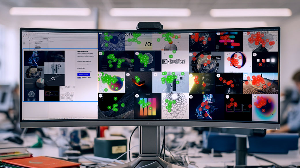
What Heatmaps Actually Tell You About Your Audience (and What They Don’t)
What Heatmaps Actually Tell You About Your Audience (and What They Don't)Quick answer: "Heatmap" means three different things depending on who you ask. A mouse-tracking heatmap (Hotjar) shows where cursors move on a page. An eye-tracking heatmap (Tobii) shows where...

Giving Prospective College Students a Vision Board For Their College Experience
The College Use Case: How Test Structure Shapes What We See We Should've Suspected That Prospective College Students Like Fun... Even simple changes to how a Constellations test is structured can reveal entirely different audience perceptions. This case looks at a...
We Map What Other Just Argue About
How a U.S. Public Distinguishes “Health” from “Wellness”
How a U.S. Public Distinguishes "Health" from "Wellness" EHealth vs. Wellness: What People Actually Picture "Health" and "wellness" have become the twin engines of a trillion-dollar conversation — and we use the words almost interchangeably. Hospitals have wellness...
When We Look at Robots, What Are We Really Seeing?
When We Look at Robots, What Are We Really Seeing? Understanding the Tools-Versus-Beings Divide in Robot Perception What makes a robot seem helpful versus creepy? Using our platform Constellations, designed to capture perception through visual interaction, we asked...
What does “American” Look Like?
What makes something look "American"? Perception Drives How National Identity Is Recognized We showed 57 people a mix of posters, stamps, logos, and packaging—all using familiar red, white, and blue palettes, stars, stripes, and vintage typography—and asked them to...
How Express Newark at Rutgers University Built Alignment During a Year of Transition
How Express Newark at Rutgers University Built Alignment During a Year of TransitionNew leadership. A skeptical staff. A 10th anniversary on the horizon. Here's how a Rutgers University arts incubator used Constellations to earn trust and turn a strategic realignment...
What Heatmaps Actually Tell You About Your Audience (and What They Don’t)
What Heatmaps Actually Tell You About Your Audience (and What They Don't)Quick answer: "Heatmap" means three different things depending on who you ask. A mouse-tracking heatmap (Hotjar) shows where cursors move on a page. An eye-tracking heatmap (Tobii) shows where...
Giving Prospective College Students a Vision Board For Their College Experience
The College Use Case: How Test Structure Shapes What We See We Should've Suspected That Prospective College Students Like Fun... Even simple changes to how a Constellations test is structured can reveal entirely different audience perceptions. This case looks at a...
Every Question is Different.
Ask it. Map it. See the Answers Clearly.
Anywhere words get in the way of honest answers, a visual study can get underneath them. Run one before a public rollout, in the middle of a planning process, or when a decision has been stuck for months. The results go straight into your briefing and keep informing decisions long after the study closes. Here are a few of the ways researchers and leaders use them.
Public Engagement
Hear beyond the town hall
Community Planning
Test the vision before the vote
Program Evaluation
Measure perception, before and after
Academic Research
Measure what words can’t reach
Stakeholder Alignment
Boards, councils, and coalitions
Issue Research
See where people really stand
Uncover Deeper Meaning
There’s more to the story, Constellations makes it visible.
Not Sure Where to Start?
No Sales. Just Information.