
The test
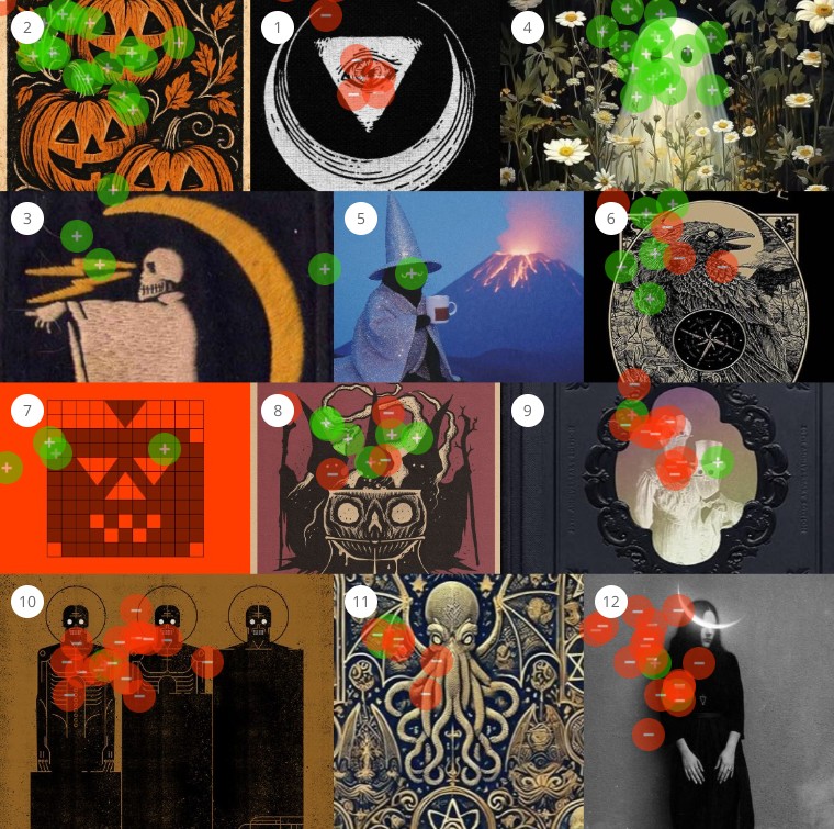
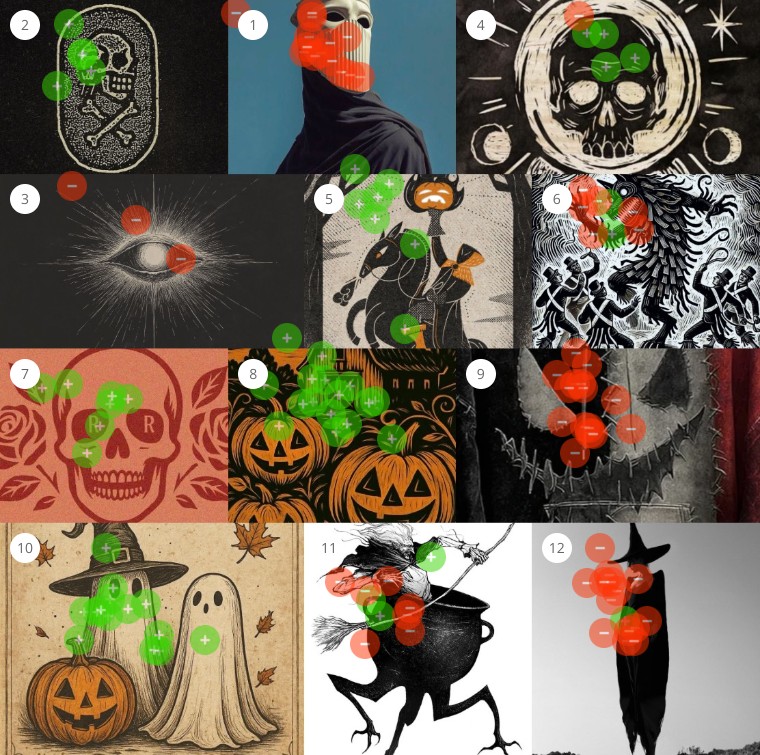
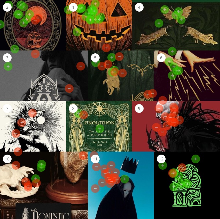
Three Audience Perception Maps, twelve images each, sourced from Pinterest searches for spooky, scary, Halloween, creepy and eerie. Every image carried a familiar trope: ghosts, pumpkins, occult symbols, figures drawn from folklore and horror. Twenty-two people from a general audience dragged green dots onto the things they found spooky and red dots onto the things they found scary.
The question was not “what do you like?” It was closer to “what feels safe to look at?” At a 75% threshold the resulting clusters revealed three emotional registers: spooky, scary, and a curious neutral middle. The maps above are the raw result. What follows is what each register has in common.
Spooky: the comfort of the uncanny
The spooky board glowed with warmth. Participants gravitated to images that felt friendly in their eeriness: gentle ghosts, smiling pumpkins, soft line work that evoked presence without threat.
Colour was key. Burnt oranges, creams and parchment yellows carried nostalgia. The strongest positive reactions went to work that felt illustrative, textured and intentional, as opposed to photorealistic or heavily digital. These tones and treatments recalled handmade decorations, storybook illustrations and folklore rather than fear.
The emotional pattern was clear: spooky equals belonging. It is darkness rendered as community ritual, approachable, symbolic, slightly nostalgic. The perception of spooky celebrates aesthetic eeriness, the haunting as a visual experience rather than an emotional threat, something that returns each autumn and stays safely within the frame.
Figure 2 · Sorted spooky at the 75% threshold
- Green: 16 images 75% or more of the room called spooky
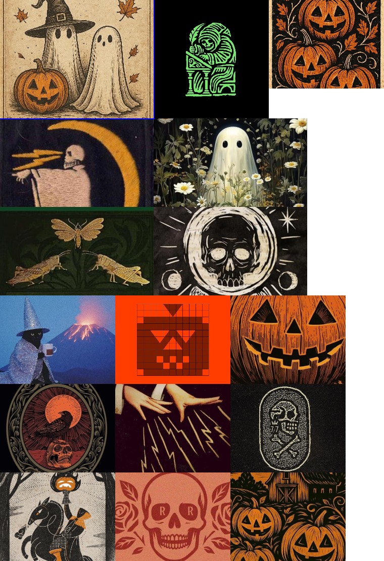
The spooky sheet. Sixteen images. Count the faces: nearly every one has eyes you can read and a mouth that might be smiling. Count the palette: orange, parchment, cream, black used as ink rather than void.
Scary: the loss of safety
The scary images carried a different kind of charge: unease through distance and dehumanisation. The atmosphere across them was cold, ascetic and isolating, emphasising detachment rather than folklore.
Visually, they were marked by high contrast and low warmth. Black, white and desaturated red dominated; orange and parchment were absent. Textures were sleek or digital rather than hand-worn, and many compositions relied on hard geometry to structure the unease. Common motifs included eyes as symbols or disembodied forms, suggesting surveillance or omniscience; masks and veils, erasing personal identity; and distorted humanoid figures. Even the line work seemed aggressive, with black rays, cracks and shattering light radiating from within the composition.
The emotional response was psychological threat. The viewer felt watched, or absorbed into something inhuman. Unlike the friendly ghosts and pumpkins of the spooky set, these images denied comfort or humour. They evoked the uncanny as existential rather than seasonal. In short, participants defined scary as that which obscures or erases humanity: figures that look back without faces, symbols that suggest an infinite gaze, settings stripped of warmth. Fear here is no longer playful. It is ontological.
Figure 3 · Sorted scary at the 75% threshold
- Red: 13 images 75% or more of the room called scary
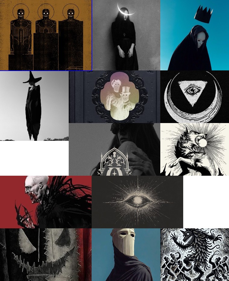
The scary sheet. Thirteen images. Find a face you could read: there is one witch silhouette and one Victorian couple, and both are half-hidden. Everything else is a mask, a veil, an eye without a head, or a figure with the features removed.
Neutral: the aesthetic middle
Between charm and dread lay a middle zone of detached fascination. These images resembled occult diagrams, taxidermy studies or mythic hybrids: dark in subject but emotionally restrained.
The set shared a formal precision with the scary board but was softened by rich palettes and decorative framing. Deep golds, navy blues and bone whites gave the work an archival elegance. Each element signalled dark intelligence, the occult as taxonomy, but not terror. Viewers recognised danger as subject matter, encoded within intellectual aesthetics. Mythic creatures, inscriptions and ritual diagrams implied scholarship rather than fear.
Neutral images blurred moral and emotional direction, defined by distance and containment: the supernatural presented as artefact, not presence. This is the academic side of darkness, where horror becomes design and folklore becomes system. Participants admired the craftsmanship and the symbolism, but it was not charged enough to be either comforting or threatening.
Figure 4 · Below threshold in both directions
- Grey: 7 images that neither register claimed
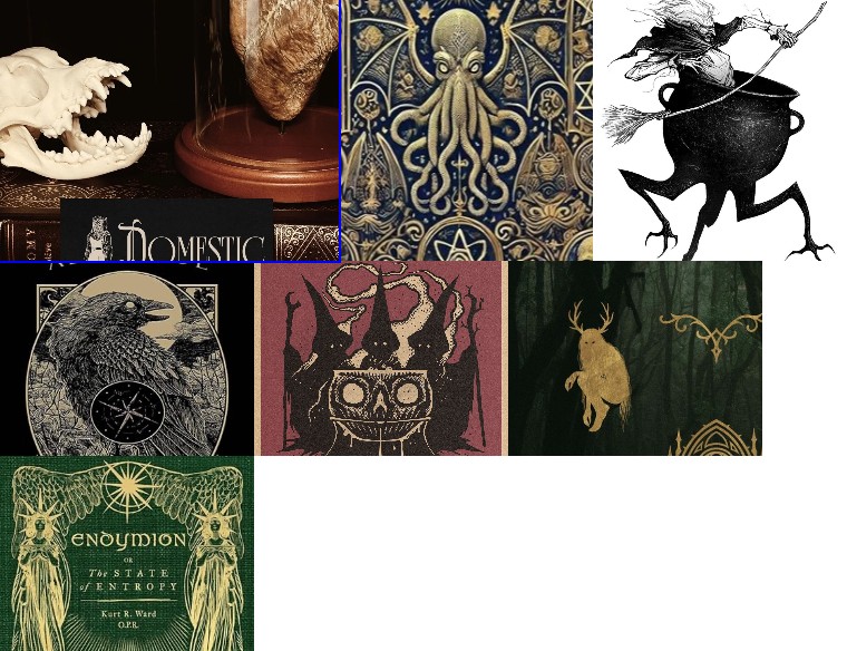
The neutral sheet. Seven images in gold, navy and bone. Every one is a specimen, a diagram or a book cover: the dark thing held at arm’s length and catalogued.
Patterns across the spectrum
Lay the three registers side by side and the same six dimensions shift in step. Tone cools. Texture goes from hand-worn to polished to digital. The human presence goes from playful to symbolic to erased. The cultural anchor moves from folklore through myth to horror, and the emotional mode from comforted curiosity to vulnerable fear.
Figure 5 · Three registers, six dimensions
Across all three, participants were not reacting to monsters. They were reacting to how human the image felt. The more an artwork retained warmth, imperfection or personality, the more it read as spooky. The moment that warmth disappeared, scary began.
Principal finding
Spooky is about presence within safety. Scary is about absence within power. “Is something here with us?” versus “What if we are not here anymore?”
The visual language of fear
What separates spooky from scary is not just how something is drawn. It is how the human is treated within it. In the spooky images, people or figures might appear as ghosts, skeletons or symbols, but they are still open to us: expressive, readable, even friendly. In the scary ones, the human form is obscured: masked, veiled, half-seen. We recognise it but cannot quite reach it. That distance feels dangerous.
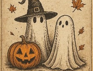
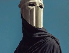
Both are a covered figure. One is a sheet with a face on it. The other is a face with nothing behind it, and the room measured the difference on sight.
Design amplifies the shift, curves versus geometry, texture versus glare, but the deeper divide is emotional. Spooky speaks in texture and warmth; scary speaks in precision and absence. Together they reveal how design governs emotion before meaning ever forms. The way a picture feels decides how close we are willing to get to it.
Do
- Keep the face readable. Eyes, a mouth, an expression. The spooky sheet is full of ghosts and skulls, and nearly all of them can look back kindly.
- Work warm. Burnt orange, cream, parchment yellow. The palette of handmade decorations and storybooks carried spooky on its own.
- Show the hand. Linocut grain, ink texture, imperfect line. Illustrative and intentional beat photorealistic and digital.
- Borrow from folklore. Ritual, nostalgia, the thing that comes back every autumn. Spooky equals belonging.
- Use the neutral register for prestige. Gold on navy, diagrams and specimens read as dark intelligence: admired, not feared.
Don’t
- Don’t erase the human. Masks, veils, faceless figures and disembodied eyes were the reliable scary cues.
- Don’t go cold. Black, white and desaturated red with no orange or parchment read as existential rather than seasonal.
- Don’t structure the unease with hard geometry. Rays, cracks and shattering light radiating from the composition read as threat.
- Don’t confuse craft with comfort. Some of the most beautifully finished images in the study sat in the neutral middle, admired and unfelt.
- Don’t assume the trope carries the tone. Skulls, witches and ghosts appear in every register. Treatment decides which one.
Methodology and confidence
Twenty-two respondents from a general audience, three boards of twelve images sourced from Pinterest, sorted at a 75% threshold into 16 spooky, 13 scary and 7 neutral. This study was published as a visual reading rather than a scored report, so no per-image percentages are given here and none should be inferred from the sheets. The pattern is what the study establishes: the three registers separated cleanly on warmth, texture and the treatment of the human figure, and the same separation appeared on all three boards independently.
Frequently asked questions
What was tested in the spooky vs scary study?
Thirty-six Halloween images on three Audience Perception Maps, sourced from Pinterest searches for spooky, scary, Halloween, creepy and eerie. Ghosts, pumpkins, skulls, witches, occult symbols and figures from folklore and horror. Twenty-two people placed green dots on the images that felt spooky and red dots on the images that felt scary.
How do I read the Audience Perception Maps?
Each map is one board of twelve images with every dot left where a participant placed it. Green means the image felt spooky, red means it felt scary. Where the dots cluster shows attention; the colour mix on each image shows the verdict. At a 75% threshold, 16 images sorted spooky, 13 sorted scary, and 7 drew a mix that neither register claimed.
What actually separates spooky from scary?
How human the image still feels. Spooky images keep warmth, texture and a readable face: burnt orange and parchment, handmade line work, ghosts and pumpkins that could be smiling. Scary images remove them: black, white and desaturated red, sleek or digital surfaces, hard geometry, and a figure that is masked, veiled or faceless. The subject matter overlaps almost completely. The treatment does not.
What does this mean for a seasonal campaign?
Decide which register you want before you decide the imagery, because the audience sorts on treatment, not trope. A skull can be spooky, scary or neutral depending on palette, texture and whether it can look back at you. If the goal is delight, keep the face readable and the palette warm. If the goal is dread, remove them. And if you are not sure which you have made, a perception test on your own boards will tell you in a day.