
The form that informs
At Constellations we use perception testing to inform more intuitive, more effective design decisions. That work depends on a shared vocabulary, and one term we meet constantly and see defined almost never is visual data.
It is routinely confused with data visualization, and the two are not the same. Data visualization turns a dataset into a chart, a graph or an infographic to support interpretation. Visual data is information embedded directly in visual form: structured, styled and labelled so that meaning is instantly perceptible. It is not decoration. It is legibility through form.
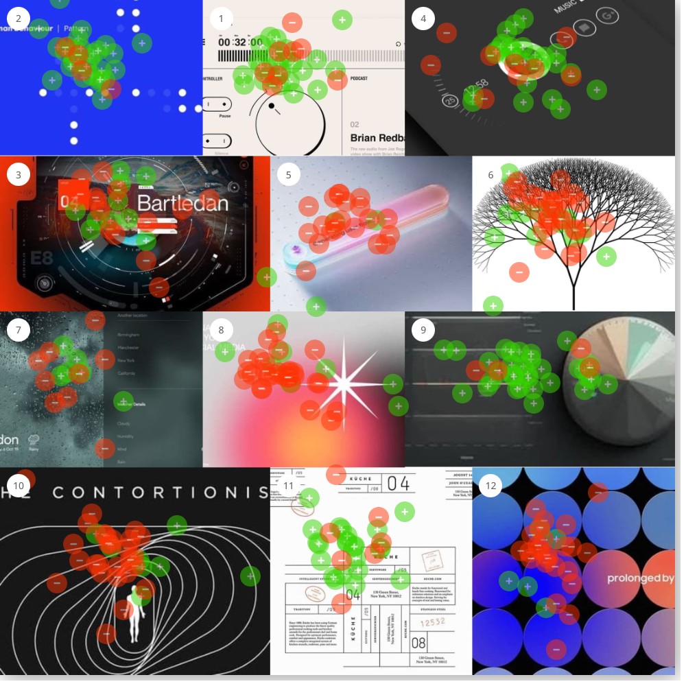
So we put the question to a board. What does visual data actually mean to people? What associations come up, where is there alignment, and where is there ambiguity? This was the first study run on the Constellations platform, and the answer was sharper than we expected. See the full report for every image and score.
Video 1 · A deeper analysis with our founder
How the study worked
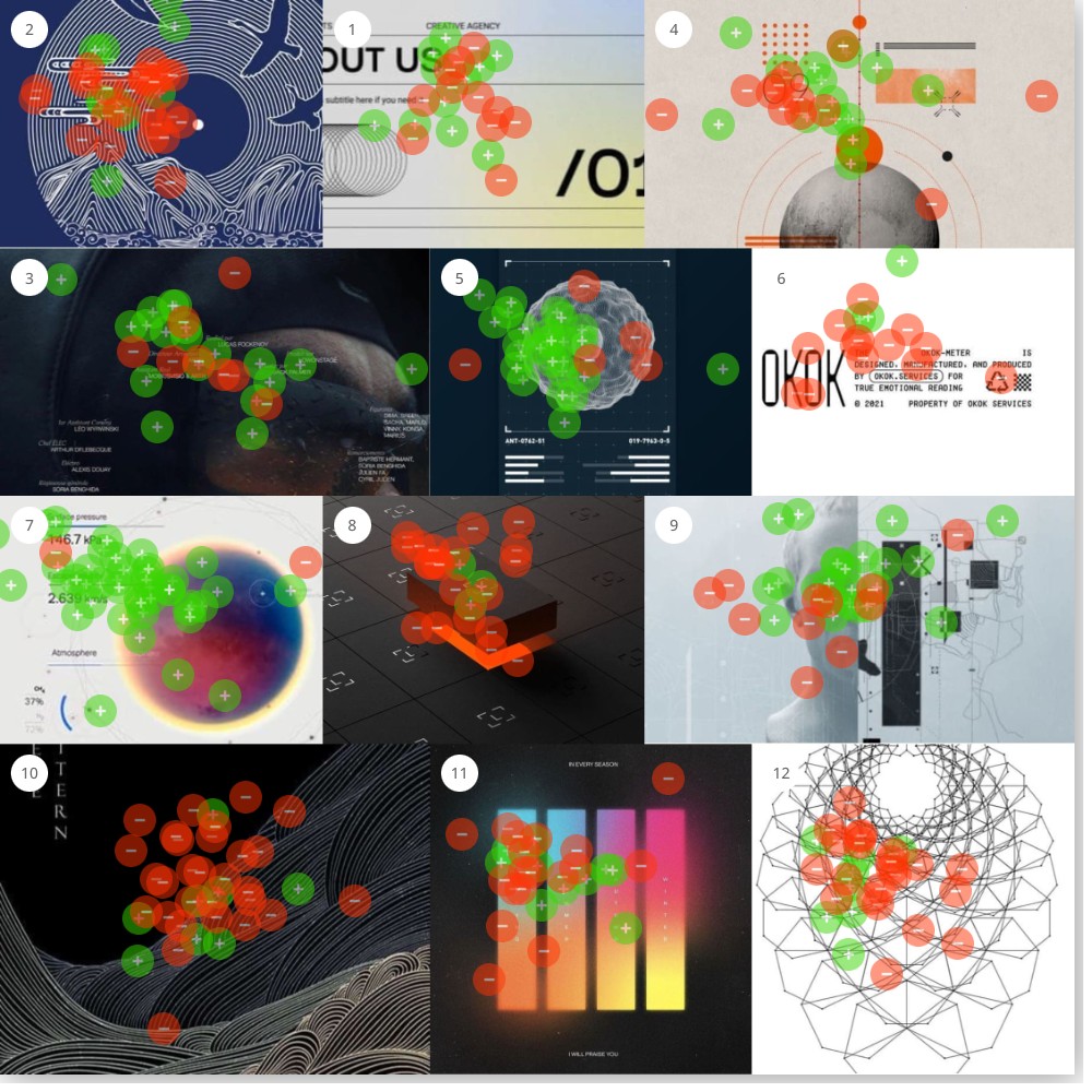
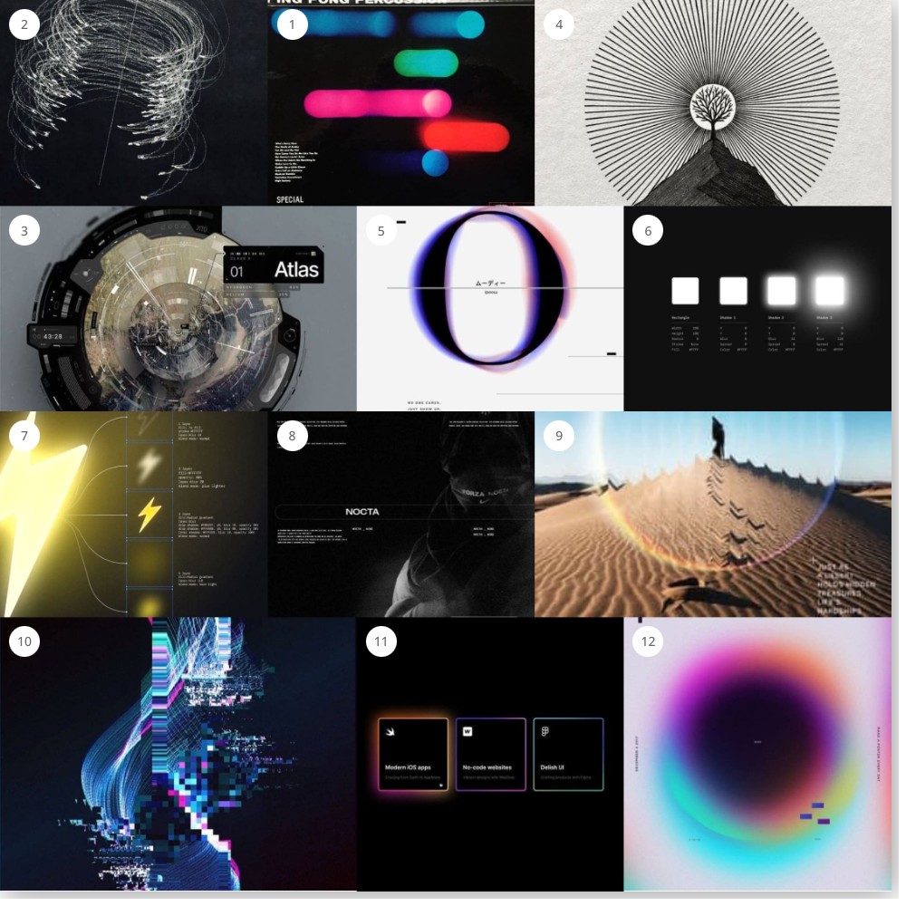
Three boards, twelve images each: dashboards, posters, packaging, renders, photography, interface screens and illustration, mixed with no grouping and no order. The prompt: drag green dots onto the images you most associate with “visual data,” red dots onto the images you least associate with it.
One hundred and eighty-one people opened the survey and 67 completed it, a 37% completion rate. At the report’s 70% threshold the 36 images sort into three groups: thirteen cleared the bar as visual data, twelve were rejected, and eleven split the room. The threshold is what turns a heatmap into a finding. Below it, an image is an opinion. Above it, the room agrees.
Meta-type is the signal
Every image that cleared the bar contains what the report names meta-type: self-referential text that documents the image’s own construction. Numerical values, parameter labels, units, dimensional annotations that describe elements inside the frame. The planet shows its surface pressure. The shadow sheet shows its blur and spread values. The lightning icon is exploded into layers, each annotated with fill, opacity and blend mode.
This is not simply text on an image. It is a feedback loop. The image shows something, the text measures it, and the measurement validates the image. The highest-scoring images do not just show data. They show their work.
Figure 2 · Every image, ranked
Principal finding
Participants are not judging whether data exists behind an image. They are judging whether the image performs the aesthetic of measurement. Meta-type signals that something has been quantified, verified and subjected to scrutiny. Its presence is the message, whether or not anyone reads the values.
What won: images that show their work
Thirteen images cleared the 70% positive threshold. They range from a planet infographic to a phone dial to a printed packaging specimen to a frame of film credits, and the compositions lean modular: zoned layouts, discrete regions, clear hierarchies, dark grounds with high-contrast readouts. They look like they were made to be verified.
Resonance
The planet infographic
A planet with its surface pressure and escape velocity printed beside it
95% greenResonance
The shadow sheet
Four shadow swatches with their blur, spread and colour values beneath
91% greenResonance
The lightning breakdown
An icon exploded into layers, each annotated with fill, opacity and blend mode
89% greenResonance
The dashboard
A dark dashboard, a pie chart and a labelled timeline
89% greenResonance
The dot pattern
White dots on blue under a “Human Behaviour | Pattern” header
88% greenResonance
The specimen sphere
A wireframe sphere with catalogue numbers and readout bars
84% greenResonance
The glitch
A figure dissolving into pixel noise that reads as signal
78% greenResonance
The Küche specimen
A printed packaging sheet, every element numbered and addressed
77% greenResonance
The audio player
Timecode, transport controls and a labelled dial
75% greenResonance
The phone dial
A dark screen with a circular gauge and a numeric readout
75% greenResonance
The NOCTA frame
A brand frame with small annotation text at the margins
73% greenResonance
The Atlas HUD
An instrument face with a labelled readout chip
71% greenResonance
The credits
Film credits: names in columns under role labels
70% greenMedium does not matter
The array holds digital interfaces, a dashboard, a phone screen, an audio player, and it holds print. The Küche packaging grid, a specimen sheet with numbered elements, scored 76.67% alongside the dashboards. A print sheet with its parts addressed reads as data just as clearly as a screen does. What matters is the layer, not the surface it sits on.
What lost: absence, not presence
Twelve images crossed the 70% negative threshold, and they share almost nothing visually. Monochrome line art, a vibrant gradient sphere, a geometric wireframe, an illustrated wave, an atmospheric photograph, a 3D render. What unites them is not a shared aesthetic. It is the shared absence of meta-type.
None of these images contains self-referential measurement. The sunburst tree at 90.24% resistance could represent a hierarchy, but without labels it could equally be decoration. The wireframe could be a data structure, but unannotated it is a pattern. The gradient could encode something, but without parameters it is just colour.
Resistance
The sunburst tree
A tree inside radiating lines, no label anywhere
90% redResistance
The desert
An atmospheric photograph with a geometric arc and a line of copy
88% redResistance
The floating cube
A rendered cube over a grid, glowing underneath
88% redResistance
The pill
A pastel gradient capsule with a line of marketing copy
88% redResistance
The gradient sphere
A soft radial gradient, poster type along the edge
86% redResistance
Prolonged circles
Gradient circles in a grid, one word of type
83% redResistance
The OKOK meter
Text everywhere, but claims without a single value
81% redResistance
The wave pattern
Illustrated line waves in gold on black
78% redResistance
The starburst
A pink gradient with a white star
78% redResistance
The contortionist
Contour lines around a figure, poster type above
77% redResistance
The vinyl wave
A navy sleeve illustration of waves and birds
74% redResistance
The wireframe
A geometric net that could be a data structure and says nothing
73% redThe OKOK exception
One rejected image is covered in text. The OKOK meter reads “designed, manufactured, and produced for true emotional reading,” and it took 81.25% red. The copy makes claims and provides no values. That is the distinction in one plate: text alone is not the signal. Self-referential, quantified text is.
Note · Reframing the loss
It would be a mistake to read this array as “avoid organic forms” or “avoid gradients.” The tree, the waves and the gradients are not causing the rejection. The missing layer is. Annotate the wireframe with vertex counts. Label the gradient with colour stops and blend modes. The report’s working hypothesis is that these images would flip.
The twin test
The cleanest pair in the data is two round objects with structure radiating out of them. One is a planet with its atmosphere sketched around it. One is a tree inside a burst of lines. Both are centred, both are illustrated, both are quiet. One carries three measurements and the other carries none.
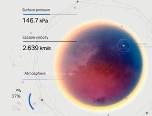

The difference between the top of the wall and the bottom of it is a few lines of small type. That is the whole study in two images.
The threshold zone
Eleven images landed between 31.71% and 67.65%, and the pattern is consistent: they contain some meta-type, buried under competing aesthetic elements. The data is there. It is not leading.
Near-positive
The humanoid schematic at 67.65% has technical drawing and dimension lines, partly obscured by atmospheric treatment and a dominant figure. The collage planet at 55.56% has numbered callouts and orbital notation under a vintage aesthetic that muddies the signal.
Near-negative
The fractal tree at 31.71% has the structure of a visualization and zero labelling. The Bartledan dashboard at 42.31% shows real readouts dwarfed by dramatic imagery. The weather app at 40% displays real locations and conditions, and photography owns the frame.
Contested
The humanoid schematic
Dimension lines and drawing marks, half hidden by atmosphere
68% splitContested
The app cards
Three dark UI cards, titles and one-line descriptions
59% splitContested
The collage planet
Numbered callouts and orbital notation in a vintage collage
56% splitContested
About Us
An agency page with section numbers and hairline rules
50% splitContested
Ping Pong Percussion
Blurred colour bars over a track listing
45% splitContested
The Bartledan dashboard
Real readouts, dwarfed by the picture behind them
42% splitContested
The Moody O
One letterform with small annotation marks
41% splitContested
The weather app
Real locations and conditions, photography owning the frame
40% splitContested
The trajectory
Light trails tracing an arc, no scale
39% splitContested
The seasons bars
Four gradient bars with tick marks, a poster line above and below
36% splitContested
The fractal tree
The shape of a hierarchy with zero labelling
32% splitThe contested cases suggest a ratio rule. When meta-type occupies less than roughly 40% of the visual hierarchy, opinion splits. Secondary annotation on a primarily aesthetic image does not reliably register as visual data. The layer has to be present and prominent.
The nutritional label
Consider the nutrition panel on a bottle of soda. Almost nobody reads it. If it were missing, far fewer people would drink the product. Its job is not to communicate values. Its job is to signal that the contents have been measured, regulated and deemed safe. Visual data works the same way. The meta-type layer tells the viewer: this has been subjected to scrutiny, this is accountable, this is trustworthy. The performance of rigour produces the perception of validity.
That is why presence matters more than legibility. Participants were not asking what the data says. They were asking whether anything had been measured. It is the same mechanism we found when we asked designers what “make it pop” means and what elevated design looks like: the room reads a code, and the code can be built deliberately.
Do
- Add self-referential text. Label elements inside the image with their own properties: dimensions, values, parameters.
- Show specific values. “146.7 kPa” signals data. “High pressure” does not. Specificity implies measurement.
- Include units. kPa, km/s, px, %, RGB. Units say quantification happened.
- Document construction. Layer breakdowns, parameter sheets, dimensional callouts. Make the image explain itself.
- Use modular layouts. Zoned compositions with clear hierarchy read as informational. The grid is your friend.
- Put the layer in front. Meta-type has to occupy roughly 40% or more of the hierarchy to register reliably.
Don’t
- Don’t assume digital means data. Print and screen performed equally when the layer was present.
- Don’t blame the style. Dark dashboards and light specimen sheets both won. Gradients and organic forms only lost when unannotated.
- Don’t mistake copy for measurement. The OKOK meter was covered in words and took 81.25% red. Claims are not values.
- Don’t bury the annotation. Real readouts behind dramatic imagery landed in the contested zone every time.
The report’s own next step is a falsifiable one: take the rejected images, add a meta-type layer, and run them again. If the mechanism is right, they flip. That is what a finding should let you do.
Frequently asked questions
What was tested in the visual data study?
Thirty-six images across three boards: dashboards, interface screens, posters, packaging, renders, illustration and photography, mixed with no grouping. Participants placed green dots on the images they most associated with “visual data” and red dots on the images they least associated with it.
Who took part?
Sixty-seven people completed the survey out of 181 who opened it, a 37% completion rate. The study ran on the Constellations platform for an audience of emerging designers, and the report treats individual scores as directional and the cross-image pattern as robust.
How do you read the dot maps?
Each board is one of the three walls participants saw. Green dots mark an association with visual data, red dots mark the least association, and an image’s score is the share of its own dots that were green. Images at 70% or more in one direction are classified as visual data or not; the rest are contested.
What does this mean for a brand or a product team?
If the goal is to communicate rigour, validity or trustworthiness, add the layer that measures the image: values, units, parameters, labelled dimensions, placed prominently. The visual style is free. The annotation is the signal, and it works before anyone reads it.