Perception Map Test: What Is Your Favorite Halloween Candy?

This test asked participants a deceptively simple question: What is your favorite Halloween candy? Behind the wrappers, though, the answers revealed powerful emotional codes. From generational classics to chewy wildcards, we sorted responses into three visual boards—Chocolate Bars, Chewy Candy, and Bitesize/Suckers—with each image tested for resonance thresholds. Only candies with 75% or higher approval made it into the Resonance Constellation Map, while those that tanked went straight into the Resistants Constellation Map.

APM 1
APM 1
APM 1

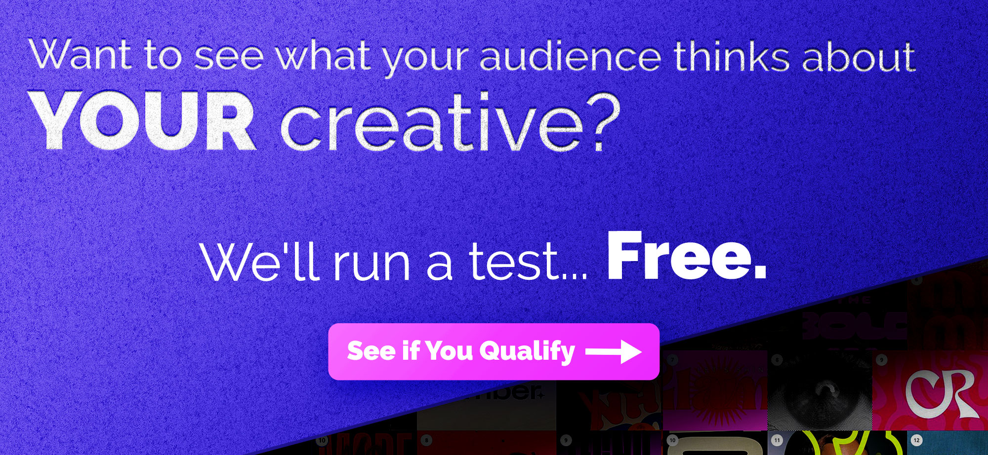
Want to see what your audience thinks about

YOUR creative?

We’ll Run a test… Free. 

Is Your Creative Candy Corn?

Not all Halloween candy is created equal—and some of it is surprisingly polarizing. This study shows what people actually respond to. The full AI report is below.

You can uncover the same kind of clarity in your own work, before it goes live.

free test ad

About Constellations

Constellations is a platform for mapping how audiences perceive visual content. It helps creatives, strategists, and researchers understand the emotional and conceptual signals their visuals send. By analyzing how real people interpret images, Constellations reveals patterns of meaning, ambiguity, and association that are often invisible to creators. For a question as layered and subjective as “What does intelligence look like?”, Constellations is the ideal tool collect visual data about how different minds connect and contrast, turning perception into insight.

Stay Updated

Sign up for our mailing list to participate in more tests and get updates on the results. 

Join Our Mailing List
I agree to the Privacy Policy and Terms of Service.

Previous Studies and Results

The Aesthetic of “Edgy”

The Aesthetic of "Edgy" and the Problem of Distressed Fonts What do people mean when something feels “edgy”? It’s a word that shows up in creative direction all the time, but like most aesthetic language, it points to a vibe more than a clear set of decisions. So we...

The Legend Zelda Movie and What Fans Want to See

We tested six dimensions of the film’s visual direction using Constellations, from character design to villain treatment to overall style, spanning every era of the franchise. Despite Breath of the Wild being the bestselling Zelda game by a wide margin, its characters, enemies, and aesthetics consistently split the audience. What participants converged on was Ocarina of Time…

When Client’s Say “Make It Pop”

Every designer has heard it: “Can you make it pop?” It’s one of the most common pieces of creative feedback, and one of the hardest to act on, because it points to a feeling more than a specific fix. So we decided to find out what “pop” actually means. Using Constellations, we asked creative professionals to sort images by which ones pop and which ones don’t—and the results were surprisingly consistent.

When We Look at Robots, What Are We Really Seeing?

When We Look at Robots, What Are We Really Seeing? Understanding the Tools-Versus-Beings Divide in Robot Perception What makes a robot seem helpful versus creepy? Using our platform Constellations, designed to capture perception through visual interaction, we asked...

Will the Most Authentic Santa Please Stand Up

The images people embraced all shared one thing: they caught Santa in the middle of doing something. Reading his list by candlelight. Kneeling to feed a reindeer in falling snow. The images they rejected? Cute graphics, staged photos, and counterintuitively, some of the most beautifully rendered Santas in the set.

What Does “Visual Data” Look Like

Fifty designers rated visual data, revealing that structure—not style—is the key driver of visual trust and credibility.

Spooky Or Scary?

Is it "Spooky" or "Scary"? A visual study of how people separate spooky from scary — and what that says about our modern relationship with fear. Halloween sits at the strange crossroads of delight and dread. Every October, our visual culture fills with ghosts,...

What does “American” Look Like?

For July 4th, we explored what “American” looks like in 2025—revealing shared civic values through visual perception mapping.

Design Meets Data—Stay in the Loop

We’re just getting started. Subscribe below to get more studies, reflections, and visual data insights straight to your inbox

Mailing List

Sign up to participate in interactive visual surveys and receive exclusive analysis reports on timely, trending topics—all from a visual perception perspective. You'll also get product updates, creative case studies, and smart ways to sharpen your visual strategy.