Resources

Studies and articles

Everything we've published, newest first.

Perception Studies

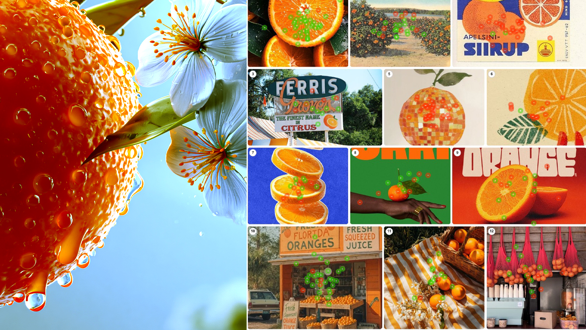
Orange Juice

What does high quality orange juice look like? 50 people sorted 24 images of photography, labels and packaging, placing 535 green and red dots. Dew on cut fruit took 97%. A trendy can took zero. Packaging only wins when real fruit surrounds it. One variable explains every score: distance from the tree.

Read More
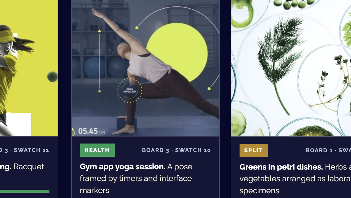
How a U.S. Public Distinguishes “Health” from “Wellness”

“Health” and “wellness” get used almost interchangeably — but do people picture the same thing? We asked 26 participants to sort 36 images between the two words with no definitions provided. The boundary they drew was strikingly consistent: health is what the body does; wellness is what it receives.

Read More

The Anatomy of Craving, or What All That Brand Money Isn’t Buying

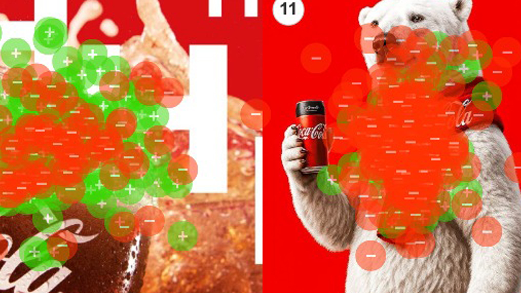
Every year, brands spend fortunes on nostalgia — the polar bears, the holiday trucks, the Santa on retainer — betting that feeling is what sells the drink. So we tested it. We asked 467 people what actually makes them crave a Coke, and the results were unkind to the marketing budget: not the beloved icons, but cold, wet, in-motion liquid — condensation on glass, a bottle at the lips. People don’t crave the brand. They crave the drink.

Read More

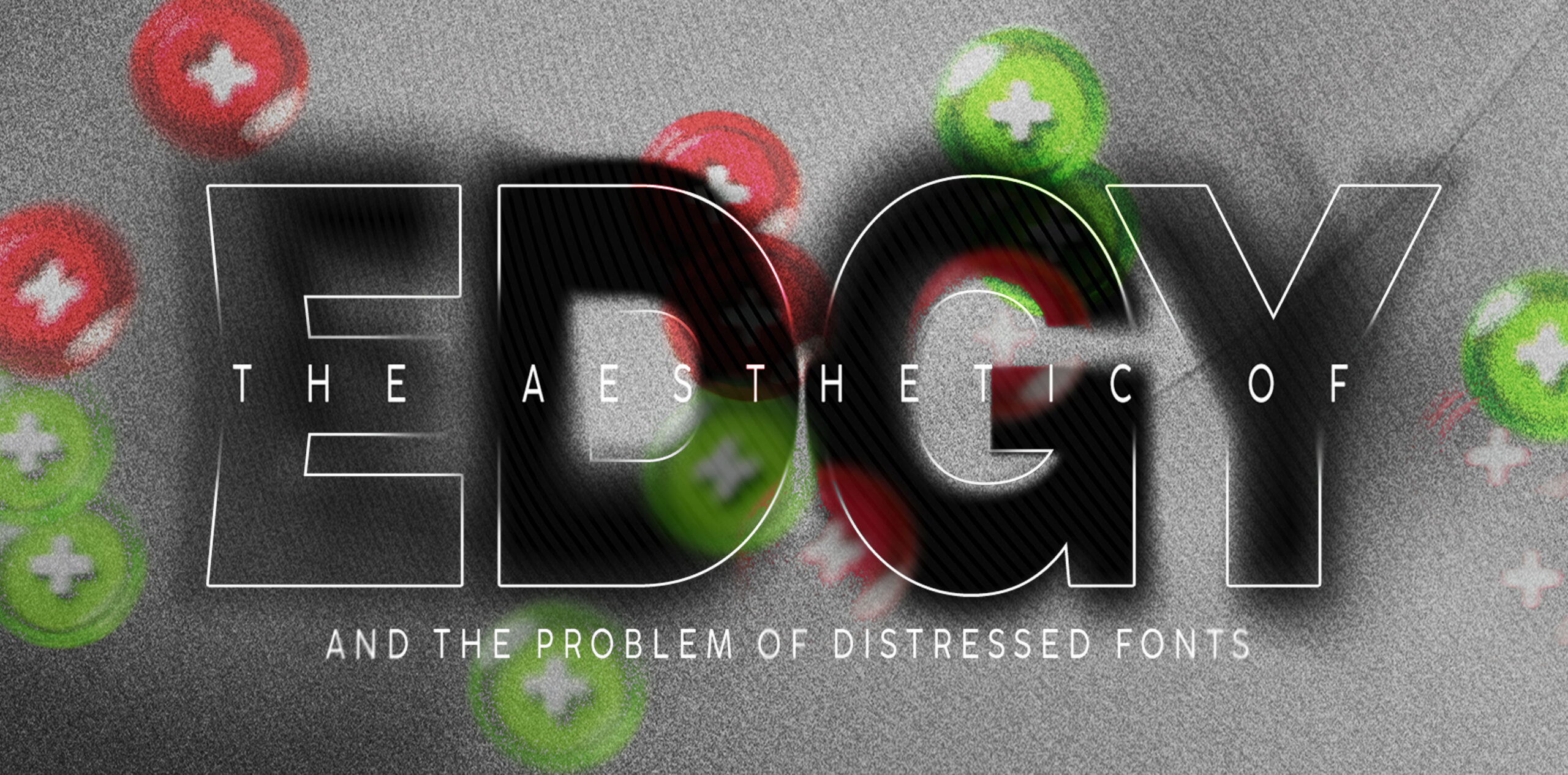
The Aesthetic of “Edgy”

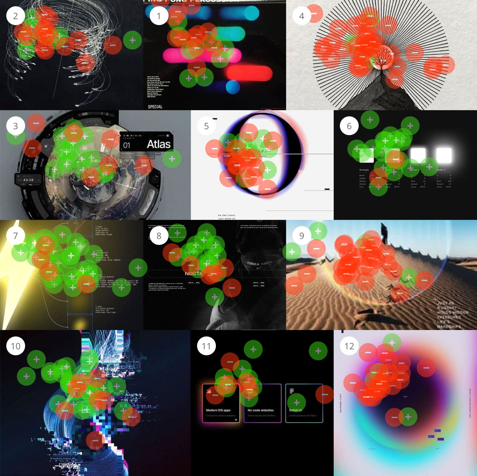
The Aesthetic of “Edgy” and the Problem of Distressed Fonts What do people mean when something feels “edgy”? It’s a word that shows up in creative direction all the time, but like most aesthetic language, it points to a vibe more than a clear set of decisions. So we set out to define it. Using […]

Read More

The Legend of Zelda Movie and What Fans Want to See

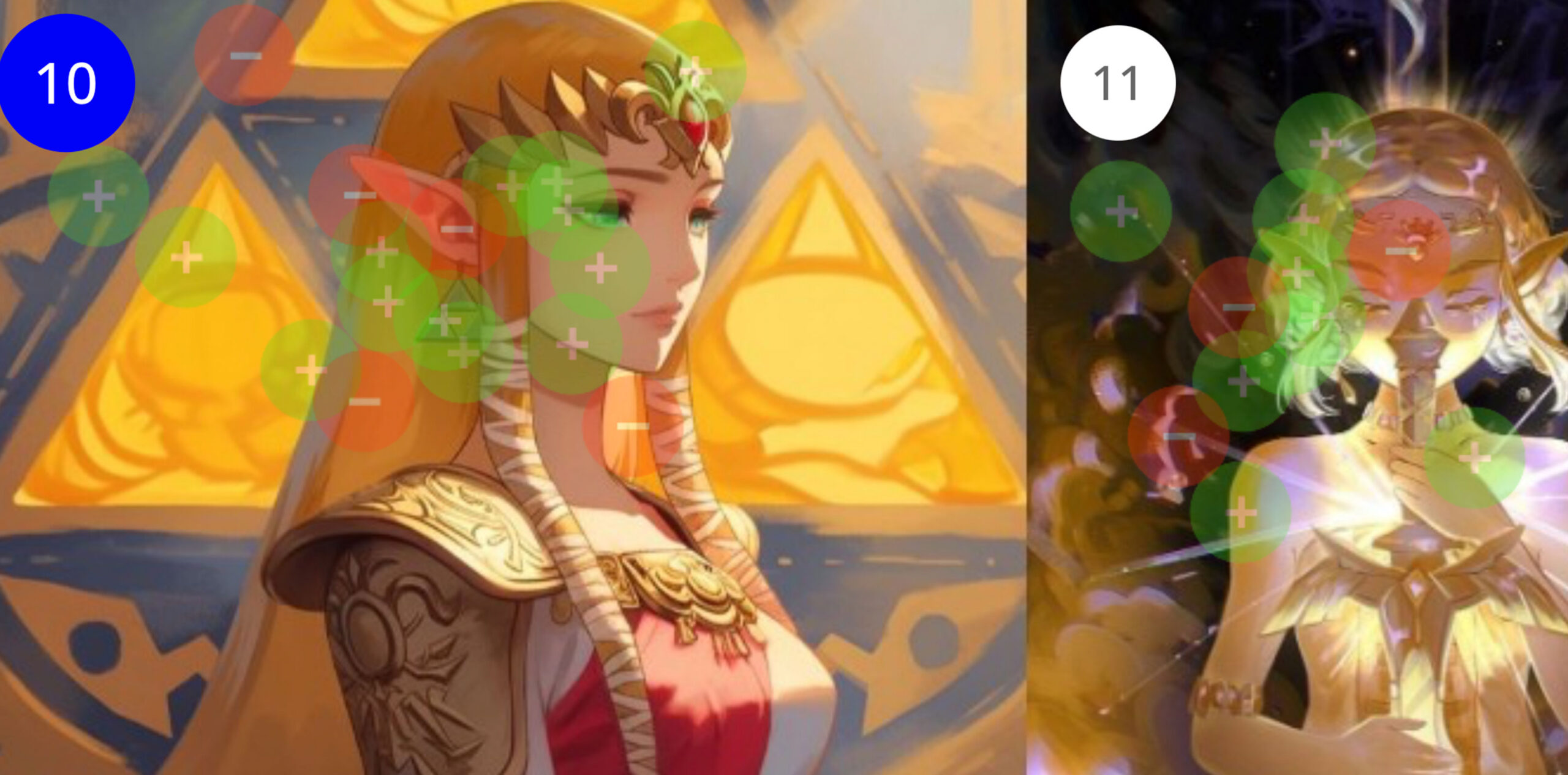
We tested six dimensions of the film’s visual direction using Constellations, from character design to villain treatment to overall style, spanning every era of the franchise. Despite Breath of the Wild being the bestselling Zelda game by a wide margin, its characters, enemies, and aesthetics consistently split the audience. What participants converged on was Ocarina of Time…

Read More

When Client’s Say “Make It Pop”

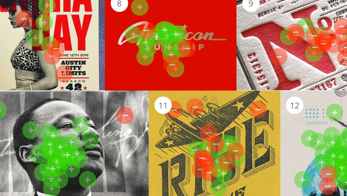
Every designer has heard it: “Can you make it pop?” It’s one of the most common pieces of creative feedback, and one of the hardest to act on, because it points to a feeling more than a specific fix. So we decided to find out what “pop” actually means. Using Constellations, we asked creative professionals to sort images by which ones pop and which ones don’t—and the results were surprisingly consistent.

Read More

When We Look at Robots, What Are We Really Seeing?

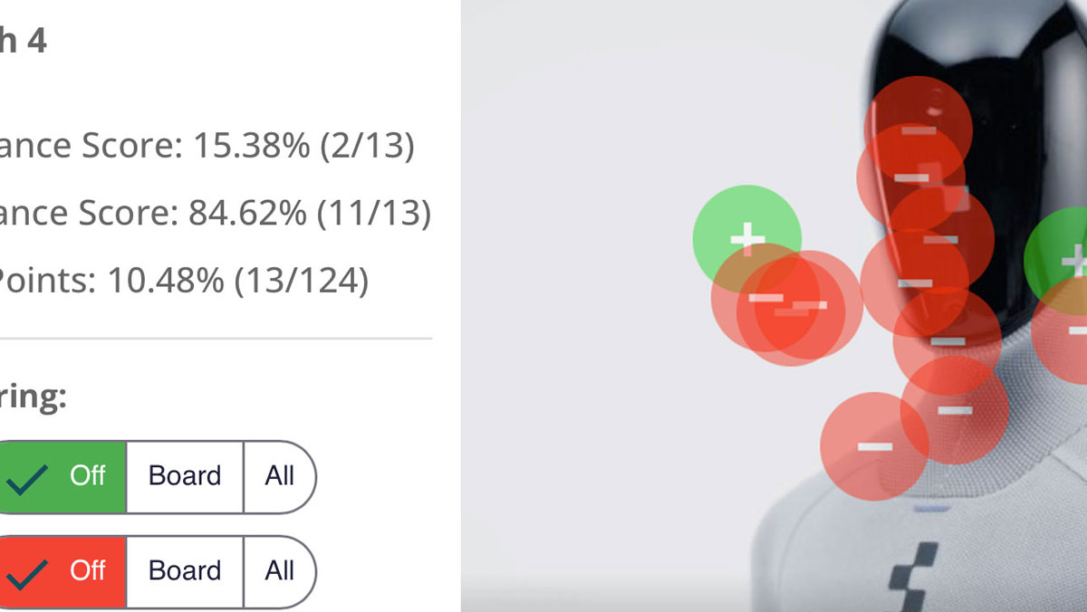
What makes a robot look helpful instead of creepy? 21 people placed green and red dots on 17 robot images. Industrial arms with no face scored 90.91% to 100% helpful. Humanoids in kitchens and living rooms scored 81.82% to 100% creepy, even while caring for the elderly. The one humanoid that won had a camera for a face.

Read More

Will the Most Authentic Santa Please Stand Up

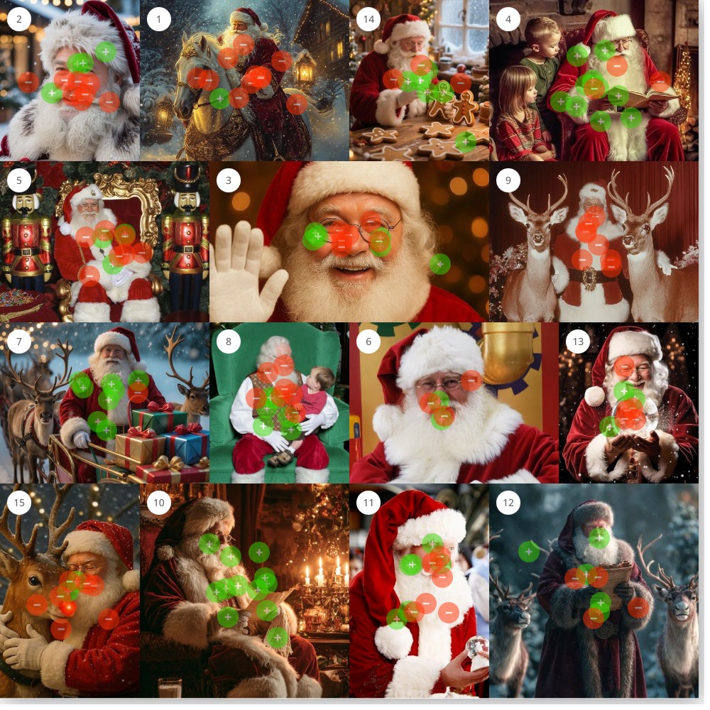
The images people embraced all shared one thing: they caught Santa in the middle of doing something. Reading his list by candlelight. Kneeling to feed a reindeer in falling snow. The images they rejected? Cute graphics, staged photos, and counterintuitively, some of the most beautifully rendered Santas in the set.

Read More

Everyone’s Favorite Halloween Candy

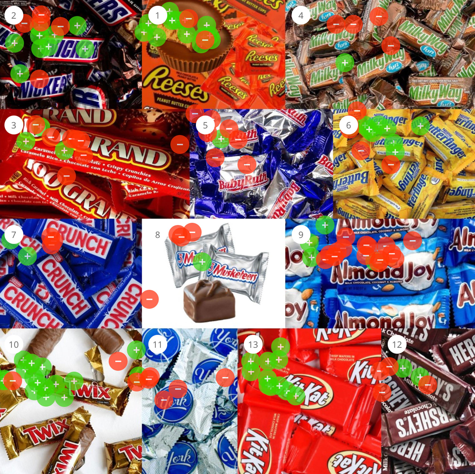
What is everyone’s favorite Halloween candy? 26 people sorted 24 candies on a 75% threshold. KitKat took 91.67%, M&Ms 92.86%. Jawbreakers, Laffy Taffy and York took no green dots at all. Three nougat bars were refused, Snickers split the room, candy corn landed at exactly 50%. Texture, not flavour, predicts the verdict.

Read More

Spooky Or Scary?

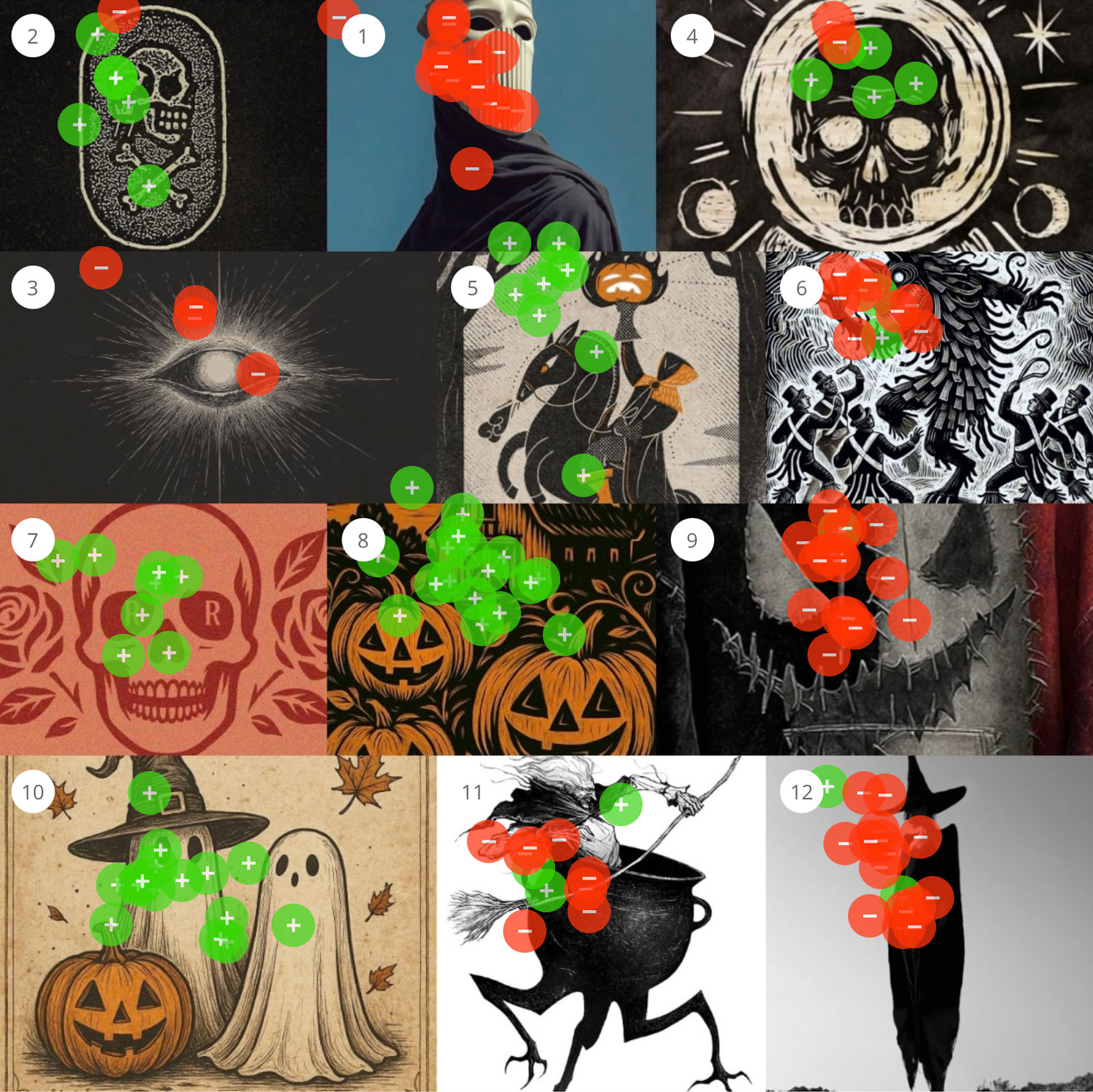
“Spooky” and “scary” are not interchangeable. 22 people sorted 36 Halloween images: 16 spooky, 13 scary, 7 neither. Spooky was warm palettes, handmade texture and friendly ghosts. Scary was cold contrast, hard geometry, masks and faceless figures. Presence within safety versus absence within power.

Read More

All studies

Articles

Your Client Speaks a Different Language

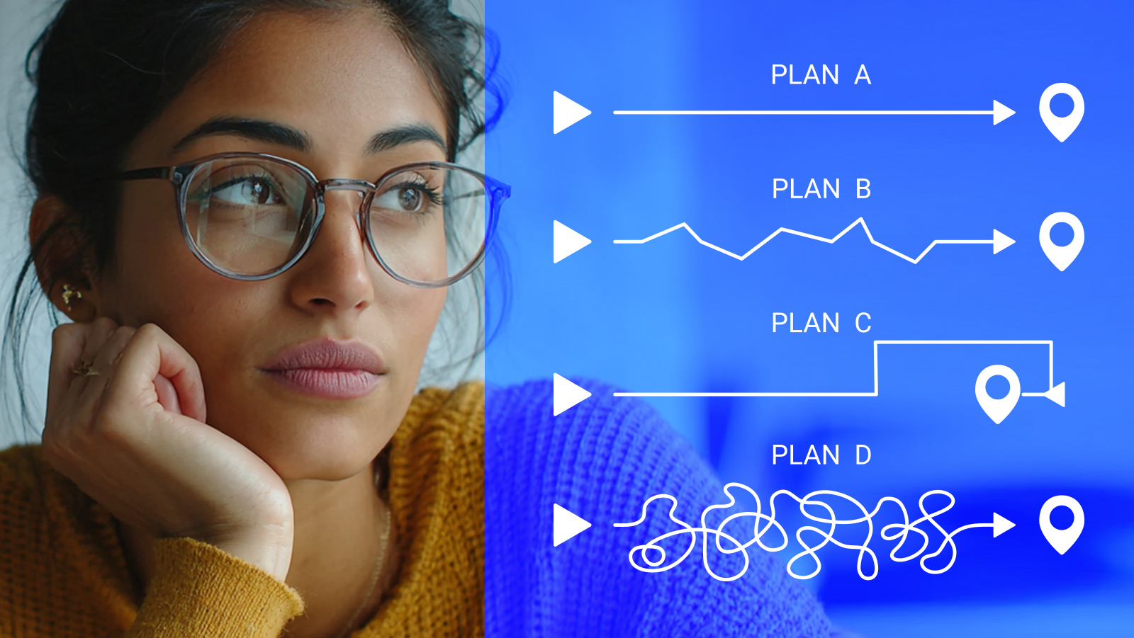
Clients live in a world where A leads to B. Creative work has no such line, which is why “that doesn’t feel like us” is often the most precise note a client can give you. The gap isn’t obstruction, it’s vocabulary. Judgment and description are different skills. Ask for a reaction instead of a word.

Read More

The Mood Board Problem

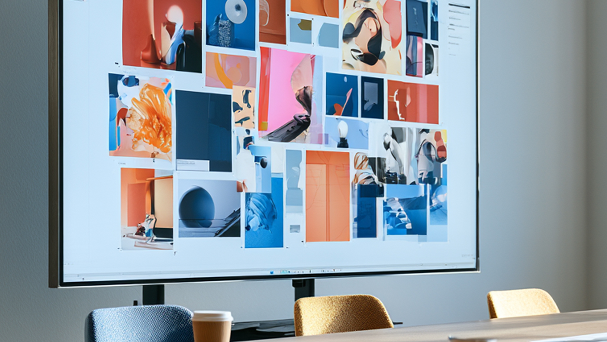
A mood board records what the room agreed on. The market never sat in that room. Where mood boards work, where they stop, and what gets you real signal.

Read More

A Field Guide to Vague Creative Feedback

Vague creative feedback isn’t a sign the stakeholder is being difficult. It’s a sign they’re reacting to something real they don’t have the vocabulary to name. “Feels off,” “more premium,” “needs more energy”—each one is a precise feeling wearing an imprecise word. Here’s what those phrases actually mean, and how to translate them into something measurable.

Read More

Why Mid-Project Pivots Happen (and What Triggers Them)

Creative projects rarely lurch off course at the end—they start wobbling much earlier, the moment a new stakeholder, leadership change, or unresolved internal thread enters the room. Most pivots trace back to alignment assumed but never established. Here’s what actually triggers them—and how to spot the warning signs weeks before the deadline slips.

Read More

How to Test a Logo Before You Launch It

You can’t test a logo by posting it to a Facebook group, running it past a focus group, or asking your spouse. Those methods measure who’s loudest, not what your audience associates with the mark. Here’s how to test the parts that matter—and the one thing to measure above all: association.

Read More

The Real Cost of a Rebrand Revision Cycle

A single round of major rebrand revisions costs $10K–$50K—and the invoice is the smallest part of it. The real cost is burnout, missed deadlines, and the people who quit after months of chasing “I just don’t love it.” Here’s where that cost actually lives, and how audience data shrinks it.

Read More

What Happens When You Show AI 100 Brand Directions

A year ago, AI couldn’t complete a Constellations perception test at all — every result was an even split. Today it handles simple prompts fine, but on the nuanced, abstract prompts branding depends on, it’s wildly off from human data. The danger isn’t that AI gets it wrong. It’s that it now sounds convincing while doing it.

Read More

What Heatmaps Actually Tell You About Your Audience (and What They Don’t)

What Heatmaps Actually Tell You About Your Audience (and What They Don’t)Quick answer: “Heatmap” means three different things depending on who you ask. A mouse-tracking heatmap (Hotjar) shows where cursors move on a page. An eye-tracking heatmap (Tobii) shows where eyes land in the first instant, which is mostly survival-level reaction. A perception heatmap, the […]

Read More

Alternatives to Focus Groups for Creative Testing

Focus groups were built in 1946 for conversation, not visual creative: 8-12 people, one confident voice, anchoring bias steering the room. What each alternative actually measures, from survey panels to A/B tests, and why Audience Perception Maps are the only one that captures what 300-500 people see, in under 48 hours.

Read More

How to Test Brand Direction With Your Audience Before Launch

Most brand launches don't go badly. They go blindly. Focus groups give you 12 people and anecdotes, surveys give you stated preference, A/B tests cost six figures and burn trust. Audience perception mapping shows what 300-500 people see, in under 48 hours, and aligned 22 stakeholders with zero revisions.

Read More

The Most Expensive Moment in Branding: The Approval Cliff.

Approval means nobody blocked it. Alignment means the team believes in it. The gap costs agencies $30,000-$60,000 per mid-market project in rework, lost launch windows and eroded trust. The five-step process that got 22 stakeholders to one direction with zero revisions.

Read More

InEight Rebrand: Evidence-Backed Identity for Enterprise Software

A global capital construction software company needed a brand that matched its leadership position. Four Audience Perception Maps went to 500+ employees as a proxy for hard-to-reach executives. Innovation was expected; confident leadership won. Twenty-two stakeholders, one direction, zero reworks.

Read More

Design Due Diligence

Four rounds of development, alignment reached, then a senior stakeholder redirects the work in the final week and the campaign underperforms. The creative team owns the outcome without the control. Design due diligence moves audience testing upstream, so shared evidence settles the direction before production begins.

Read More

All articles