
How the study worked
Twenty-four pieces of typographic and graphic design went on a board: posters, packaging, wordmarks, editorial spreads, 3D lettering. Thirty creative professionals each got green dots and red dots and one instruction. Drag the green dots to the images that pop the most and red dots to the images that pop the least.
The platform sorts the result at a 59% threshold. An image pops when at least 59% of the dots it drew were green, does not pop when at least 59% were red, and is contested in between. Ten images cleared the bar, seven crossed it the other way, and seven split the room. See the full report.
Every number on this page is a share of that image’s own dots. Green and red are the study’s own encoding, so the verdict is written beside each score.
Pop is legibility, not volume
When designers hear “make it pop” they reach for contrast and energy. The room did not want maximum contrast or maximum energy. The highest-contrast image on the board, a set of concentric black and white circles, was rejected by 90.91%. The boldest black-and-white poster was rejected unanimously.
Figure 1 · Every image, ranked
Line the images up by the share of dots they took green and the rule shows itself. The winners deliver one visual statement in saturated colour with a hard edge between figure and ground. The losers sacrifice clarity for cleverness, whether through optical interference, monochrome restraint or layers that need assembling. Pop is not about being loud. It is about being legible at speed.
Principal finding
Pop is confident simplicity: a single, immediate visual statement delivered through saturated colour, clear typography and tactile materiality. Images that fail either muffle the message, create friction with optical effects, or retreat into understated elegance that reads as an absence of energy.
What popped: pink, black and letters you could touch
Ten images cleared the 59% line, and every one of them is built on typography. Not just any typography. The letters have dimensional presence, through gloss, 3D rendering, shadow or hard colour contrast, and they carry some organic imperfection: a drip, a scrawl, a hand-drawn edge.
Hot pink or magenta appears in seven of the ten. It never appears alone. It is paired with black in BAD, SNUG and THE BOLD, or with warm secondaries in Glam, Legacy and the pizza boxes. Pink with black is the canonical pop palette. The collective mood is unapologetically extroverted. These images announce arrival.
Resonance
The glossy BAD
One word in dripping gloss black on flat pink, nothing else in the frame
92% greenResonance
The yellow overlay
Acid-yellow letterforms scrawled across a fashion portrait
83% greenResonance
The TECHNO editorial
Purple type behind a pink-visored model, a 2001 fashion spread
82% greenResonance
The Glam sunburst
Fat script on a mid-century sunburst, pink over orange
75% greenResonance
The lavender blobs
Inflated 3D letters in matte lilac, silhouettes kept clean
71% greenResonance
The CR mark
A chunky white monogram on a hot-magenta field
71% greenResonance
THE BOLD
Fat lilac letters across a portrait, pink and black holding the contrast
67% greenResonance
The pizza boxes
Primary-colour packaging stacked at angles, blue, red and yellow
67% greenResonance
The SNUG boxes
Black block capitals on hot-pink packaging
64% greenResonance
The Legacy script
A 1970s album-cover script in yellow on red
61% greenThe highest-scoring image is literally the word BAD in glossy black on a pink background. That is the whole brief. When a client says pop they want irreverent messaging, saturated pink, high-contrast black and a physical material presence. Sophistication is not the goal. Confident execution of a simple idea is.
The four ways to miss
Seven images crossed the 59% negative line, and their failures are more varied and more instructive than the successes.
Chromatic restraint. The most rejected image is the CIAO poster, off-white condensed capitals on black. Bold, well made, and not one green dot. The slumber wordmark, black on cream, confirms it at 71.43%. Monochrome reads as quiet and sophisticated, which is the opposite of pop.
Optical interference. The concentric circles are arguably the highest-contrast image on the board and were rejected by 90.91%. They demand attention through discomfort. Pop implies a positive energy, and this image is energetic but unpleasant.
Texture camouflage. The fuzzy pink felt letters share the hot pink that dominates the winners and still failed at 77.78%. The letterforms disappear into their own material. There is no edge, so there is no figure.
Complexity without clarity. The EA ICY editorial with its overlapping text blocks, the blur-layered MODE MORE, and the chrome SOON whose reflections eat its own edges. Each attempts something ambitious. Each requires work, and pop is parsed as I get it instantly.
Resistance
The CIAO poster
Off-white condensed capitals on black, bold and colourless
100% redResistance
The concentric circles
High-frequency black and white rings that shimmer and strain the eye
91% redResistance
The chrome SOON
Liquid chrome letters, reflections and colour shifts eating the edges
82% redResistance
The felt letters
Fuzzy pink letterforms sinking into a fuzzy pink ground
78% redResistance
The EA ICY editorial
Overlapping text blocks and a cool green wordmark over a portrait
77% redResistance
The slumber wordmark
A quiet black sans-serif on cream, corporate calm
71% redResistance
The blurred stack
Layered, blurred type in red on maroon, three words fighting for one space
67% redThe chrome SOON is the one to study. It shares the 3D, glossy quality of the winning lavender letters. The difference is that the chrome creates reflections that undermine legibility, while the matte lavender keeps a clean silhouette. Pop rewards material richness, but never at the expense of reading it in one glance.
The whole study in two images
The cleanest pair on the board is two typographic posters. Both are one word. Both are confident, well-crafted and built on black. One is pink.
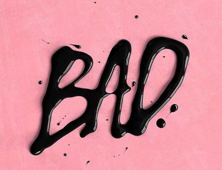
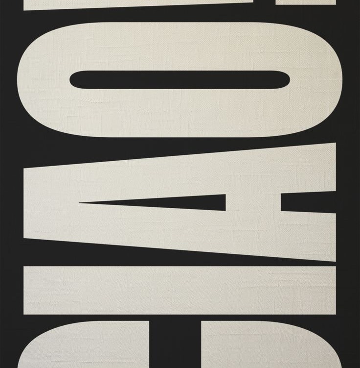
Same craft, same confidence, same single-word idea. The difference is warmth. Black and white, no matter how bold, cannot pop in this room’s mental model. Pink and black feels alive.
Where pop gets contested
Seven images landed between 42.86% and 58.33% green, and they mark the edges of the word. The MO-PO portrait just missed the line at 58.33%: a black-and-white photograph with a hand-drawn blue scrawl. The energy is there, the base image is greyscale, and the overlay only half compensates.
Blue is the through-line. The c. mara denim treatment, the STORY breakfast ad and the cider cans all lean on blue and all split opinion. Blue is the anti-pop colour, associated with calm and trust rather than energy. The FUNKY comic illustration split exactly in half: the cartoon exuberance that pops for some reads as kiddie to others.
Contested
The MO-PO portrait
A greyscale portrait with a gestural blue scrawl on top
58% split · 41.67% redContested
The inflated oui
3D inflated letters in a cool, muted purple
55% split · 45.45% redContested
The ice cube
A word cast in ice between red lips, cool material on a warm subject
53% split · 47.37% redContested
The FUNKY comic
Comic-style lettering in primary colours, exuberant and a little kiddie
50% split · 50% redContested
The denim wordmark
A cream script on blue denim, a red sole in the corner
50% split · 50% redContested
The breakfast ad
Red block capitals over pancakes on a blue field
45% split · 54.55% redContested
The cider cans
Geometric beverage packaging on a red and pink pattern
43% split · 57.14% redThe inflated oui is the edge case worth remembering. It has the 3D material quality of the winners, in a cooler, more muted purple, and the room could not decide. Lilac can work when it is rendered with physical presence. Participants are just less sure of it than they are of hot pink.
The rule the room was using
Underneath the sorting is a three-part test. Immediacy: the image must land in a fraction of a second, which is why optical illusions and layered complexity fail. Warmth within contrast: hot colours against black, never white or grey, because cool monochrome feels clinical and pure black and white feels austere. Materiality without dissolution: gloss, 3D and texture help only when they amplify the letters instead of becoming the subject.
Figure 2 · Three checks, one verdict
This is why the brief is so hard to act on. “Pop” sounds like one dial. It is three, and turning any one of them to maximum without the other two produces the concentric circles. Which is a translation problem, and there is a field guide to the rest of the phrases that behave the same way.
What to do with this
The decision logic translates cleanly into art direction for any brief that arrives with the word pop attached.
Do
- Lead with hot pink or magenta. Seven of the ten winners did. Pair it with black for maximum impact, or with yellow and orange for variation.
- Give the letters a body. Gloss, 3D rendering, drop shadows, cut-outs. Letters should look like they could cast a shadow.
- Commit to one statement. Every winner has a single dominant element. Three competing focal points do not pop.
- Borrow from confident eras. 1970s bold serifs, Y2K gloss, maximalist fashion editorial. These styles are inherently unembarrassed.
- Protect figure-ground at all costs. Whatever else happens, the primary element must read instantly against its background.
Don’t
- Don’t go monochrome. Black and white, however bold, does not register as pop. CIAO at 100% rejection is definitive.
- Don’t buy attention with discomfort. Moiré, high-frequency pattern and optical interference grab the eye and lose the dot: 90.91% red.
- Don’t let cool colours lead. Blue, teal and muted purple pushed every image toward neutral. If you must, add warm accents and dimensional rendering.
- Don’t let texture eat the form. Felt, fabric and fur that dissolve the letters into the ground: 77.78% red for the fuzzy pink.
- Don’t make the viewer assemble it. Overlapping blocks, blurred layers, fragmented compositions. Pop is instant; puzzles are not.
Two cautions from the report. The sample is 30 creative professionals, which makes the core pattern a strong directional signal rather than a statistical verdict, and the edge cases in the contested band may move with more data. And the sophistication trade-off is real. Designs that pop tend to sacrifice restraint. A financial services or healthcare brand asking for pop is asking for a playful, extroverted register that may conflict with its trust signals. Sometimes the brief wants presence or confidence, not pop, and it is worth finding out which before the third revision.
Frequently asked questions
What was tested in the Make It Pop study?
Twenty-four pieces of typographic and graphic design: posters, packaging, wordmarks, editorial spreads and 3D lettering. Participants dragged green dots to the images that pop the most and red dots to the ones that pop the least. The platform then sorted the images at a 59% threshold.
Who took part?
Thirty creative professionals completed the board in January 2026. The report treats the sample as a strong directional signal rather than a statistically definitive one, and notes that the study reflects a creative population’s reading of a vernacular phrase, not formal design terminology.
How do you read the scores?
Each percentage is the share of that image’s own dots. BAD at 92.31% pop drew green on 92.31% of its dots. CIAO at 100% not pop drew only red. Images between roughly 40% and 58% in both directions are contested, which is where most of the blue-led designs landed.
What does pop actually mean for a design brief?
Legible in one glance, warm in contrast, physical in material. Hot pink or magenta with black, one dominant statement, letters with dimensional presence. Not monochrome, not optical effects, not texture that swallows the form, not layers that need assembling.
Should every brand try to pop?
No. The winning register is playful and extroverted, suited to consumer, entertainment, fashion and lifestyle categories. Brands that trade on trust and understatement may actually want presence or confidence. The study is a way to find out which word the brief really means.