
How the study worked
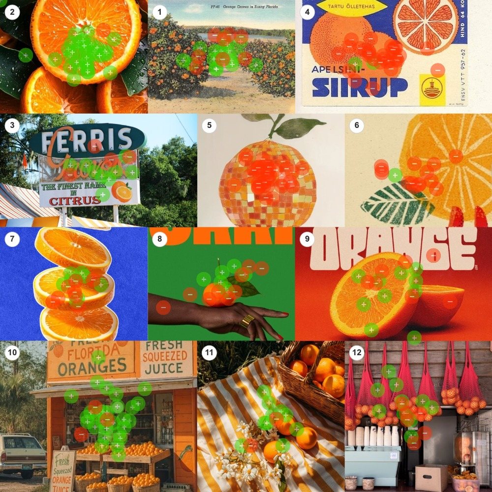
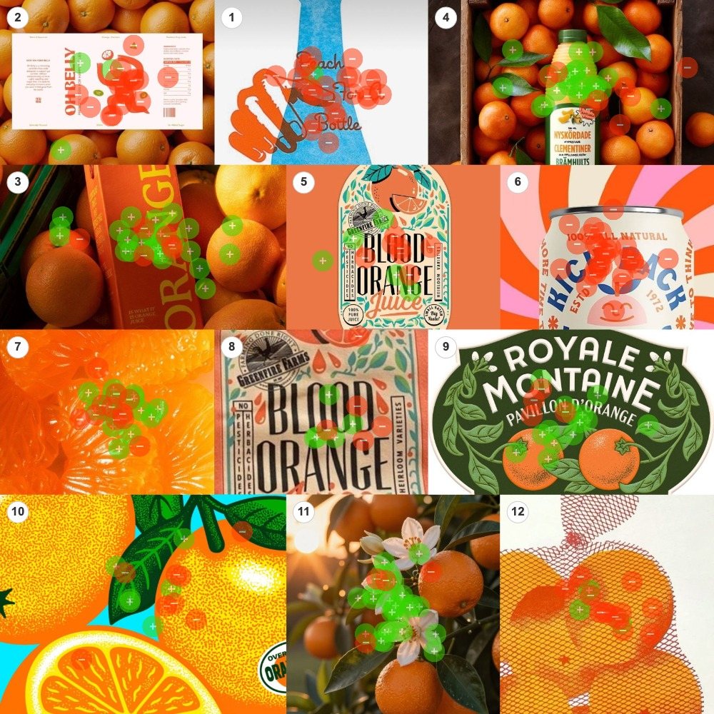
Two boards, twelve images each. Photographs, labels, illustrations and packaging, mixed together with no grouping and no order. Fifty people got a handful of green dots and a handful of red ones, and a single prompt: green on the images you most associate with highest quality orange juice, red on the ones you least associate with it.
They placed 535 dots, and the heatmaps above are the raw result, before any sorting. Both boards ran the identical prompt, which means the same pattern had to appear twice, independently, to count. It did.
At the platform's 60% threshold those 24 images fall into three groups. Eleven cleared the bar as resonant, seven crossed it as resistant, and six split the room. What follows is what each group has in common.
The one variable that decided everything
People measured quality the way you would measure freshness: by how close the image sits to the tree.
The winning images are a trip to the source. Dew still on the cut fruit. Blossoms still on the branch. Crates, groves, hand-painted signs. The closer a picture sits to the moment the orange left the tree, the more the room trusted the juice inside.
Line all 24 images up by the share of dots they took green, and they sort themselves into a road. One end is the orchard. The other end is the design studio. There is almost nothing in between, and what is there splits the room in half.
Figure 2 · Every image, ranked
Principal finding
Quality is measured in distance from the tree. Every step between the orange and the image, whether styling, illustration or branding, reads as a step away from fresh. The winning move is not better design. It is a shorter apparent supply chain.
What won: the shortest trip from the tree
Eleven images cleared the 60% positive threshold. Read top to bottom they are a drive through citrus country: the cut fruit, the branch, the roadside stand, the picnic in the grove, the crate on the tailgate.
The strongest single result in the study contains no typography, no packaging and no styling beyond a knife cut. That absence is the whole point.
Resonance
The dewy halves
Macro cut fruit, droplets still on the flesh, leaves attached
97% green · 36 of 37 dotsResonance
The farm stand
A roadside stall with hand-lettered boards and baskets of fruit
90% green · 28 of 31 dotsResonance
The blossom branch
Orange blossoms and fruit still on the tree, backlit
88% green · 29 of 33 dotsResonance
The grove picnic
Striped blanket, blossom sprigs, straw basket in warm light
83% green · 10 of 12 dotsResonance
The carton in the fruit
A monochrome pack shot sunk into a bed of real oranges
81% green · 25 of 31 dotsResonance
The estate label
Engraved oranges and a botanical wreath on a deep green crest
78% green · 14 of 18 dotsResonance
The clementine crate
A juice bottle tucked into a wooden crate of fresh clementines
74% green · 23 of 31 dotsResonance
The roadside sign
Hand-painted citrus-stand signage against the trees
69% green · 9 of 13 dotsResonance
The groves postcard
A tinted linen postcard, rows of orange trees to the horizon
68% green · 17 of 25 dotsResonance
The mesh bags
String bags of fruit hanging over a juice counter
65% green · 11 of 17 dotsResonance
The peeled segments
Wet supremes pulled apart, pulp catching the light
62% green · 18 of 29 dotsPackaging can win, but only with a warrant
Two packaged images cleared the bar, and they share one staging device. The carton is sunk into a bed of oranges. The bottle is tucked into a crate of clementines. In both cases the real fruit is doing the vouching, and the pack is simply allowed to sit inside it. Put the design on top of the fruit instead and the mechanism inverts, which is exactly what happens further down this page.
One illustration got through
The engraved estate crest is the only drawn image on the winning side, at 77.8%. Its vocabulary points at an orchard: engraved realism, a botanical wreath, an estate mark. It does not look designed, it looks inherited. That distinction turns out to be worth about seventy points, and the next section shows what happens when heritage points somewhere else.
What lost: the orange as an art object
Seven images crossed the 60% negative threshold, two of them unanimously. The more the orange became a piece of design, the less the room trusted the juice.
The first way to miss is to turn the fruit into art. A mosaic orange, a rubber-stamped orange, a papercut hand. Clever images, all of them, and all of them buried. The second way to miss is trend-forward branding. The retro can went thirty for thirty red. To this audience, fashionable packaging design says soda, not fresh-squeezed.
Resistance
The disco-ball orange
An orange rebuilt as a mirrored mosaic ornament
100% red · 39 of 39 dotsResistance
The trendy can
A retro can on a pink sunburst, beverage branding at full trend
100% red · 30 of 30 dotsResistance
The papercut hand
A printed hand and bottle, illustration in place of fruit
96% red · 24 of 25 dotsResistance
The syrup label
A flat mid-century commodity graphic, fruit as diagram
93% red · 28 of 30 dotsResistance
The ink-stamp orange
Stamped ink texture, the fruit dissolving into printmaking
93% red · 14 of 15 dotsResistance
The brand boards
Pink brand-system boards laid over a bed of oranges
83% red · 15 of 18 dotsResistance
The crosshatch print
Red netting rendered in ink over printed fruit
81% red · 13 of 16 dotsNote · Old wins, old loses
Heritage worked for the engraved estate label at 77.8% green and failed for the vintage syrup graphic at 93.3% red. Both are old-fashioned. The difference is where they point. The estate label points at the orchard, with realistic fruit, a botanical wreath and a place. The syrup label points at the factory, with flat fruit-as-diagram and a product code. Nostalgia only works here when it is nostalgia for the farm.
The twin test
The cleanest pair in the data is one orange given two treatments. Same subject, same central composition, similar crowd size. Seventy-six dots landed on the pair, and seventy-five of them agree.
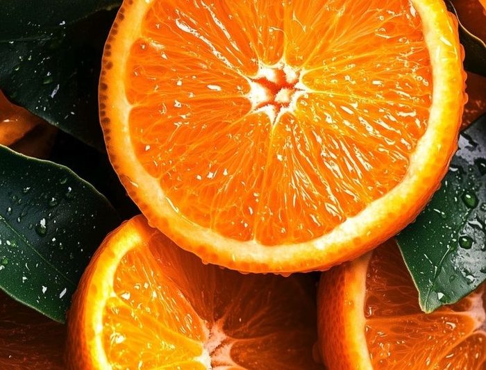
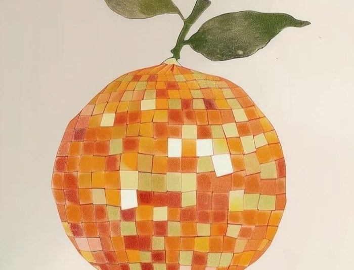
One is an orange. The other is a picture of an idea about an orange. That is the whole study in two images, and the room needed no instruction to tell them apart.
The six images that split the room
Six images landed between 41% and 59%, and every one of them sits exactly halfway between the tree and the design studio. Real fruit under heavy art direction, or hand-drawn labels that are half charming and half distant. When an image is half fruit and half design, the vote comes back half green and half red.
Contested
The retro type
Fat seventies letters above a split real orange
59% green · 10 of 17 dotsContested
The stacked slices
Studio-styled rounds piled on cobalt felt
50% green · 8 of 16 dotsContested
The printed fabric
The same label language up close, drips and grain
50% green · 5 of 10 dotsContested
The fashion hand
Gold rings on a green field, fruit as an object of styling
44% green · 7 of 16 dotsContested
The halftone print
Screenprint fruit with thick outlines on turquoise
43% green · 6 of 14 dotsContested
The illustrated label
A folk-botanical bottle label on an orange field
42% green · 5 of 12 dotsNothing in the middle is trend-driven. This zone is pure arithmetic: the ratio of fruit to design in the frame, read back as a percentage.
Attention is not endorsement
The disco-ball orange drew 39 dots, the largest single crowd in the study, 14.55% of everything placed on its board. Every one of those dots was red. It stopped people, held them, and was rejected unanimously.
Plot the two measurements against each other and there is no relationship at all. Big crowds sit at the top of the chart and at the bottom of it. This is the number that gets misread most often in the wild, because a stopping-power test and a quality test look identical from the outside and answer opposite questions.
Figure 3 · Crowd size against verdict
What to do with this
The decision logic translates cleanly into art direction, for juice and for any category where quality means fresh.
Do
- Shoot at zero distance. Dew, pulp, blossom, branch. The three highest scores in the study contain no design at all.
- Stage the warrant. When packaging has to appear, surround it with real fruit. The produce endorses the product.
- Borrow the farm channel. Crates, hand-painted signage, roadside stands, string bags. The props of a short supply chain carry quality on sight.
- Choose agricultural heritage. Engraved realism, botanical wreaths, estate marks. History that points at a place and its trees.
- Hold the fruit palette. Orange, leaf green, golden light. The winners never left it. The pink-shifted images paid for the drift.
Don't
- Abstract the fruit. Mosaic, riso, papercut. The room rejected every rendering of an orange, twice unanimously.
- Reach for trend-coded packaging. Mascots, sunbursts, revival type. It reads as the soda aisle: 30 of 30 red.
- Put design on top of fruit. Brand boards laid over oranges inverted the warrant and scored 83% red, worse than showing no fruit at all.
- Sell industrial nostalgia. Commodity-label vintage reads as concentrate, not craft.
- Over-style the real thing. Studio props and editorial styling turned a 97% winner into a coin flip.
One warning before you run with this
This study decoded a single attribute, highest quality, which for juice collapses into freshness and provenance. The disco orange and the trendy can might win most fun or coolest brand with exactly the same fifty people. Before you extend any of this into a brand system, confirm which attribute the brief is actually buying.
Methodology and confidence
50 completions across 107 opens, 535 dot placements over 24 images on two boards, 268 on Board 1 and 267 on Board 2, classified at the platform's 60% threshold. Per-image crowds run from 10 to 39 dots. The three anchor verdicts, 36 of 37, 0 of 39 and 0 of 30, are effectively beyond sampling noise, and the distance gradient replicates on both boards independently. Confidence thins in the contested zone, where crowds drop to 10 to 17 dots and scores sit within a few dots of even. Treat those six as directional. The palette observation is correlational: the pink-shifted images were also the most trend-coded, and this study cannot separate the two.
Frequently asked questions
What does "97% green" actually mean?
It means 97% of the dots placed on that image were green rather than red. The dewy halves took 37 dots in total and 36 of them were green. The figure is a share of that image's own crowd, not a share of all 50 participants, so a decisive image with a small crowd and a decisive image with a large crowd both read at full strength.
Why did packaging score well on some images and badly on others?
Packaging cleared the threshold only when real fruit physically surrounded it. The carton sunk into a bed of oranges scored 80.6% and the bottle in a clementine crate scored 74.2%. The flat-lay that laid brand boards on top of oranges scored 83% red. The fruit has to vouch for the pack, and it stops vouching the moment the design sits over it.
Does a rejected image mean bad design?
No. Several of the most rejected images are the best-executed work on the boards. The mosaic orange is meticulous. The study measured one attribute, highest quality, and against that attribute craft counts for nothing if it puts distance between the viewer and the fruit. A different prompt would sort the same 24 images differently.
Is 50 people enough to act on?
For the headline pattern, yes. Three verdicts came back unanimous or near unanimous on crowds of 30 to 39 dots, and the same gradient appeared on both boards independently. The contested zone is a different matter: those six images drew 10 to 17 dots each and sat within a few dots of even, so treat them as directional rather than settled.
How do I run this on my own category?
Build a board of 12 to 24 images covering the range of directions you are considering, write one attribute prompt, and send it out. Constellations collects the green and red placements, produces the heatmaps and sorts the images into resonance, contested and resistance at a 60% threshold. The first test is free.