Will The Most Authentic Santa Please Stand Up

People don’t judge Santa’s authenticity by how he looks, they judge it by what he’s doing.

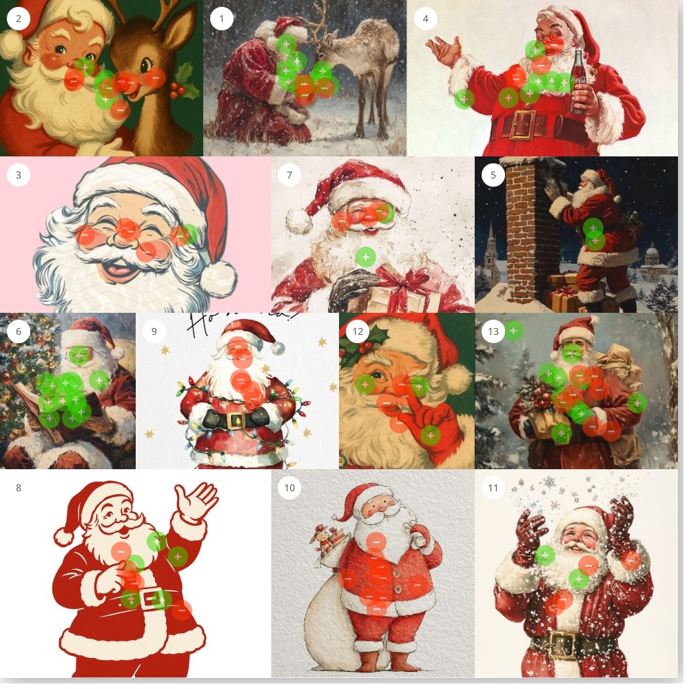
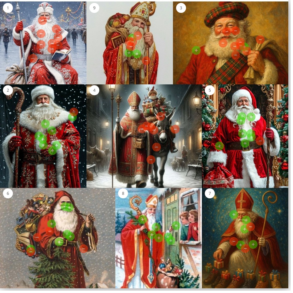
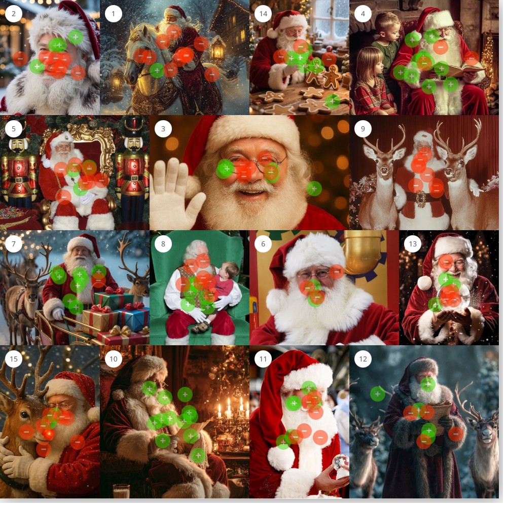
Participants reveal a clear preference framework: Santa’s authenticity is defined not by adherence to a single canonical look, but by narrative immersion and temporal grounding. Resonant images depict Santa engaged in purposeful activity within rich, atmospheric settings, reading lists by candlelight, tending reindeer in falling snow, preparing to descend chimneys. In contrast, resistance clusters around two failure modes: simplified graphic depictions that remove context, and scenes that feel staged, commercial, or temporally incongruent.

Santa APM 1
Santa APM 2
Santa APM 3

Previous Studies and Results

The Legend Zelda Movie and What Fans Want to See

We tested six dimensions of the film’s visual direction using Constellations, from character design to villain treatment to overall style, spanning every era of the franchise. Despite Breath of the Wild being the bestselling Zelda game by a wide margin, its characters, enemies, and aesthetics consistently split the audience. What participants converged on was Ocarina of Time…

When Client’s Say “Make It Pop”

Every designer has heard it: “Can you make it pop?” It’s one of the most common pieces of creative feedback, and one of the hardest to act on, because it points to a feeling more than a specific fix. So we decided to find out what “pop” actually means. Using Constellations, we asked creative professionals to sort images by which ones pop and which ones don’t—and the results were surprisingly consistent.

When We Look at Robots, What Are We Really Seeing?

When We Look at Robots, What Are We Really Seeing? Understanding the Tools-Versus-Beings Divide in Robot Perception What makes a robot seem helpful versus creepy? Using our platform Constellations, designed to capture perception through visual interaction, we asked...

What Does “Visual Data” Look Like

Fifty designers rated visual data, revealing that structure—not style—is the key driver of visual trust and credibility.

Everyone’s Favorite Halloween Candy

Perception Map Test: What Is Your Favorite Halloween Candy? This test asked participants a deceptively simple question: What is your favorite Halloween candy? Behind the wrappers, though, the answers revealed powerful emotional codes. From generational classics to...

Spooky Or Scary?

Is it "Spooky" or "Scary"? A visual study of how people separate spooky from scary — and what that says about our modern relationship with fear. Halloween sits at the strange crossroads of delight and dread. Every October, our visual culture fills with ghosts,...

What does “American” Look Like?

For July 4th, we explored what “American” looks like in 2025—revealing shared civic values through visual perception mapping.

Design Meets Data—Stay in the Loop

We’re just getting started. Subscribe below to get more studies, reflections, and visual data insights straight to your inbox

Mailing List

Sign up to participate in interactive visual surveys and receive exclusive analysis reports on timely, trending topics—all from a visual perception perspective. You'll also get product updates, creative case studies, and smart ways to sharpen your visual strategy.