
What Does Halloween Look Like?
This test explored the visual vocabulary of Halloween. Two moodboards—one composed of positively resonant imagery, the other of rejected or less effective visual cues—revealed how participants intuitively distinguish between “good” and “bad” Halloween aesthetics.


Parameters Overview
| Item | Detail |
| Test Topic | What Does Halloween Look Like? |
| Respondents | 17 |
| Audience | General Audience |
| Image Source | |
| Search Terms | Halloween- branding, design, typography, creative |
| Tagging Method | N/A |
| Key Insight | Participants favor imaginative folklore over literal horror. The most resonant images build a world rather than cite one—offering texture, tone, and narrative over shock or satire. |

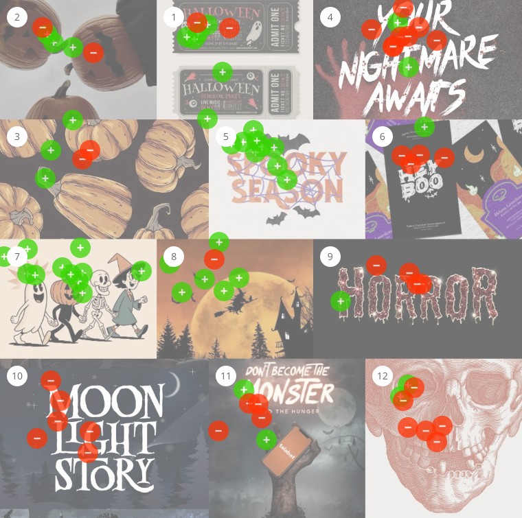
Resonance Constellation Map Analysis
Visual Setup
The positive board features a cohesive mix of hand-drawn illustration, stylized photography, and retro design. A warm autumn palette—dominated by orange, black, and beige—ties together imagery of skeletons, pumpkins, witches, and haunted landscapes.
Audience & Participation
Participants favored visuals that balanced eerie with playful. Most resonant were images that suggested a larger, imaginative world just beyond the frame.
Visual Findings
-
Color Language: Deep oranges and matte blacks conveyed warmth and clarity.
-
Style: Strong preference for vintage and illustrated aesthetics.
-
Motifs: Skeletons, pumpkins, black cats, and witches appeared frequently in narrative-driven scenes.
-
Mood: “Spooky but charming” was the sweet spot—evocative, not scary.
Pattern Analysis
Stylization made creepiness approachable. Even eerie moments felt warm or storybook-like. Visuals leaned on mood and suggestion, not literal horror.
Insight Summary
Participants responded most to Halloween as a folkloric, atmospheric season—more enchanted than terrifying. The favored visuals offered timeless, tactile charm over shock or satire.

Resistants Constellation Map Analysis
Visual Setup
The negative board leaned into graphic horror and digital effects—featuring harsh reds, metallic textures, clinical imagery, and modern, over-processed fonts.
Audience & Participation
Participants found these visuals too aggressive or conceptually hollow. The common reaction: too much shock, not enough atmosphere.
Visual Findings
-
Color: Neon reds and high contrast felt out of step with fall tones.
-
Tropes: Blood, brains, and slasher motifs came across as clichéd.
-
Typography: Gore-styled fonts disrupted rather than enriched the mood.
-
Tone: Branded or ironic elements felt forced or superficial.
Pattern Analysis
These images relied on spectacle over story. Where the positive board suggested magic, this one shouted horror—losing emotional texture in the process.
Insight Summary
Participants preferred visuals that felt crafted, not commercial. The rejection of hypermodern horror points to a nostalgic, analog Halloween—rooted in mood, not marketing.
Comparison Report
Core Thematic Split
-
Positive Board: Magical Realism, Whimsical Darkness, Cozy Eerie
-
Negative Board: Commercial Horror, Over-Design, Visual Aggression
Style Trends
| Feature | Positive Board | Negative Board |
|---|---|---|
| Color Tone | Earthy oranges, blacks, creams | High-contrast reds, purples, neons |
| Visual Medium | Illustrated, vintage, narrative | Digitally composited, literal, typographic |
| Mood | Enchanted, moody, playful | Graphic, loud, horror-centric |
| Typography | Decorative, storybook | Gory, distressed, over-processed |
| Characters & Motifs | Skeletons, black cats, pumpkins, witches | Skulls, brains, blood, haunted fonts |
Emerging Insight
There is a subtle cultural shift in how Halloween is visually interpreted. Participants favor imaginative folklore over literal horror. The most resonant images build a world rather than cite one—offering texture, tone, and narrative over shock or satire.
About Constellations
Constellations is a platform for mapping how audiences perceive visual content. It helps creatives, strategists, and researchers understand the emotional and conceptual signals their visuals send. By analyzing how real people interpret images, Constellations reveals patterns of meaning, ambiguity, and association that are often invisible to creators. For a question as layered and subjective as “What does intelligence look like?”, Constellations is the ideal tool collect visual data about how different minds connect and contrast, turning perception into insight.Stay Updated
Sign up for our mailing list to participate in more tests and get updates on the results.
Previous Studies and Results
Design Meets Data—Stay in the Loop
We’re just getting started. Subscribe below to get more studies, reflections, and visual data insights straight to your inbox
Mailing List
Sign up to participate in interactive visual surveys and receive exclusive analysis reports on timely, trending topics—all from a visual perception perspective. You'll also get product updates, creative case studies, and smart ways to sharpen your visual strategy.