
How the study worked
Clients say it all the time. It belongs to a family of phrases that sound like a direction and land like a shrug, alongside make it pop and elevate it. So we tested it.
The question participants saw
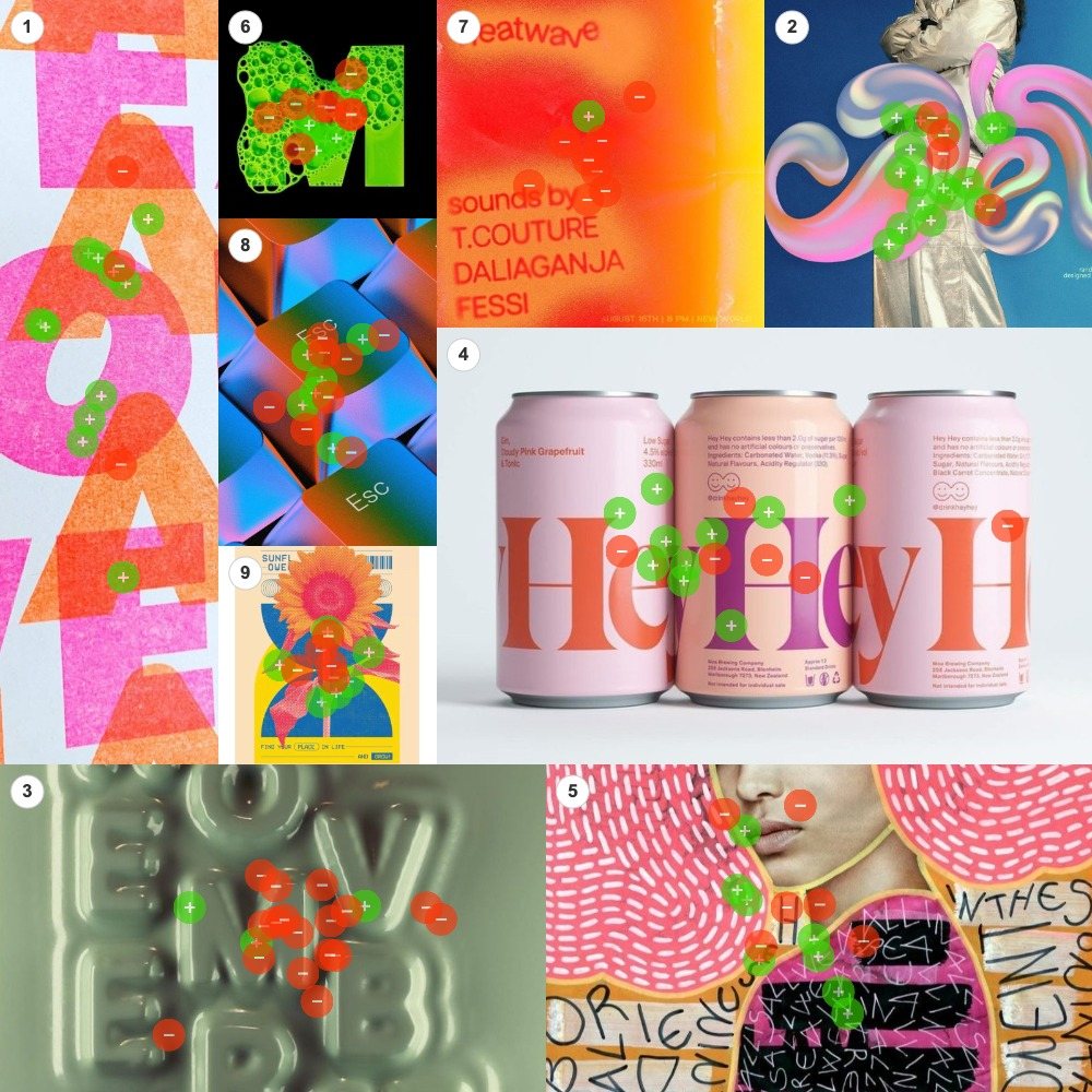
“When someone says ‘Jazz it up!’ about a design, what does that look like? Drag the green (+) dots to the images you most associate with the idea, and red (−) dots to the images you least associate with it.”
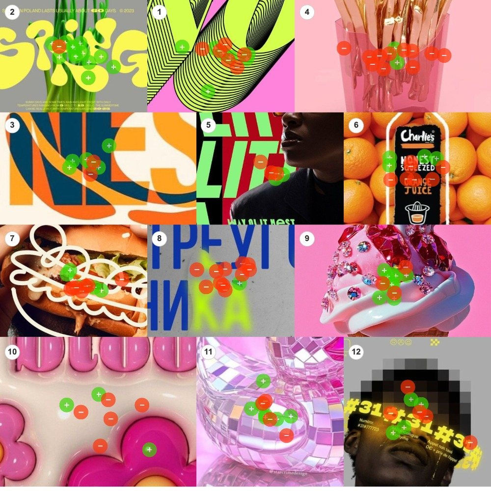
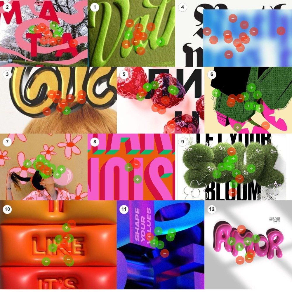
We put 33 designs on three boards. Posters, packaging, lettering and photographs, mixed together with no grouping and no order. Twenty-five people got green dots and red dots. Green meant this is what jazzed up looks like. Red meant this is not it. Together they placed 396 dots: 132 on the first board, 131 on the second and 133 on the third.
Each image is scored by the share of its own dots that were green. We sorted at a 65% threshold, one step stricter than the platform's 60% default. An image is resonant when at least 65% of its dots are green, resistant when at least 65% are red, and contested when neither side gets there.
At that bar the 33 images fall into three groups. Nine cleared it as resonant. Eight crossed it as resistant. Sixteen, nearly half the study, split the room. Here is the surprise: “jazz it up” sounds vague, and people mostly agreed anyway. They were all picturing the same kind of thing.
Figure 2 · Every image, ranked
| Board | Images | Dots | Resonance | Contested | Resistance |
|---|---|---|---|---|---|
| Board 1 | 9 | 132 | 2 | 5 | 2 |
| Board 2 | 12 | 131 | 3 | 7 | 2 |
| Board 3 | 12 | 133 | 4 | 4 | 4 |
| All three boards | 33 | 396 | 9 | 16 | 8 |
The big discovery: two dials
The winners look loud. But the pattern is more specific than loud.
Every winning design does two things at once. It uses bright colors that clash, and it looks like something you could touch: goo, chrome, fur, jewels, thick shiny plastic. Color alone did not win. Texture alone did not win. Together they won every time.
Figure 3 · Two dials, four outcomes
- Color down
- Touch up
- Color up
- Touch up
- Color down
- Touch down
- Color up
- Touch down
Principal finding
“Jazz it up” means turn up two dials at the same time: louder color and more touchable texture. One dial without the other does not count.
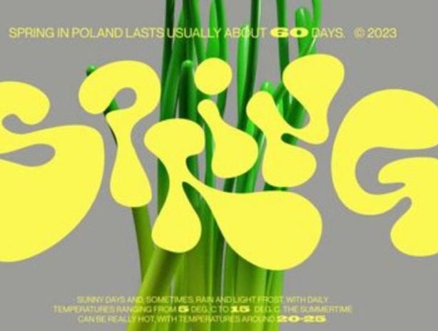
The top scorer in the whole study says it in one image: letters that look like dripping yellow goo, poured right over a photo of tulips. Thirteen of its 14 dots were green. The same kind of dimension in tasteful monochrome scored 85% in the opposite direction. The audience is not asking for more design. They are asking for more sensation.
What won: loud color on a surface you could touch
Nine images cleared the 65% bar. They span print, packaging, 3D and illustration, and they share one recipe.
Resonance array 9 images at 65% green or better
Resonance
The goo letters
Dripping yellow blob letters poured over a tulip photo
93% green · 13 of 14 dotsResonance
The chrome swirls
Liquid-metal ribbons coiling over a silver-suited figure
80% green · 16 of 20 dotsResonance
Flowers over bubblegum
Hand-drawn red flowers scribbled over a photo portrait
80% green · 12 of 15 dotsResonance
The riso overprint
Neon letters stacked in transparent, misregistered inks
79% green · 11 of 14 dotsResonance
The jeweled ice cream
A pink ice-cream swirl set with candy gemstones
79% green · 11 of 14 dotsResonance
The furry letters
Letters grown from moss and daisies
77% green · 10 of 13 dotsResonance
The chunky retro letters
Overlapping fat letterforms, orange on blue
75% green · 6 of 8 dotsResonance
The glossy blocks
Glossy violet 3D blocks, lit like candy
75% green · 6 of 8 dotsResonance
The halftone jacket
Screenprint textures, green tweed and hot-pink heels
67% green · 8 of 12 dotsBoard 1: surface as spectacle
The two winners on the first board pair the most surface with the most color. The chrome swirls took 80% green on 20 dots, tied for the largest crowd of the board and 15.15% of everything placed there. Liquid metal, rainbow shine, and a figure half swallowed by ornament. The riso overprint took 79% with a print version of the same move: fluorescent inks stacked wet on wet until the letters vibrate. In both you can see the material being poured, printed and layered. That visible wetness is what this audience reads as energy.
Board 2: the goo standard
The goo letters are the benchmark at 93%, 13 of 14. Acid yellow on gray, with the shine of poured syrup, and the goo runs over the photograph instead of sitting beside it. The jeweled ice cream at 79% turns the same formula into pure appetite: gloss, sugar and gemstones. The chunky retro letters at 75% matter because they are flat print. Visual weight and overlap can stand in for touch, as long as the color is fully committed.
Board 3: texture you could pet
The third board's winners run the full range of touchable. Hand-drawn flowers scrawled over a bubblegum portrait took 80% on the biggest crowd of the board. Letters grown from moss and daisies took 77%. Candy-glossed blocks took 75%. A halftone fashion illustration in tweed green and shocking pink took 67%, the lowest score that still cleared.
That last one is the least dimensional winner, and it shows. The further an image sits from a physical surface, the harder its color has to work.
Every board's top scorer layers two worlds
The goo runs over a photo. The swirls wrap a figure. The flowers are drawn on top of a portrait. Illustration or dimensional type colliding with photography shows up in the top scorer of every board.
What lost: the tasteful shelf
Eight images crossed the 65% bar on the red side. Here is the part worth taping to the wall: the losers are not bad designs. Most of them are beautiful.
The first way to miss is quiet elegance. Embossed letters in one soft color. Gold script. A classic gothic masthead. These are refined, expensive-looking pieces, and they were buried in red. When people say jazz it up, calm and tasteful is the exact thing they are asking you to move away from.
The second way to miss is soft and hazy. Blurry gradients and washed-out photos sank too. Fuzziness reads as the opposite of jazz. Jazz is crisp, wet and in focus.
Resistance array 8 images at 65% red or better
Resistance
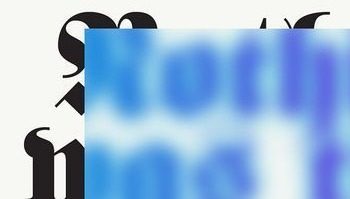
The blurry gothic letters
A gothic masthead dissolving into haze
100% red · 13 of 13 dotsResistance
The flat blue letters
Spare geometric letters on concrete
92% red · 11 of 12 dotsResistance
The gold script
Elegant lettering over a blond close-up
90% red · 9 of 10 dotsResistance
The heatwave haze
Soft-focus orange haze gig poster
89% red · 8 of 9 dotsResistance
The embossed letters
Tone-on-tone letterpress, one quiet color
85% red · 17 of 20 dotsResistance
The cutlery in resin
Gold forks cast in a pink resin block
85% red · 11 of 13 dotsResistance
The green script
Letterpress calligraphy, tone on tone
69% red · 9 of 13 dotsResistance
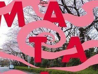
The pink cutouts
Wavy type floated over a pale street photo
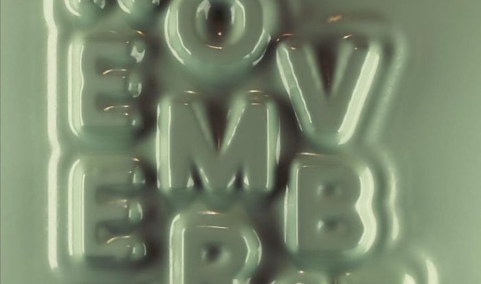
67% red · 8 of 12 dotsThe embossed letters are the most instructive rejection in the study. Beautifully pressed, plainly premium, and voted down 17 to 3 after drawing the joint-largest crowd on the board. People stopped, looked closely, and filed it under not jazz. The cutlery in resin is the more surprising loser. It is dimensional, and it is pink. But it is a preserved object, sealed rather than alive. Touchable that reads as look, don't touch fails the second dial.
The flat blue letters took 11 of 12 red. Smart, spare, minimal type, and this audience shrugged. The pink cutouts close the loop from the color side: loud and playful, but flat and floating over a pale photograph. Color without body does not survive. And the blurry gothic letters combine both ways to miss at once, heritage elegance and haze. Thirteen dots, all red, the only unanimous verdict in the study.
Note · The beautiful-loser rule
The rejected designs would probably win a different contest: premium, calm or timeless. Nobody said they are ugly. The dots define a direction, not a quality score. When a client says jazz it up, they are pointing away from this shelf.
The twin test
The cleanest pair in the study is two sets of 3D letters with opposite scores.
Both are letters with real depth and shadow. The only difference is the second dial. The goo is loud and juicy. The emboss is hushed and tasteful. Dimension in quiet colors reads as premium. Dimension in loud colors reads as jazzed. Same tool, opposite direction.
The sixteen images that split the room
Sixteen of the 33 images landed between 35% and 65% green. For an everyday phrase, the width of that middle is a finding in itself.
Contested 16 images between 35% and 65% green
Contested
The disco ball
A mirrored loop in pink light
64% green · 7 of 11 dotsContested
The pink cans
Grapefruit-pink brand packaging, big serif type
63% green · 10 of 16 dotsContested
The collage portrait
Stitched patterns and scrawled text over a face
57% green · 8 of 14 dotsContested
The balloon letters
Pink puffed letters in raking light
56% green · 5 of 9 dotsContested
The sunflower print
Blue and marigold flower poster
55% green · 6 of 11 dotsContested
The glass strawberries
Glossy red berries over heavy black type
55% green · 6 of 11 dotsContested
The op-art stripes
Lime moiré stripes on pink
54% green · 7 of 13 dotsContested
The inflatable letters
Blown-up vinyl words, tightly cropped
54% green · 7 of 13 dotsContested
The LIT poster
Lime block letters on red beside a face in shadow
50% green · 3 of 6 dotsContested
The MAKE NOISE type
Pink block letters with hard shadows on orange
50% green · 2 of 4 dotsContested
The pixel portrait
A face lost in pixels behind glowing yellow type
44% green · 4 of 9 dotsContested
The acid bubble M
Green foam letterform on black
43% green · 6 of 14 dotsContested
The chrome keycaps
Iridescent keyboard keys, blue to orange
43% green · 6 of 14 dotsContested
The burger doodle
White marker scribble on food photography
42% green · 5 of 12 dotsContested
The puffy flowers
Pink balloon blooms on cream
38% green · 3 of 8 dotsContested
The juice bottle
A bottle on a wall of oranges
36% green · 4 of 11 dotsThe middle has a clear center of gravity: the inflation trend. The balloon letters at 56%, the inflatable letters at 54%, the puffy flowers at 38% and the disco ball at 64%, one dot short of resonance. All of them carry the winners' gloss, and none of them cleared. The likeliest read is that these surfaces are everywhere right now, and about half the room files them under expected. Borrowed shine splits. Invented shine wins. The winners did not just look shiny. They looked freshly made.
The pink cans drew 16 dots, the largest crowd among the contested images, and missed for a different reason at 63%. Strong palette discipline reads as brand polish, not jazz.
The rest of the middle is a set of near misses on one dial. The op-art stripes and the sunflower print are bright but flat. The chrome keycaps and the acid bubble M are dimensional but cold or narrow in color. And photography with one clever touch added leaned red: the burger doodle at 42% green and the juice bottle at 36%. Decorating a product shot reads as exactly that, decoration, which is the thing the phrase is trying to get away from. The quietest image in the study sits here too. The MAKE NOISE type drew four dots in total.
The second pass: caught mid-motion
A second look at the same 396 dots turned up something the first reading missed. Line up the nine winners and describe each one with a verb. Goo dripping. Chrome swirling. Moss growing. A bubble inflating. Blocks tumbling. Letters jostling. Every winner is a snapshot of something happening right now. Not one of them is sitting still.
Run the same game on the red images and the tense flips. Pressed letters, lacquered script, forks sealed in resin: things that moved once and then stopped. Two of them do move, and it is the wrong kind of motion. The heatwave poster is evaporating and the gothic letters are disappearing. Energy leaving the picture was rejected hardest of all.
Figure 4 · The same dots, sorted by tense
That explains the middle. Inflation is a great verb, but in the balloon letters the air is already in. The event is over. Half the room felt the leftover energy and half felt the stillness.
The two dials still hold. Motion explains why they work. Wet goo, fresh fluff and mirror shine are all evidence that something is happening. The surface is a timestamp.
In one sentence
Jazz is the middle of the verb. Show the thing while it is still dripping, growing or spinning, never after it has dried, settled or faded.
Note · What the second pass is, and is not
This is a second reading of the same 396 dots. No new data was collected, and the motion verbs were assigned by one analyst from the image content. With 33 images, a lens applied after the fact can fit too well. Treat it as a strong hypothesis that sits under the two dials, not as a second study.
Attention is not endorsement
The chrome swirls and the embossed letters each drew 20 dots, the two largest crowds in the study. One went 16 to 4 green. The other went 17 to 3 red.
Plot crowd size against verdict and there is no relationship at all. Big crowds sit at the top of the chart and at the bottom of it. Quiet images earn low certainty, not low scores. The orange juice study found the same thing with twice as many people: an image that stops the room has only stopped it. What the room decides next is a separate measurement.
Figure 5 · Crowd size against verdict
What separates green from red
Across all three boards, the same six differences separate the green pile from the red one.
| Dimension | Resonance: what cleared the bar | Resistance: what was rejected |
|---|---|---|
| Surface | Wet, mirrored, furred, jeweled, inflated. The process is left visible. | Matte, pressed, dissolved, or preserved behind museum glass. |
| Color logic | Saturated clash: acid on gray, pink on green, fluorescent overprint. | Tone on tone, monochrome, or muted washes. |
| Dimension | Present and loud: goo, gloss, fluff. | Present but silent (emboss), or absent (flat type). |
| Typography | Poured, grown, inflated or heavily overlapped. | Elegant script, blackletter, spare modernism. |
| What photography is for | A canvas to be drawn on, poured over, collided with. | An atmosphere to be respected, or blurred. |
| Emotional register | Appetite, play, freshness. | Taste, restraint, reverence. |
The data behaves as a pair of linked dials, not a sum. Loud color with no body failed: the pink cutouts, 67% red. Body with no color failed worse: the embossed letters, 85% red. Both down, with blur added, failed unanimously. Only both up cleared the bar, nine times out of nine.
The middle adds a softer third variable: how new the surface looks. Trend-standard gloss splits the room even with both dials up. Surfaces that look freshly invented, goo poured this morning, moss grown for this exact word, landed between 77% and 93% green.
What to do with this
The next time a client says the words, the phrase comes with a specification instead of a mood. It is one of the more useful entries in the field guide to vague creative feedback: louder color, a more touchable surface, crisper focus, a fresher texture, and something still happening in the frame.
Do
- Turn up both dials. Clashing brights plus a touchable surface: goo, chrome, fur, gloss, gems. It is the only combination that cleared the bar, and it cleared it nine times out of nine.
- Layer two worlds. Draw over photos, pour letters onto pictures, mix media. Every board's top scorer does it.
- Make type physical. The best-loved letters looked poured, grown or upholstered, not typed.
- Invent the surface. Freshly made textures landed between 77% and 93% green. Off-the-shelf trend gloss stalled in the middle.
- Keep it crisp. Sharp focus, hard highlights, wet-looking edges. The winners look wet, never misty.
- Catch the middle of the action. Drips mid-fall, bubbles mid-blow, letters mid-bounce. Give the eye a next second to wait for.
Don't
- Answer with elegance. Embossing, gold script, blackletter, spare modernism: 69% to 100% red. Craft quality did not rescue a single one.
- Reach for blur and haze. The steepest single predictor of rejection, including the only unanimous no in the study.
- Use color without body. Flat bright shapes over a quiet photo read as decoration, not energy.
- Decorate the product shot. A doodle on a burger and a bottle on oranges both leaned red. Garnish is the move the phrase is trying to escape.
- Lean on the inflation trend. Balloon and puffy surfaces split the room. Assume they read as everywhere, not electric.
- Show the finished state. Pressed, cast, lacquered, sealed. Craft in the past tense reads as the opposite of jazz.
One warning before you run with this
This study measured one phrase. The losing designs might win premium or calm in a heartbeat, with the same 25 people. Use the result as a translation: when the phrase shows up in feedback, you now know what it is asking for. Do not stretch it into a general verdict on taste.
Methodology and confidence
25 completions across 58 opens, 396 dot placements over 33 images on three boards: 132 on Board 1, 131 on Board 2 and 133 on Board 3. The boards carried 9, 12 and 12 images and ran the identical prompt. Images were sorted at a 65% threshold, one step stricter than the platform's 60% default.
With 25 people this is a directional study. Per-image crowds run from 4 to 20 dots, so single scores between 65% and 80% carry real uncertainty. The chunky retro letters and the glossy blocks cleared the bar on eight dots each, 6 of 8, and should be read as tendencies. The findings that can bear weight are the ones that repeat. The two-dial pattern holds across nine separate winners and eight separate losers. The emboss rejection shows up on two boards, at 85% and 69% red. And a 13 of 13 rejection is the kind of agreement a small sample rarely produces by chance.
Three passes would sharpen it. Run the same boards against premium, where the prediction is a near inversion of these results. Segment the inflation cluster to separate tired of it from never liked it. And isolate first dots, to see whether the goo letters win on first impression or on reflection.
Frequently asked questions
What does “93% green” actually mean?
It means 93% of the dots placed on that image were green rather than red. The goo letters took 14 dots in total and 13 of them were green. The figure is a share of that image's own dots, not a share of all 25 participants, so an image with a small crowd and an image with a large crowd are scored the same way.
Does “jazz it up” just mean add more color?
No. Color alone lost. The pink cutouts are loud and playful, and 8 of their 12 dots were red, because the shapes are flat and float over a pale photo. Every image that cleared the bar paired loud color with a surface that looks touchable: goo, chrome, fur, gloss or gems. It takes both.
Does a red score mean the design is bad?
No. Most of the rejected images are refined, expensive-looking work: embossed letterpress, gold script, a classic gothic masthead. The study measured one phrase. Against that phrase, calm and tasteful is the direction people are pointing away from. The same designs would likely win a prompt like premium or timeless.
Is 25 people enough to act on?
For the main pattern, yes, as a direction. The two-dial rule repeats across nine winners and eight losers, and one verdict came back 13 of 13. Single scores are softer. Crowds run from 4 to 20 dots per image, so anything between 65% and 80% is a tendency, and the 16 contested images sit within a few dots of even.
Why did the trendy, shiny images split the room?
Balloon letters, inflatable type, puffy flowers and a disco ball all have the gloss the winners have, and none of them cleared the bar. The likeliest reason is familiarity. Those surfaces are everywhere right now, so about half the room reads them as expected. The winners looked freshly made.
How do I run this on my own client's phrase?
Build a board of 9 to 12 images that cover the range of things the phrase could mean, write one prompt, and send it out. Constellations collects the green and red placements, produces the heatmaps and sorts the images into resonance, contested and resistance. The first test is free.