
How the study worked
Curious is one of those words that shows up in a brand brief and a creative review and means something different to everyone in the room. The dictionary is no help. What people need is the picture. So we asked for it.
The question participants saw
“Which images do you associate with the word ‘curious’? Drag the green (+) dots to the images you most associate with the word, and red (−) dots to the images you least associate with it.”
We put 24 designs on two boards. Logos, posters, packaging, patterns, photographs and illustration, mixed together with no grouping and no order. Thirty-three people completed the study out of 113 who opened it. Each person got three green dots and three red dots per board. Green meant this feels curious. Red meant this does not. Together they placed 361 dots: 180 on the first board and 181 on the second.
Each image is scored by the share of its own dots that were green. We sorted at a 54% threshold, slightly under the platform's 60% default, because the study has a wide middle and the tightest cut-off that still separates the piles is the useful one. An image is resonant when at least 54% of its dots are green, resistant when at least 54% are red, and contested when neither side gets there.
At that bar the 24 images fall into three groups. Eight cleared it as resonant. Thirteen crossed it as resistant. Three sat within a dot or two of even. For a word nobody can define, the room agreed on most of the pictures.
Figure 3 · Every image, ranked
| Board | Images | Dots | Resonance | Contested | Resistance |
|---|---|---|---|---|---|
| Board 1 | 12 | 180 | 4 | 2 | 6 |
| Board 2 | 12 | 181 | 4 | 1 | 7 |
| Both boards | 24 | 361 | 8 | 3 | 13 |
What won: eight images that are not done with you
Eight images cleared the 54% bar. Three of them contain a person. Five do not. They split cleanly into the two routes.
Resonance array 8 images at 54% green or better
Resonance
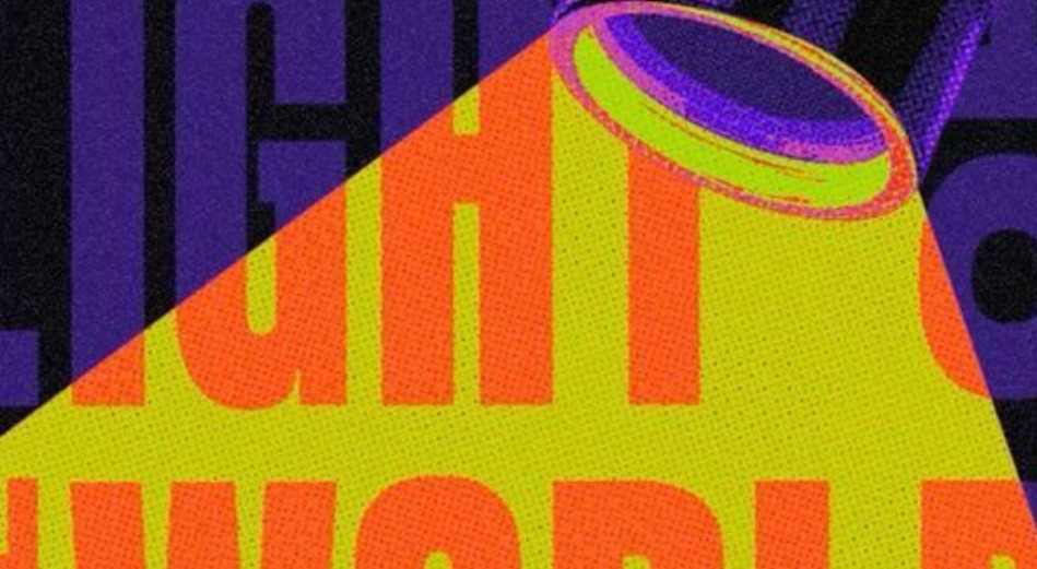
The spotlight
A beam cutting across LIGHT THE WORLD, cropped mid-word
89% green · 16 of 18 dotsResonance
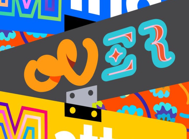
The sign collage
Clipped shop signs and lettering styles piled on top of each other
89% green · 8 of 9 dotsResonance
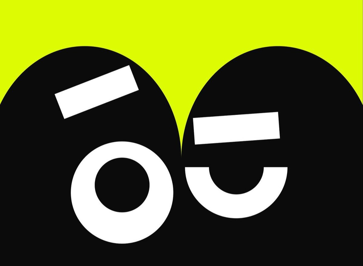
The raised eyebrow
Two eyes on lime, one brow lifted, pupils off to the side
83% green · 15 of 18 dotsResonance
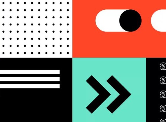
The symbol grid
Dots, a toggle, stripes, chevrons and three a's in a tiled code
79% green · 15 of 19 dotsResonance
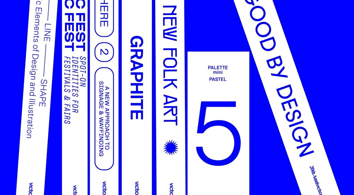
The festival strips
Tilted blue strips of event labels, a 5, and GOOD BY DESIGN
78% green · 14 of 18 dotsResonance
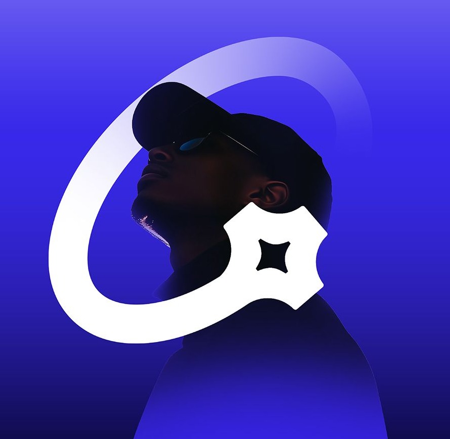
The man looking up
A face in a cap, eyes raised, with a loop and a sparkle around it
76% green · 13 of 17 dotsResonance
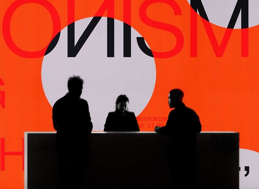
The silhouettes at the counter
Three figures, backs to us, facing a lit wall of mirrored type
61% green · 11 of 18 dotsResonance
The overprinted A
One letter printed in four misregistered inks
58% green · 7 of 12 dotsRoute one: someone is looking at something you cannot see
The raised eyebrow took 83% green, 15 of 18. It is two eyes on lime, nothing else, and the pupils sit off to one side with a brow lifted over them. That is the facial expression of the word, and the room treated it as such: of the eight people who put their very first dot on it, all eight placed a green one. The man looking up took 76%, 13 of 17. His eyes are raised toward something above the frame and a loop and a sparkle orbit his head. The silhouettes at the counter took 61%, 11 of 18, the softest of the winners. Three people with their backs to us, looking at a glowing wall whose type runs backward. We see them seeing.
In each of these the person's attention is pointed away from the viewer. That is the cue. We are not being looked at; we are watching someone else look, and we want to know at what.
Route two: the image is not finished for you
The spotlight is the top score in the study at 89%, 16 of 18. A beam of light cuts a wedge across LIGHT THE WORLD, and the words are cropped at both edges so you read them by inference. The sign collage matched it at 89% on a smaller crowd, 8 of 9: five or six lettering styles clipped and stacked, with OVER sliding across the middle and something else always peeking out from behind. The symbol grid took 79%, 15 of 19, the largest green crowd on Board 1. Dots, a toggle, stripes, chevrons and three lowercase a's in a tiled layout that reads like a code you almost know. The festival strips took 78%, 14 of 18: a poster made of tilted columns of small labels, more to read than you can take in at a glance. The overprinted A cleared at 58%, 7 of 12, one letter printed in four misregistered inks so the layers separate as you look.
None of these contain a person. What they share is that the eye has work left to do. Something is cut off, hidden behind something else, or arranged as a system with a rule you have not found yet.
Loud, but not because it is loud
All eight winners are saturated and high contrast. So are seven of the thirteen losers, including the yellow B, the purple pills, the stacked B and the big smile. Brightness gets an image noticed. It does not get it called curious. Within the bright pile, the open images won and the closed images lost, every time.
What lost: thirteen finished statements
Thirteen images crossed the 54% bar on the red side. Most of them are good work. Several are the kind of polished identity piece a studio puts on the front page. They lost for one reason: they are finished.
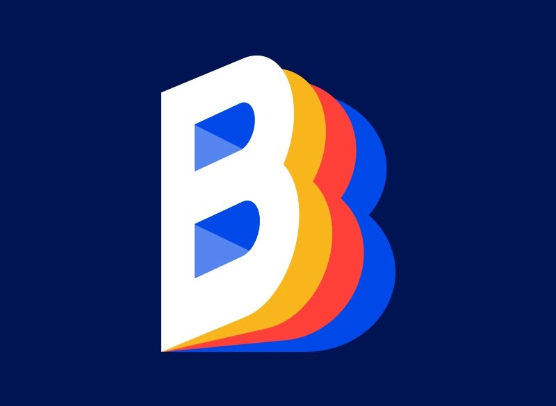
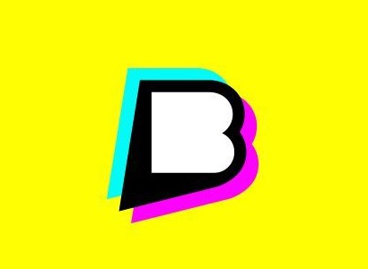
The first way to miss is to be a mark. The yellow B at 82% red and the stacked B at 80% red are logos. Bold, complete, closed. A logo's whole job is to resolve, and this room filed resolution under not curious.
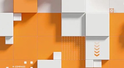
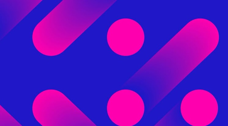
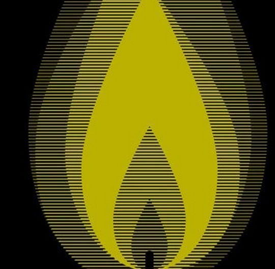
The second way to miss is to repeat. The purple pills, the orange tile wall and the striped flame are patterns. Once you have seen one module you have seen the image, and the eye leaves.
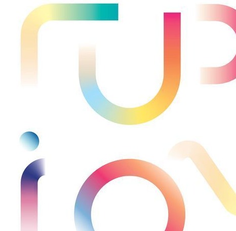
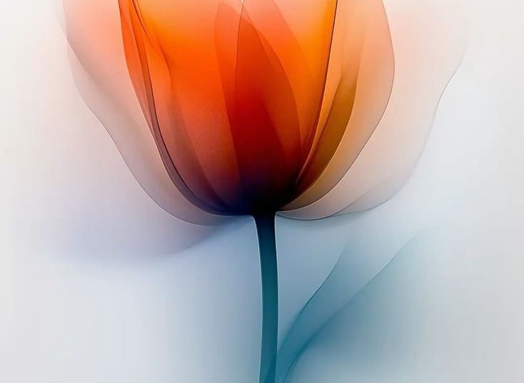
The third way to miss is to be pretty. The twice forty numerals, the x-ray tulip and the gradient letters are delicate, translucent and calm. Beautiful, and settled. The numerals took 10 of 11 dots red, the heaviest rejection in the study.
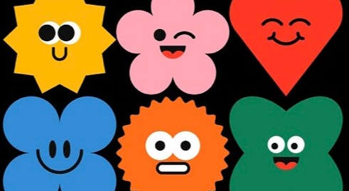
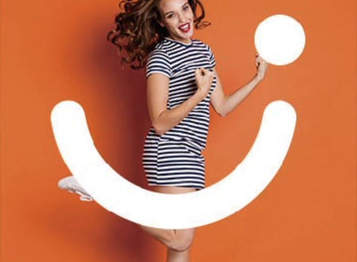
The fourth way to miss is to have already decided how you feel. The big smile at 80% red and the sticker faces at 56% red are faces aimed at the viewer, expressing delight. An emotion that has arrived is the opposite of one that is still forming.
Resistance array 13 images at 54% red or better
Resistance
The twice forty numerals
Translucent pink 4 and 0 overlapping on white
91% red · 10 of 11 dotsResistance
The yellow B
A fat black B with cyan and magenta offsets on flat yellow
82% red · 14 of 17 dotsResistance
The big smile
A woman laughing at the camera beside a giant white smile
80% red · 16 of 20 dotsResistance
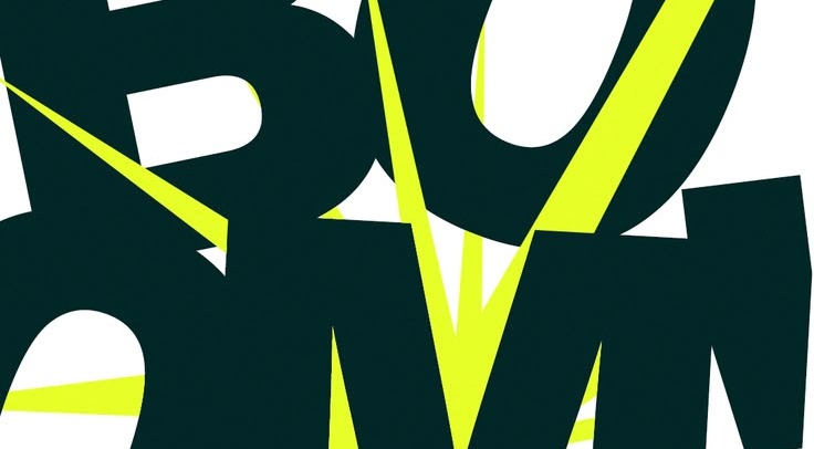
The sliced letters
Dark green letterforms cut through with lime slashes
80% red · 8 of 10 dotsResistance
The stacked B
A chunky B in blue, yellow and red layers on navy
80% red · 8 of 10 dotsResistance
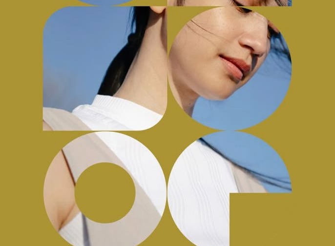
The olive collage
A woman's face seen through cut-out circles and arcs
77% red · 10 of 13 dotsResistance
The striped flame
A flame built from olive scan lines on black
73% red · 11 of 15 dotsResistance
The x-ray tulip
A translucent orange tulip fading into white
69% red · 11 of 16 dotsResistance
The gradient letters
Pastel rainbow strokes of soft, rounded type
67% red · 6 of 9 dotsResistance
The orange tile wall
White blocks stepping out of an orange grid, render clean
64% red · 7 of 11 dotsResistance
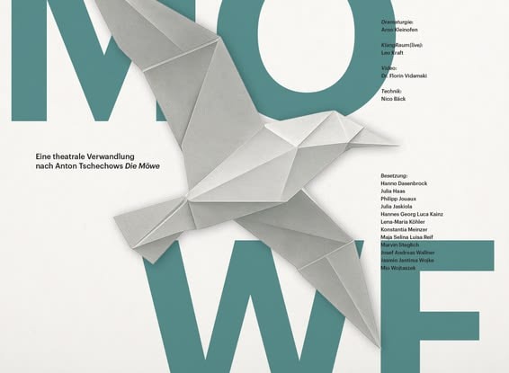
The paper bird poster
An origami gull over teal theater type and a cast list
62% red · 8 of 13 dotsResistance
The purple pills
Magenta capsules and dots repeating on violet
56% red · 9 of 16 dotsResistance
The sticker faces
Six cheerful characters, sun, flower, heart and cloud, grinning at you
56% red · 10 of 18 dotsThe big smile is the most instructive rejection. It drew 20 dots, the second-largest crowd on its board, and 16 were red. People stopped, looked, and said no. It is a face, it has an expression, it has energy, and it fails the one test that matters: it is looking at us, and it has nothing left to find out.
The sliced letters are the surprising loser. Fragmented, cropped, aggressive, and 80% red. Cutting an image up is not the same as leaving it open. The slashes destroy the letters rather than hide them, and what comes through is hostility, not inquiry. The paper bird poster lost in the opposite register. A full cast list, a title, a finished origami object, every fact present and calm. Dense information that is all there is just reading, and reading is not curiosity.
Note · The beautiful-loser rule
Red means least associated with the word, not disliked. The yellow B and the twice forty numerals would likely win a prompt like confident or refined with the same 33 people. The dots define a direction. When a brief says curious, this is the shelf it is pointing away from.
The big discovery: the open loop
Lay the eight winners next to the thirteen losers and the split is not about color. The yellow B is as loud as the spotlight. The purple pills are as bright as the symbol grid. Loud lost as often as it won.
The split is about whether the image is finished. Every winner is open in one of two ways. Either a person in the frame is paying attention to something you cannot see, or the image itself has been cut off, layered or coded so that you have to finish it. Every loser arrives complete: a logo, a repeat pattern, a pretty object, or a face that has already decided how it feels and is showing you.
Figure 4 · Open or closed, with a face or without one
- Open
- A person in it
- Closed
- A person in it
- Open
- No person
- Closed
- No person
Principal finding
“Curious” is a picture with something still open in it. Either someone in the frame is looking at a thing you cannot see, or the thing itself is cropped, layered or coded so you have to finish it. The moment an image is complete, it stops being curious.
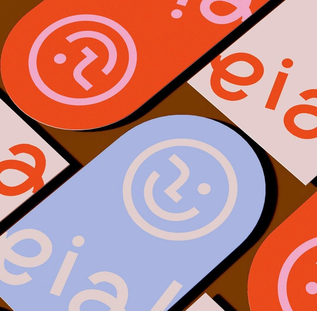
The word's literal symbol proves the point from the other direction. The question-mark stickers, a logo whose smiley face is drawn from a question mark, landed at 53% green, one dot short of the line. The room did not respond to a symbol of asking. It responded to the act of looking, and to things it had to look at longer.
The twin tests
The cleanest pair in the study is two faces with strong expressions and opposite scores.
Both are faces. Both are expressive. Both are high contrast and graphic. The only difference is tense. An expression that is still forming reads as curious. An expression that has arrived reads as the opposite. Gaze direction carries it: away from us wins, at us loses.
The second pair is two pieces of transparent, overlapping typography.
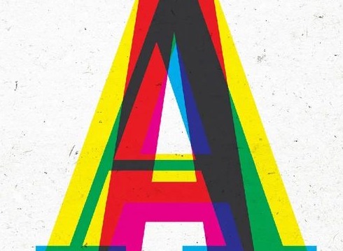
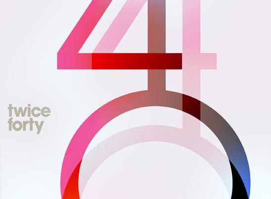
Same device, opposite verdict: 58% green against 91% red. The overprinted A looks like a mistake you want to inspect. The twice forty numerals look like a decision someone already made. Overlap reads as curious only when it looks unresolved.
The three that split the room
Only three images landed between 46% and 54% green, and all three sit at 52% or 53%. They are not a wide middle. They are three near-ties, and each one is a half-match for the rule.
Contested 3 images between 46% and 54% green
Contested
The question-mark stickers
Pill-shaped eia stickers with a smiley made of a question mark
53% green · 8 of 15 dotsContested
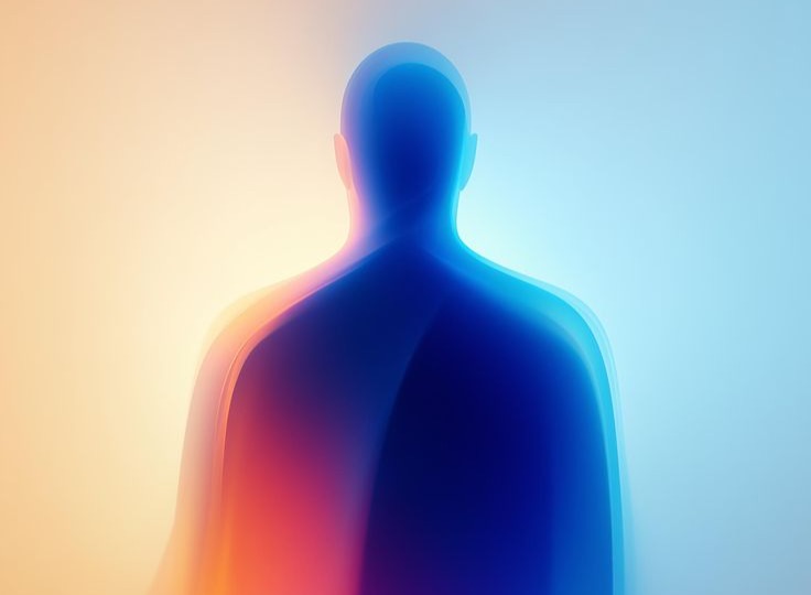
The glowing figure
A faceless human silhouette dissolving into blue and orange light
53% green · 9 of 17 dotsContested
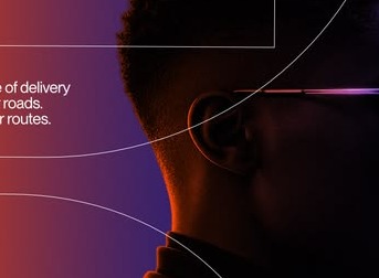
The profile in the dark
A man in glasses, lit from behind, looking out of frame past ad copy
52% green · 11 of 21 dotsThe profile in the dark drew the largest crowd on either board, 21 dots, and split them 11 to 10. The man is looking out of the frame, which is route one, but the image is a polished tech advertisement with copy about delivery routes sitting next to his face. Half the room saw the gaze. Half saw the ad. At the first-dot level it is just as split, four green and three red.
The glowing figure is a human silhouette with no face at all, dissolving into light. There is a person, but nothing to tell you where their attention is. Nine green, eight red. The question-mark stickers are a logo built from the literal symbol of the word, and the room treated them the way it treated the other logos, almost. Eight green, seven red, one dot short of the line. A symbol of asking is not the same as a picture of someone asking.
Where the first dot went
The platform records the order each person placed their dots, so the first dot on each board is a clean read of the gut. Two things stand out.
People look for the yes first. Twenty-three of the 31 people who placed dots on Board 1 opened with a green dot, and 26 of 31 on Board 2. The red dots came after, as a correction. And the first green dot went to the same images the final verdict favored: the symbol grid and the festival strips on Board 1, the raised eyebrow, the spotlight and the man looking up on Board 2. The first red went to the logos. The yellow B took six first-red dots, more than any other image on its board.
Figure 5 · Where the first dot went
The gut and the considered verdict agree. That matters for anyone using the result: the open-loop reading is not something people reasoned their way to over a minute. It is what they saw in the first few seconds.
In one sentence
Show someone looking at something we cannot see, or leave something for us to finish. A picture that is still open is curious. A picture that has resolved, however bold or beautiful, is not.
Attention is not endorsement
The profile in the dark drew 21 dots and split them down the middle. The big smile drew 20 and went 16 to 4 red. The sign collage drew 9 and went 8 to 1 green.
Plot crowd size against verdict and there is no relationship. Big crowds sit at the top, the bottom and the middle of the chart. The jazz it up study found the same thing: an image that stops the room has only stopped it. What the room decides next is a separate measurement.
Figure 6 · Crowd size against verdict
What separates green from red
Across both boards, the same six differences separate the green pile from the red one.
| Dimension | Resonance: what cleared the bar | Resistance: what was rejected |
|---|---|---|
| What the subject is doing | Looking at something out of frame, or at something inside the image we see from behind. | Looking at us, eyes closed, or absent altogether. |
| Emotional tense | Still forming: a question on the face, a search in progress. | Already arrived: delight, calm, confidence. |
| Edges | Cropped mid-word, mid-object. Things continue past the frame. | Self-contained. The whole mark fits inside the picture. |
| Layers | Stacked, overprinted, piled, with something peeking out from behind. | One plane, or layers composed so cleanly they read as one. |
| Information | A system with a rule you have not found yet: a grid, a code, columns of labels. | A repeat pattern, or a full statement with every fact present. |
| Color | Saturated and high contrast. | Saturated and high contrast, or soft and translucent. Both lost. |
The last row is the one to notice. Color does not sort the piles. Both saturated and soft images were rejected, and every winner is saturated only because every open image in this set happened to be. The structure rows do all the work.
What to do with this
The next time a brief says curious, the word comes with a specification instead of a mood. It is one of the more useful entries in the field guide to vague creative feedback: give the viewer something to look for, and do not finish the thought for them.
Do
- Point the gaze away from the viewer. A person looking up, sideways or at something inside the image we see from behind. The three winners with people in them all do this.
- Crop mid-word, mid-object. Let type and shapes run off the edge. The top score in the study is two words you cannot fully read.
- Stack and overprint. Layers with something peeking out from behind. The sign collage and the overprinted A both cleared the bar this way.
- Build a system with a rule to find. A grid of marks, columns of labels, a code. Dense, but with a logic the eye wants to crack.
- Keep the expression unresolved. A raised brow, a searching look. The question, not the answer.
- Keep the contrast up. Every winner is saturated and crisp. Soft and translucent images never cleared.
Don't
- Lead with the logo. Two complete marks took 80% and 82% red. A mark's job is to resolve, which is the one thing this word is not.
- Repeat a module. Pills, tiles, scan lines. Once the pattern is read, the eye leaves.
- Answer with a smile. Faces aimed at the camera, expressing delight, took 80% and 56% red. Arrived emotion is the opposite of curiosity.
- Mistake violence for openness. The sliced letters are fragmented and still took 80% red. Cutting something up is not the same as leaving it open.
- Mistake density for mystery. The paper bird poster has a full cast list and lost. Information that is all there is reading, not looking.
- Use the question mark. The literal symbol of the word split the room. Show the act, not the glyph.
One warning before you run with this
This study measured one word. The rejected designs might win confident, refined or joyful in a heartbeat, with the same 33 people. Use the result as a translation: when the word shows up in a brief, you now know what it is asking for. Do not stretch it into a general verdict on the work.
Methodology and confidence
33 completions across 113 opens, 361 dot placements over 24 images on two boards: 180 on Board 1 and 181 on Board 2. Each person had three green and three red dots per board, so green and red totals are roughly equal on each board by design, and salience is zero-sum: a dot placed on one image is a dot not placed on another. Two people completed the study without placing dots on one of the boards; 31 people placed dots on each board. One green dot on Board 1 was dropped above the top edge and is excluded, which is why that board counts 180 of 181 placements.
Images were sorted at a 54% threshold. The platform's results screen defaults to 60%; at 60% the resonance array loses the overprinted A, the resistance array loses the purple pills and the sticker faces, and the contested group grows to six. No image changes sides. With 33 people this is a directional study with a firm center. Per-image crowds run from 9 to 21 dots, so single scores between 54% and 70% carry real uncertainty; the sign collage cleared at 89% on nine dots and should be read as a tendency. The findings that bear weight are the ones that repeat. The open-loop pattern holds across eight separate winners and thirteen separate losers, the gaze rule holds for every image with a person in it, and five rejections at 80% or above on ten or more dots are the kind of agreement a sample this size rarely produces by chance.
Three passes would sharpen it. Run the same boards against confident, where the prediction is a near inversion. Anchor on the raised eyebrow to see whether the people who chose it also chose the cropped type, which would confirm that the two routes are one instinct. And add a second face that looks away but smiles, to separate gaze direction from expression.
Frequently asked questions
What does “83% green” actually mean?
It means 83% of the dots placed on that image were green rather than red. The raised eyebrow took 18 dots in total and 15 of them were green. The figure is a share of that image's own dots, not a share of all 33 participants, so an image with a small crowd and an image with a large crowd are scored the same way.
Does “curious” just mean put a face in it?
No. Faces lost as often as they won. The big smile took 16 of 20 dots red and the sticker faces took 10 of 18 red. What the winning faces share is that their attention is pointed away from the viewer, toward something you cannot see. And five of the eight winners have no person in them at all.
Does a red score mean the design is bad?
No. Most of the rejected images are strong, finished work: two logos, a theater poster, a delicate numeral lockup. The study measured one word. Against that word, complete and resolved is the direction people are pointing away from. The same designs would likely win a prompt like confident or refined.
Is 33 people enough to act on?
For the main pattern, yes. The open-loop rule repeats across eight winners and thirteen losers, and the gaze rule holds for every image that contains a person. Single scores are softer. Crowds run from 9 to 21 dots per image, so anything between 54% and 70% is a tendency, and the three contested images sit within one dot of even.
Why did the question-mark logo not win?
The question-mark stickers landed at 53% green, one dot short of the line. The room responded to the act of looking and to images it had to keep looking at, not to a symbol of asking. A glyph that means curious is still a complete, resolved mark, and the room treated it like the other logos.
Is this about color?
No. Every winner is saturated, but so are seven of the thirteen losers, including both logos and the big smile. Within the bright pile, open images won and closed images lost. Soft, translucent images never cleared the bar either way.
How do I run this on my own brief's word?
Build a board of 9 to 12 images that cover the range of things the word could mean, write one prompt, and send it out. Constellations collects the green and red placements, produces the heatmaps and the emergence replay, and sorts the images into resonance, contested and resistance. The first test is free.