What Does “Visual Data” Look Like
The Data You Don’t Read but Still Believe In
We asked 50 emerging designers to rate what looks like visual data and what doesn’t. The findings challenged our assumptions and revealed that structure, not style, drives visual trust.
The Form That Informs
At Constellations, we help people make sense of the visual world by using perception testing to inform more intuitive, effective design decisions. Our platform reveals how visuals are interpreted, enabling teams to move forward with greater clarity, confidence, and impact. But meaningful perception testing begins with a shared vocabulary.
One term we encounter often, yet find rarely defined, is visual data.
It’s frequently confused with data visualization, but the two are not the same. Data visualization transforms datasets into charts, graphs, or infographics to support interpretation. Visual data, by contrast, is information embedded directly in visual form. It is structured, styled, and labeled in ways that make meaning instantly perceptible. It’s not decoration; it’s legibility through form.
Because we work at the intersection of visuals and understanding, we launched our first study on the Constellations platform to explore this very question:
What does visual data actually mean to people? What associations come up? What patterns emerge? Where is there alignment, and where is there ambiguity?
Below is an overview and summary of our findings.
Parameters Overview
| Item | Detail |
| Test Topic | Visual Data |
| Respondents | 50 |
| Audience | College students, early 20s, design-minded |
| Image Source | |
| Search Terms | “info branding,” “data graphic design,” “infographics,” “data structure” |
| Tagging Method | None used for this test |
| Key Insight | Meta-type and labeling define audience perceptions of “visual data” |
View The Full InterView about this test and the restults.
Study Design and Audience
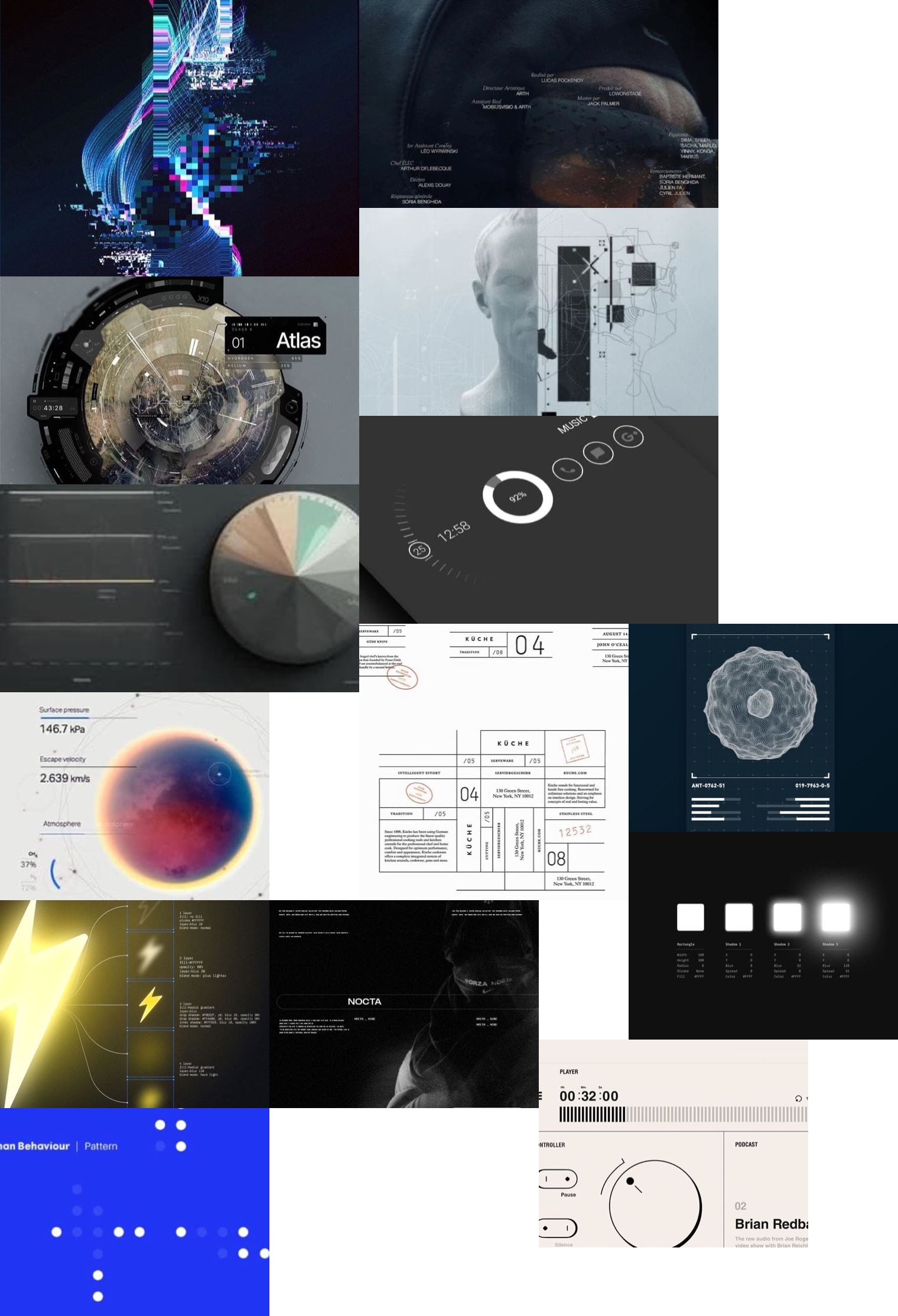
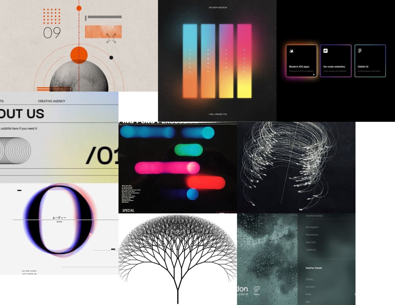
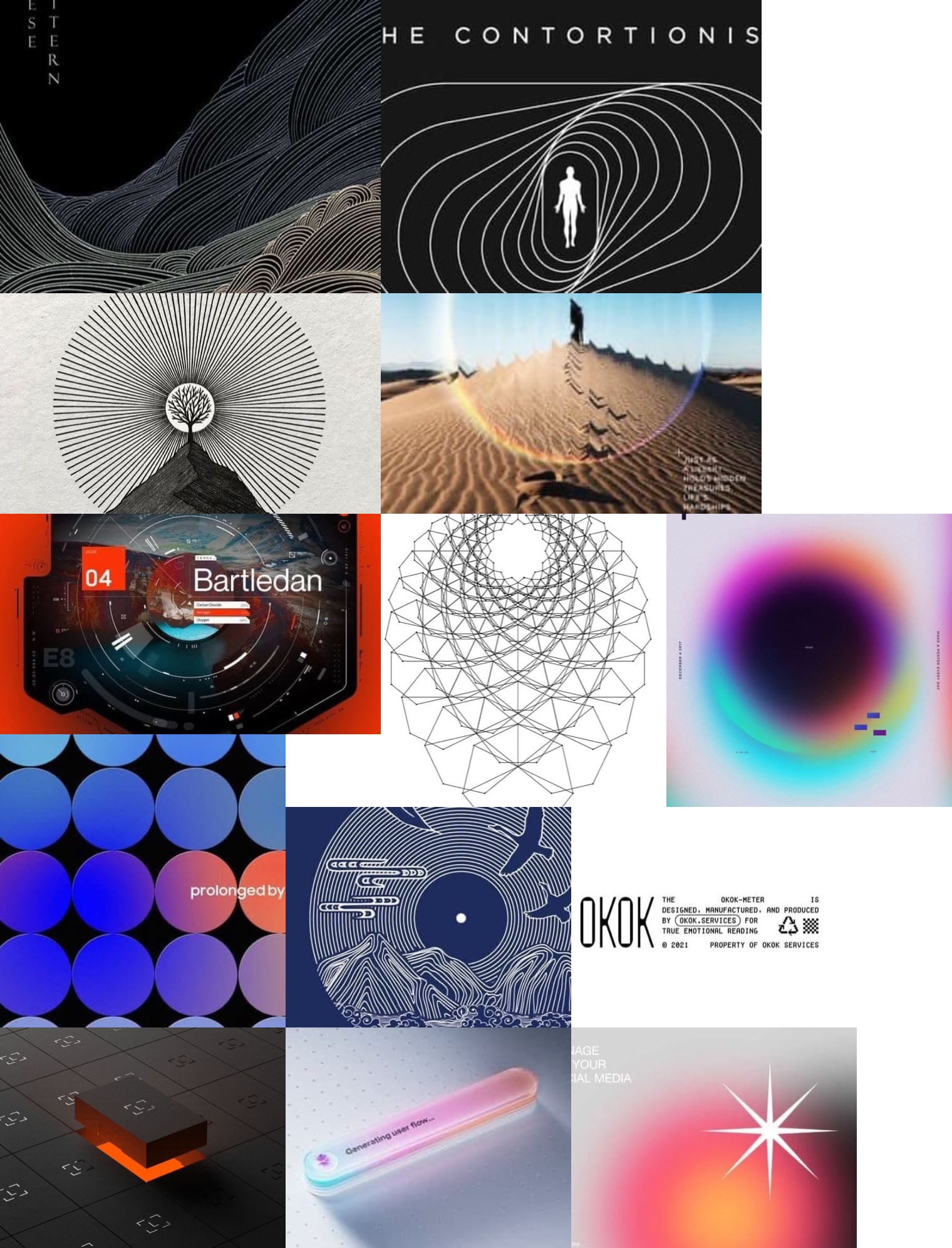
We set out to explore how people interpret the term visual data, specifically what kinds of images they intuitively associate with it and what visual language the term evokes. To do this, we showed participants a curated range of visuals and asked them to rate how strongly each aligned with their perception of “visual data.” The image set was sourced from Pinterest, using search terms such as “info branding,” “data graphic design,” “infographics,” and “data structure.” Our goal was to gather examples that blended data, structure, and aesthetic quality—images that were both beautiful and information-rich. No formal tagging or categorization was applied in this early-stage test. As a college professor I had access to an audience of design students and asked 100 of my college sophomore through seniors to complete the test. The study had a total of 54 respondents, primarily college students in their early 20s who were studying design-related fields. Each test taker presented with 3 image selection screens that we call “Audience Perception Maps or APMs, and was asked “Which images do you associate with “visual data” Drag the green (+) dots to the images you most associate with the idea of “visual data” and red (-) dots with the images you least associate with the idea.” Their responses offer a snapshot of how the next generation of creative professionals interprets the concept of visual data. Below you can see the heat map data across the 3 sequential Audience Perception Maps (APMs).Audience Perception Maps (APMs)
Visual Data, Visualized
Audience responses showed clear preferences for visuals featuring strong structure: labels, numbers, directional lines, tables, and dense meta-type. A print-based swatch with intricate labeling scored the highest at 78.26% positive, challenging our assumption that sleek, digital aesthetics would dominate.
In contrast, tech-forward designs with minimal labeling were often rated negatively. The takeaway? Visual data is perceived less as futuristic polish and more as organized, interpretable structure.
To better understand these preferences, we applied a 70% threshold to group responses into positive, neutral, and negative categories. This approach struck a balance between clarity and sample size. At this level, we observed:
Positive, Negative, and Neutral Constellations
Interpreting the Patterns
Positive swatches consistently featured structured labeling, charts, visual hierarchy, and dense information. Visuals that clearly conveyed order and content scored highest.
Negative swatches, though often sleek and tech-styled, lacked explicit cues such as clear labeling or visible structure. This led to a lower perception of them as “visual data.” Neutral swatches occupied the middle ground, showing some structure and labeling, but not enough density to trigger strong associations.
Beyond these patterns, deeper perceptual dynamics emerged:
Meta-type as Anchor
Labeling didn’t just clarify meaning; it functioned as a perceptual anchor, pulling nearby visuals into similar interpretive space. This suggests that labeling plays a gravitational role in how we cognitively frame visual data.
Analog Trust Bias
Print-based swatches scored unexpectedly high, hinting at more than just aesthetic preference. Visuals with analog qualities such as printed labels and hand-coded taxonomies may signal transparency and legibility in ways that digital minimalism does not. In this light, visual data appears to mean not only “structured,” but interpretable—trusted because it feels tangible.
Density Heuristics
Participants seemed to use visual density, especially when paired with structure and labeling, as a shortcut for “data-ness.” The implication is that viewers equate more visible content with more meaningful content, even if the actual information load is ambiguous. This raises a key design tension: is visual data about real depth, or the appearance of it?
The Sleekness Penalty
Sleek, tech-forward swatches consistently underperformed. While aesthetically polished, they often read as content-light. This disconnect suggests that minimalist design may unintentionally signal conceptual emptiness. The presence of well-organized complexity performed well regardless of whether the aesthetic leaned traditional or high tech. In this context, clarity may outweigh elegance when it comes to visual authority.
Key Takeaways
What defines visual data, according to our test audience, is not aesthetic style or digital fidelity. It is the presence of structured, labeled information that follows the visual language of metadata. Clarity, specificity, and information hierarchy carried more weight than polish or medium.
This insight helps sharpen our definition of visual data as something that carries its meaning visibly, structurally, and intentionally.
Interpreting the Patterns That Emerged:
Data You Don’t Read but Still Believe In
What this study begins to uncover isn’t just how people perceive visual data, but why certain visual forms and motifs feel like data in the first place.
What stood out wasn’t a techy look or abstract aesthetic, as we anticipated, but the presence of small, structured, densely layered information. Visual details like labels, annotations, and tiny type did more than convey content. They conveyed authority simply by being there.
Imagine buying a soft drink at a rest stop and glancing at the back of the bottle. There’s always a tight grid of nutritional data—something most people never read, but never ignore. If that visual data were missing, trust would evaporate. Most people would likely hesitate, question the product, or discard it entirely.
In modern life, we place enormous faith in systems of information we don’t always engage with directly or in depth. Layers of text and structure act as ambient signals of credibility—evidence that something has been examined, vetted, and made safe.
These cues operate like a quiet promise: this has been considered, tested, and verified. You don’t need to engage with every data point to believe the system is working. That’s the semiotic power of visual data. It doesn’t need to be loud or flashy to be reassuring. In fact, its strength may lie in its subtlety—its ability to suggest, with quiet confidence, that meaning is embedded and available for those who want to look closely, even if you don’t.
Previous Studies and Results
Design Meets Data—Stay in the Loop
We’re just getting started. Subscribe below to get more studies, reflections, and visual data insights straight to your inbox
Join Our
Mailing List
Sign up to participate in interactive visual surveys and receive exclusive analysis reports on timely, trending topics—all from a visual perception perspective. You'll also get product updates, creative case studies, and smart ways to sharpen your visual strategy.


